2016-05-30
New layout!
Yes, it's obvious. Expect if you're reading on mobile. The blog has gone through major overhaul.
The old layout was white-grey gradient thing. Pretty bland actually. On other hand it gave focus to the MOCs but honestly, it was easily forgotten among other LEGO-themed blogs. I think this interface is memorable. Heck, at least by now you should recognize that yes, you're reading Cyclopic Bricks!
I'm hugely grateful to Crudelis "Manfred" Diabolus who did hours of work on the technical code side of the layout. Actually he tweaked the original one (based on "Nautica" by Deluxe Templates, and it's still somewhere down there) too. I would have never known how to make all the buttons and frames and other thingamajigs and doodads and whatnots. Luckily Sir Diabolus knew. Well done, that man(fred). He also does music that you can check out on his website, if you dare.
Most of the graphics are done by me. I can't really draw on computer (I don't have a drawing pad and who can draw anything with mouse?) so I drew everything with pencil (2B), scanned it in black-and-white mode and colored on photoshop and added some effects. Steampunk influences are heavy, but I wanted to avoid general cogs and gears. Ever been in a steam locomotive's cockpit? There's a full maze of pipes, tubes, valves and meters, but no gears. It's about pressure, that's it. So I went with the tubes.
The theme used here is actually based on a drawing below I made when I was on my civil service at the local police station. There wasn't lot to do, so I had plenty of time to read Discworld novels, watch Father Brown in the backroom and draw things (On other hand, I also drove police vans which was quite cool). The idea was actually inspired by a cartoon by local satirical cartoon artist on the newspaper, with interesting pipe-maze-machine representing some political or economical process. The image was also used on Salsa, The Official Klaanon Card Game, as the image of place card of The Shipyard, the base of most of my characters. I also made a printing sieve of it and printed some T-shirts.
I first made the new logo that appears on some of the banners; I wanted it to have something LEGO-like on it. I ended up with a tan headlight brick, the one I usually use for eyes. You know, Cyclopic Bricks? One-eyed-mythical-creature-like bricks. So it has a one eye. You know?
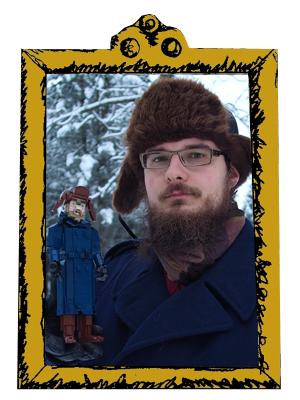
The good-LEGO-bricks-in-sand-green-circles motif continued through the side bars. They loop and their visibility depends on the resolution of your screen. I also made a frame for the interchangeable banners, frame for my new portrait (taken in last November, including telescope-eye-thing, Swiss Railway Station officer hat, old Finnish mantle... ) and icons for links on the top bar (including my Brickshelf user on "older works" - Proceed with caution) aaand icons on the right side (The frames were composed on my graphics by Mr. Diabolus). The new font is, I think, Sahitya.
The blog still features some interchangeable banners composed by Don Valentino "Uncle Rubber" Delucci, powered by coding by Nenya (You know, like Galadriel's ring). They deserve a thank you here: Thanks!
Labels:
Misc.
2016-05-13
MOC: Sergeant Colon & Corporal Nobbs
Back to the Discworld! Here's two characters that appear in large number of Sir Terry Pratchett's books, the experienced and badly educated watchmen Sergeant Frederick Colon and Corporal Cecil Wormsborough St. John "Nobby" Nobbs. They were part of the "original" Night Watch in the first Watch series books with Captain (later Commander) Sam Vimes and Lance-constable (Later Captain) Carrot.
Nobby is a petty thief, slimy, dirty and smelly, and always has a sad cigarette with him. He's often mistook as a pet monkey or similar, but hold a species certificate signed by Lord Vetinari that states he is an actual human. He's interested in dangerous weaponary and has gone through several identity crises and currently dates a goblin lady.
With my Discworld characters, building Nobby and Colon would have been obligatory at some point, so I went for them. Nobby was first. I begun with the head, which was quite easy. The torso was harder, as Nobby's a small man and regular techniques couldn't be applied. There's some TECHNIC in there to enable bad posture and thin neck. Notice the stale City Watch badge where metallic copper finish has party worn out.
I didn't want to post Nobby without his partner so I built Colon shortly after finishing him. Colon began with his muscular Roman-style chestplate worn over his big stomach. I'm very happy how it turned our. Several of my favorite pieces like boat studs and curved slopes are used here. I'm also happy with the legs. The boot design is similar to Vimes' and Carrot's, but is wider and thicker. Legs on human figures are somehow harder than expected, giving that they usually are just couple of pillars under the torso. But they're not very interesting and therefore not very fun to build.
It took a while to give accessories to these guys. Nobby's halberd was originally on Colon, who was described preferring polearms to keep enemies out of reach. But it felt too war-like to him, so I switched to Nobby who was holding a bell at the time with a baton on his belt; I swapped the bell to the belt and baton to Colon and polearm to Nobby (who loves dangerous objects like Klatchian fire engines, morningstars etc.) and moved bit of the polearm's lenght to the baton to make them look balanced to the characters. I also gave Sarge a doughnut, which felt fitting for the character.
-Eero
Labels:
Discworld
2016-05-04
MOC: Arcane Samurai
This is one of those builds that had a strong original idea but ended up something rather different. The idea was similar than on Kira; to adapt well-designed minifig torso to a larger build. Accidentally this torso was from same character, Samurai X from Ninjago (this time the 2015 version). I intended the scale to be similar than on Kira, but it ended up being somewhat smaller, around the scale of Mace-bearer and Cyira the Paladin.
The colors were one of the main points here. Samurai armors have often dashing but earthly colors, opposed to (popular culture imaginary of) European knight armors, which usually seem to be silvery or grey. The colors are naturally based on the minifig torso, as is the bird emblem in the breastplate, but it was generally interesting to match the bright red and pearl gold parts with more toned-down ones.
The katana is a basic one, with Ninjago blade and a simple handle. The flagpole was a late addition: I had thought about it, but wasn't sure if it needed one or not. I ended up building it anyway. Those masts are just pretty cool overall, and the flags from Orient Expedition's Dragon Fortress were just perfect.
-Eero
Labels:
Bionicle