Hello readers. I posted
New Century City Corner II in May and said that its predecessor would be posted any time soon. Well, here it is now. But as it's rather large block, 128x96 studs, I wasn't able to take photos from all angles in same way than I did with the Block II that is only half of this one's size. Therefore this is photographed and presented mostly in groups of three or four adjacent buildings. The first five were presented in
New Century City Corner in April 2016. This is a large project - or was, as it was finished in February 2017, over year ago, to be displayed in
Palikat Pinoon - Brilliant Bricks in Vapriikki museum in Tampere. It is still there, so if you can have perfect, all-around-look of this in real life, head to
Vapriikki.
As noted elsewhere and before, the grand aim was to build a block of residential city buildings in style of early 20th Century; mostly in Art Nouveau, also called Jugendstil. There are no floors nor dividing walls and definitely no interiors. I wish there would be, but I'll rather spend my limited array of bricks on the stuff that is visible. I will discuss on individual buildings further on.
 |
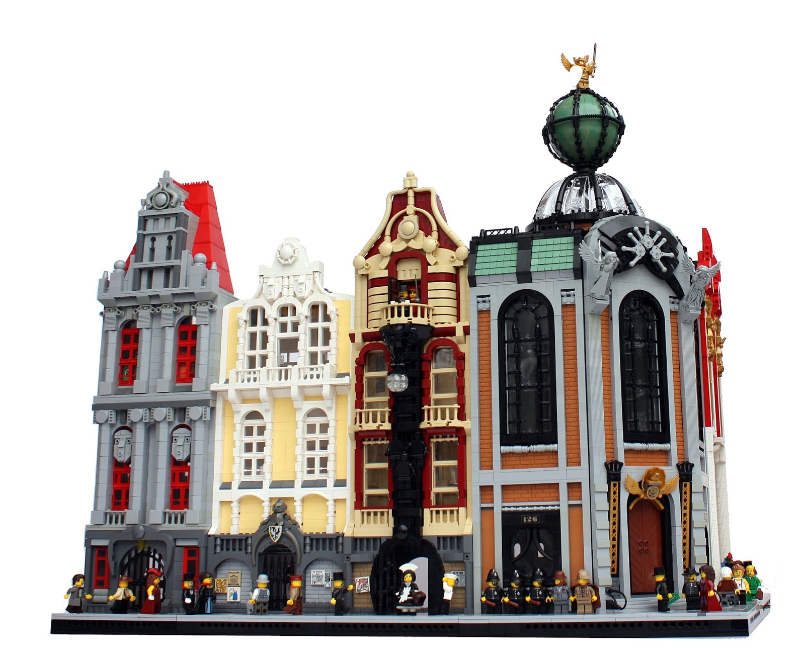
| Left to right: House of Golden Frogs, discussed in post about New
Century Corner; House of the Sword of Justice; House of the Firefighter
Alliance. |
House of the Sword of Justice
Building this one begin almost straight after I had moved to Tampere in summer 2016. I had won half of Brick Bank modular on Palikkatakomo contest and drafted it, and wanted to use the printed windows; they had nicely coloured mosaics and curved lines appropriate for Art Nouveau style. I also wanted to make sort of rounded pillars and an oddly shaped thing over the entrance. I don't know what it is, and why it is, but the building ended up having very eccentric feel and it felt fitting. The first level is also slightly unsymmetrical. The other corner buildings on this one are symmetric, and I wanted to make a difference here.
One of the main inspirations here was Catalan Modernismo. Gaudi is the most famous architect of the movement, but my references here were slightly less extreme. Actually, the right side ended up looking like American steel-supported apartment building from the same era. It's not what I originally aimed to, but I quite liked the combination of Fabuland wrought-iron arches and new-ish ornamental fence pieces. The left side is more eccentric with sort of twisty window areas. I'm especially happy with the square window on the second floor. The middle part is again strange, with a large wound window and a balcony over sort of inset with a patinated statue of Justice in it, somewhat reminding of statues of saints in similar bays in Catholic architecture. Two guards on well, guard near the door enhance the official and legal setting of the building.
Building of the Firefighter Alliance
This one is inspired by two building in my hometown Tampere, both associated with Fire Brigades, hence the name. One is
Central Fire Station, by Wivi Lönn
, from 1908 and still in its original use, and the another one is the
building of Volunteer Fire Department by Heikki Tiitola in 1910. The colour scheme draws itself from them, as well as the design with a tower on one side. The building itself is rather serene and typical compared to its neighbour. The lines are clear and details simple. The tower is rather usual brick- and plate hinge style. It has the egg-shaped dome from Agents set
Robo Attack from 2009. The roofs use cheese sloped, which create a shingle-like effect I quite like. The back wall is actually a baseplate.
 |
| Buildings left to right: Scala Arcus,Corner of the Honour of the Empire, House of Sunrise. |
Corner of the Honour of the Empire
This building has both Neo-Baroque and Art Nouveu details. The overall shape is very Baroque, and it is reflected on the name of the building, which is conservative and nostalgic to international reigns such Hasburg empire that shattered after the First World War in the early 20th century; And Baroque was in a way conservative and pompous. It is also noteworthy that while Jugendstil or Art Nouveu was popular in Finnish and Norway, neighboring countries like Sweden and Denmark preferred Neo-Baroque; those nations actually had more glorious past.
Anyway, the building. It was originally sort of a partner to House of the Secret Society of Aviation on the New Century Corner. The dimensions of the plan are same, 36x36, and the corner part is slid to its 45 degree angle in the same fashion with TECHNIC axles inside. The composition of brick surfaces and vertical pilasters are identical. In this one, the middle part sticks out around five studs, and the dome is compensated with a small turret with Baroque-style roof (it's very fragile). Lots of gold is used overall, as it felt fitting for the pompous agenda. The window design is much simpler than in the HotSSoA; It's almost church-like. However, the detail with two female figures on the facade is based on Art Nouveau design in Prague, originally placed over a doorway. The building was actually made six bricks and one plate higher prior to HupiCon 2018 in April to make it stand around as tall as its neighbours; it used to be a bit dwarfed by them.
Scala Arcus
Scala Arcus is, as indicated by its name, based on the large Scala arch piece on its third floor facade. It is 22 studs wide, which is unusual for a LEGO part. It also has some shapes very hard to achieve with usual pieces. I got it from my friends; thanks! It pretty much defined the whole building, which is Amsterdam-styled on the overall shape. Despite Amsterdam channel houses not being actual Art Nouveay style (they're older - sometimes from 1700th century), I think I managed to fuse the both styles. I also like how the aforementioned Fabuland wrought iron arch piece works as a smaller cousin of the large Scala arch. The ground floor has walls made of natural stone, typical for Finnish Jugendstil. I'm very happy with the ornamental frieze over the doorway.
House of Sunrise
This building was the last one built for the block. It has the overall same shape than Scala Arcus, fitting for rather thin modular building not on a corner of the streets. The colours are heavily based the parts available. I have plenty of those 2x2x2 slopes in dark orange, and I made a rather pleasant-looking bay windows with them. There are also few statues, one with curved dress made with jumper plates, and a mosaic of floral circle made using some very old printed tiles. The third and fourth floor feature large windows, and the white lines, portraying the sun's rays over the middle arch give the house its name. I'm happy with the colour composition of this one, even though it was in a way made of leftover pieces.
 |
Left to right: House of Sunrise, Domus Lupus, House of Two Whistling Geezers, from New Century Corner
|
Domus Lupus
This one is the oldest of "new" buildings shown here. Most of it was build in Joensuu in summer 2016. At a time it was not going to be a corner modular - it is fully hinged in four points, so it could also have been used as a 48-studs wide building, but eventually was settled for the corner on usual 32x32 footprint. It in inspired by an Art Nouveau building in
Turin, Italy, but unfortunately I don't have any reference pictures (that was two years ago). I wanted to make many different windows, including ones using old tyre pieces (third floor) and smaller ones with embedded round awnings. In the end, the building became very graphic and even disorderly mix of reddish brown and white, somewhat reminding of
Duomo in Florence. The name deprives from two dogs over the main entrance. There's even some plants in the balconies, which is unusual on my modulars; don't know why.
And here's some photos to remind you what the New Century Corner looked like:
-Eero.

 Another main bit here is the statue, somewhat inspired by Franz Joseph I of Austria, the last emperor of Astro-Hungarian Empire and man of notorious moustache. The Statue was built for the display on HupiCon, located between my New Century City Block II and Oskari's old Finnish wooden town to make the promenade there a bit more interesting. It was built during the last evening before the event (and so was the tram) but I was very happy with it. And why not - greatcoat and friendly mutton chops moustache. It's simple but it works.
 The yellow line wasn't part of the original plan. Actually I doubted if both yellow and pearl gold would look bad on the same, moderately sized MOC, but it turned out quite good. The old yellow windows have been collected from Pii Poo's tables during the few past years (the small ones are from my father's childhood collection) and 14 was enough for a tram. The dark blue returns in the roof, which is quite accurate. The conductor might be a bit too modern - trams of the age seemed to simple use a cable - but this one looked good so I settled with it, having those bar-connection joint pieces perfect for this cause.