2019-06-17

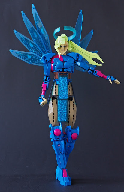
The Blue Angel of Hallow

I'm catching up with the creations, and this is probably from April. I began earlier with legs, added the wings at some point and finished with the head; so this was standing on a table for month without upper body and then another without a head. In other words, I had no clear image when I started building. This is not completely unusual in builds not based on anything particular.


The Blue Angel of Hallow is a superdigital being who watches over multimedia connections, protecting people from malignity and sourness. As a build, she was sort of counteraction to red-and-black series of characters and new "red period" of creations overall; I wanted to do something bit similar but simply in blue, which is vibrant and common colour, and while not very exciting, offers wide range of parts, including lot of curved slopes. I mixed together some magenta, which is exciting shade and also quite beautiful. I didn't have that much of it, but it felt enough to be blasted into a creation.

I began with the lower legs. Blue Carapar armour was the key piece. It comes only in one Power Miners set, which I don't even have, but I have acquired six from some other sources; I'm not sure but I might have got one or two of them while building this, which sounds like destiny or something. Anyway, the knee joint is behind the upper pair of these parts on leg, so it acts as an individual knee pad. I like the layered look they give, and bit of magenta mudguard that trims the knee joint behind them. The shoes are quite usual boot type, again hiding the grey ball socket, as those buggers seem to be colour blocked forever. The upper legs are dark tan to bring some contrast to the bright colours; Like she would wear a pair of ordinary if high-waist trousers under the armour. The shape is quite flowing, and I was afraid it would look too thin near the hip joint. Fortunately the "loincloth" piece hides most of the gap.


The loincloth, or more like skirt, is a trick I've been waiting to use for some time. They're solar panels from 1999 Town Space Port theme. The actual side of the sticker sis cool, with silver glittery pattern and some numbers, but the clear treasure lies underside - deep blue, glittery pattern. Four are used there, and they bring otherwordly yet modern feel to the build. They also make the blueness of the build more consistent. They hang (well, one of the really doesn't) from the brown belt. Above it the breastplate recycled the design from Ruki, a Klaanon creation from 2016. The cat tail piece is another one I wanted to use there, as I hardly ever build anything blue, and they seemed to fit the elegant nature of the design here. Around them there is some asymmetry with the colours. Such design element felt fitting and was supported by the inventory of magenta parts available. Mudguards again form the holes for the arms. It's an old trick I've been using on some Ankh-Morpork City Watch characters, but the bright colours here bring it up better. I have one 1x2 curved slope wedge in blue, so it was ditched here for absence of better use; 2x2 macaroni tile on the "magenta side" has some likeness of shape theme of the cat tail parts under it.

Carapar armour parts on the shoulders are attached to joints in way that they can slide over the shoulder, keeping the same silhouette. They're supposed to look like stuffed shoulders on certain types dresses, and I think they do their job nicely. I like using unusual parts like those. The arms overall are quite basic, if very SNOT heavy; Then again, these days, what isn't? There is a one innovation though, and that is connecting the new-ish round-plate-with-bar into anti-stud side of a headlight (heavy hobby lingo here, sorry) so the small support in the middle of bar part slides inside the headlight, thus eliminating the otherwise irritating two millimeter wide gap. Great yeah? I don't have any 2x2 round tiles in blue or magenta, so the inner side of elbow joint uses a very studdy design of 1x1 round plate on 2x2 one. I was afraid it would look ugly, but looking at the photos now, I barely notice it; I've never been a perfectionist, fortunately.


The angel's wings use Insectoid wing parts. They're cool: Extraordinary, cheap in second hand and flashy. The print side in on the back, to emphasize blueness and match the inverted skirt panels. The connection is bit unorthodox, but works; some pulleys are used to connect four wing parts side by side. They also went through several connections - the first one had been around for several years, I think it was a tablescrap from an preliminary version of Gale Serpent.

I wanted the hair be green. It felt fitting for the overall vibrant, modern feel of the creation, and I had plenty of suitable pieces. Colour options were very bright green and lime green, and I ended up in the lighter of the two shades; The lime green hair will be on upcoming build that is almost finished. Only missing part in very bright green is a clip to connect the flame barb bang. It is while now, and blends quite well in. I'm particularly happy with the twin sword ponytail. It's quite graphical, but natural enough, and rather flowing. The halo is a Clickits wrist band; I like the asymmetry of it.

-Eero


2019-06-14

Father Brown

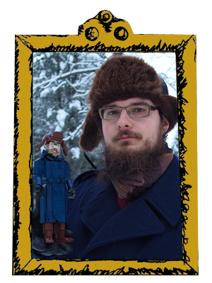
The last two creations have been Japan-inspired, but this one has its sources on Victorian and also 1950s's Britain. Father Brown is a crime-solving Catholic priest who appeared in number of short stories by British author and philosopher G.K. Chesterton, and currently on a BBC series which combines the more philosophical content of the books to traditions of British countryside crime TV fiction. Both are worth of inquiring. In BBC series Father Brown is portrayed by Mark Williams, also known as Brian Williams (Rory's father) from Dr. Who and Arthur Weasley in Harry Potter films. I've actually built Arthur before, as part of my Iron Builder two years ago. It wasn't particularly inspired by movie content, as they've always been quite remote to me, but Williams is such a great actor and decent Arthur so why not; but I wasn't particularly building Mark Williams during the Iron Builder, but I was on this creation, back in February (I'm still catching myself up, badly). Mark Williams brings warm humanity, bright insight and occasional humour to Brown's character in a charming way. This creation is a way of paying homage to the subject of joy, in similar way than Circle project some time ago. 

Overall Father Brown felt like an easy job, as largest part of the build is the cassock, an angle-length-garment worn by the clergy. It is very simple piece of clothing and ultimately monochrome, so no details or rare colours were bothered. I simply tried to get the shapes right, with the belly sticking out a bit and the lower part broadening slightly; There are some studs visible, as tiling them would have made the garment blocky and jarring. The buttons are 1x1 round tiles to distinguish them from the studs. The back is built mostly sideways, and while the construction is simple, I'm happy how the shape came out. The neck is angled to capture the correct posture. I was told that it had a sort of sacral feel, so I guess I succeeded in it. The neck band is made using a cheese slope on mudguard; the mudguard piece felt somehow obvious for this use. The arms are simple and poseable, with round-plate-with-bar joint on the elbow and ball joint on the shoulder. Father is able to hold his umbrella in several ways. The shoes are usual type seen on several other characters.


The most interesting part was the head. I've built dozens of characters, and the beardless ones are always hard. With them the features are subtle; proportions of nose and eyes, nose shape, jaw lines... Father Brown has little round glasses, and Williams' eyes are quite deep behind them. 1x1 quarter round tiles are used to make the wrinkles around the mouth and eyes. At some point he looked almost exactly like professor of civil engineering at my university, and now he looks somewhat like my great-aunt; but I'm quite happy with it. A TECHNIC connector has been used to create the small round chin, and tan 2x2 jumpers on the sides give the head overall some roundness. The brimmed hat uses old large tyre as a band to hide connection to give it slight angle, and it is surprisingly sturdy, althought it took couple of versions to get it right.

I wanted to make Father Brown a little base, as the colours didn't stand out. I though some green made it more eye-catching overall. The final design has some Gothic architecture around it to associate the build with verdant yet historical English countryside. 

-Eero


2019-06-09

Tea Ceremony in Japanese Garden


This build dates back to last November, mostly. It's one of those builds that stay on sort of work in progress stage for months, leaving the builder wondering if it's ready or is there something still to do, rocks to be rearranged, flowers to be planted, tea accessories to be added... And at some build the artist has to do the decision that yep, it's done. Finished.
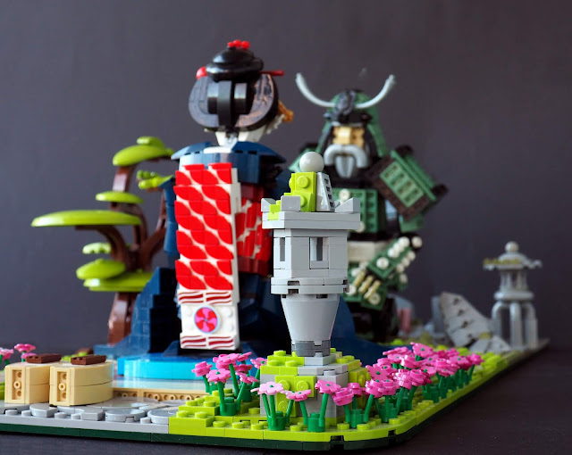
People sometimes ask me to do dioramas for my character builds. I don't build them often, as they take lot of bricks and space. With figures around 30 centimetres tall, most everyday objects are larger than a minifigure. But dioramas are also excellent ways to tell stories, reflect the figures and build cultural background and context to its characters. This creation is a mental follow-up to my previous two-character diorama The New Shogunate, which portrays challenge of old and young samurai on a garden bridge, with the environment reflecting the age and situation of its inhabitants. Both creations feature elements from medieval Japanese culture: Samurai warriors, Törö shrines or lanterns and traditional gardening elements.

 However, Tea Ceremony in Japanese Garden takes more pacifist, peaceful view on its subject - war and battle are key elements on storytelling and culture - both popular and non-popular, from Teenage Mutant Ninja Turtles to Göttendammenrung - which is quite extraordinary compared to how rare war and battle are in, let's say, average life in any European Union citizen. Theme of violence is not completely absent from this creation neither, as samurais are, despite their romaticized image, members of warrior class with killing people as their job description. The samurai has his swords sheathed on the rugged rocks, with mundane, even dirty colours and bare landscape reflecting warrior's path, in contrast to bright world of flowers and flourishing grass of maiko, an apprentice geisha. The geishas were said to live in "willow world", in contrast to the one inhabited by most people. The scene shown is calm and peaceful, but thought has been put to it. 

The first idea behind the creation was to build a beautiful, colourful kimono, and naturally a geisha inside it. I had also ambitions for samurai armour again - they are undoubtedly of cool and imposing design, and the last ones from The New Shogunate were built over one and a half years ago! So I went on building the both, and a sitting scene felt interesting, as most of my characters spend their time standing (or, honestly, lying on their boxes as there are so many of them), without even ability to sit. I also knew that large sleeves of a maiko's kimono would be problematic on standing figure. I've built them before, on Kirika Towa Alma and Red Lady of the River, and they either end up very heavy and somewhat blocky or need special pieces. On sitting figure I though I could build them laid on the floor - a tatami, to be precise - thus eliminating stability problems.

I began with the samurai, and that happened while still living on my old apartment; it's probably the last character built there. The main challenge was the legs. The samurai had to be able to sit on his legs. Boat stud joints are the most common joints on knees of my characters, as they are very sturdy while still mobile due to having two points of articulation. They are used here, and some thought has been put on the pin joints to allow plenty of circulation. The knee armour is connected to the lower leg so it doesn't limit the movement while still hiding the most severe technical areas. The legs look quite alright when standing up, too. The undersides of plates are used on the armour, mostly because they look fitting but also because they made it possible the connect the sitting character firmly to the studded ground. Contrast of war and peace continues to the flower motif on the armour, recalling cherry blossoms and creating mundane and peaceful colour scheme. Bulky shoulders create a silhouette typical for samurai armour. The kabuto helm features a scarab shield as the datemono crest. While it's not that fitting for the Japanese setting, it fits the helmet well as a shape. The facial features are similar to Samurai Stalwart, though the moustache is more walrus-esque and the nose is bulkier; the handlebar eyebrows just pack so much character to the face.

Maiko's kimono features lot of work with colours and patterns. I tried to make it pink at first, but my pink inventory was too limited. I ended up with dark blue, which is a beautiful shade, widely available in tiles and curved slopes, and fitting for the subject. The first part built was the upper leg area with its pattern of flowers and very bright green swirly part; Above it is the obi belt, featuring red-and-white pattern made of 1x1 quarter circle tiles. It continues to the back. This area features some offset to make the widths natural. The upper part is quite mundane, with typical T-bar joints on the shoulders. The sleeves consist of two parts - the 3x3x3 cone is not connected to the lower parts, which only rest on the tatami base. This made it easier to position them in a realistic way. The wide sleeves of a Maiko's detailed kimono often feature beautiful ornaments. Here I chose a gradient representing sunset. It continues from one sleeve to another, and the darker, redder part has a stylized silhouette of a tree against the colours; The upper part of light blue shades features some pink clouds.

A lot of detail had been put on the Maiko's hairdo. It has a bun sculpted with macaroni tubes pieces and variety of hair accessories including golden chainsaws, islander feather ornaments, couple of sausages and a long red hairpin. Another sausage is slided behind the eyes to represent the red eyeliner.

The setting for these characters wasn't a garden at first; it used to be one of those tea houses located in gardens, with traditional tatami alignment. This architectural approach was abandoned for I didn't have enough tan pieces for it. The garden seemed a rich environment with lot of possibilities; the contrast of the sides came later. The maiko was still about to sit on a tatami, as usual in garden nodate tea ceremonies. It seemed natural with the fine clothing, while it seemed alright for the samurai in his war armour to sit on moss. The width of the tatami (26 studs) defined the size of the build. I wanted to have four-wide strips of grass on both sides of it, so the width is 34 studs. This embedded the tatami better to the nature. The base is rather thin, as I wanted it to have shaped corners. The corners on the Maiko side are softly round, while on the samurai side one is 45 degree angled and one just 90 degrees but of pond water. The bottom layer is dark green, and top colour (grass and moss) changes from lime to olive green (both fruits or whatever). Lime is rarely used as the grass on "serious" builds, but I think it looks wonderful here. Pink flowers enhance the brightness. There is also a Törö lantern, partly covered in lime green moss. The Maiko's high okobo shoes have been left on the stone path.

I wanted to have a tree as the third point on the build in addition to the figures. A bonsai (though rather large one) was natural choice, and it was a fun build, as it consists of brown bow parts and various strange lime green bits, including "tongue" parts and dishes. It was positioned symmetrically on the middle of the back side of the build. However, at one point I wondered if it was too small compared to figures and though about building a larger cherry tree to give shade to the characters. I had a WIP of it, but it didn't fly, mainly due to lack of right parts for the branches. Hopefully the bonsai does the trick. I think it's nice.

The samurai side features the rock garden, which arranged rocks come in many different shapes and sizes. Some of them are moss-covered, and one even features some rare sand red granite. The samurai's swords lie on the rocks, a long katana and a short tantõ; together they are daishõ, "big and small", a symbol and privilege of samurai class on the Edo period. Both swords are naturally in sheaths. Their placements was bit of a challenge, I wanted them to be present but not in the limelight; they ended up on the rocks, though balancing them takes some effort. The sheathed swords are also interesting technique-wise: the small tantõ uses a dinosaur tail middle section, while the slight curve of the katana sheath consists of 1x2 liftarms on rigid hoses. On the samurai side there is another Törö lantern, this time located on the pond. It uses some of those macaroni tube pieces for round shaping.

-Eero