2018-12-16

SOAR-SWIFT IV

SOAR-SWIFT IV is, despite cool Roman number four, the second part on a trilogy of creations that began with RADIANT-EXTERT IV. This was not intentional, but I was happy with that one and the theme with slick black-and-red colour scheme and Clickits-based energy weapons felt it had still something to offer. This is also the first creation posted here to utilize parts from this year's LUGBULK, specifically those macaroni tube pieces in red and black and red 1x1 rounded corner tiles.

While RE-IV was sort of a knight-themed, sporting a longsword and shield and bulky leg armour, SOAR-SWIFT is more modern and faster hit-and-run type unit. This is reflected in sleeker armour, short-range rocket pack, tactical head-mounted computer system and elegant twin swords. Some details, like hair-embedded sense-enhancing units and bird wings in the boots are preserved, and the colour blocks have similarities. I wanted to make a character of same culture but different task.

The build began with the boots. There are some more dark red, which was limited to some cheese slopes in RE-IV. I didn't have the pieces that made its knee pads so I altered the boots design altogether; the shin part is thinner, as is logical for swifter unit, and the knees have armour shells conneted to the tigh. The knee double joint, a sturdy TECHNIC holes into studs of 2x2 round plate type, is between the 4x4 dishes, and the little wings on armour parts (modified studless slopes, excellent pieces) on both sides of the joint touch in very pleasant way when the legs are straight; this little detail made me very happy.

The skirt uses both very new and old pieces. The part on the front is from my father's childhood collection, it's a part from old freight train wagon, and the sides use new macaroni tubes, straight from LUGBULK. The back of the dress has an another container half with the same measurements but more extending shape. The whole thing is vefy sturdy.

The upper torso uses organically-shaped red pieces that stand out on the black frame; the stomach area uses again "Wedge 4 x 2 Sloped" pieces that are well-shaped for such use; I like these odd parts a lot. The chest has also a printed round tile, probably from Harley Quinn's hammer, and some black sausages (moro) from LUGBULK. The thin shoulder armour is similar (but not exactly) than on RE-IV, but the upper arms itself are a lot sturdier. While RE-IV used a design with central TECHIC axis and tyre pieces around it, these are more logical brick-and-plate connection that, in my opinion, is no less elegant, doesn't fall apart and enables some details work; a wheel hub is used as a sigil. The lower arms are almost identical, except for the use of 1x1 round corner plate that makes it more flowing.

The hair is brown. There is no actual reason for it. I didn't want to use black nor anything too unrealistic, so brown it was. It took some pondering about, and I wanted some side bangs, as RE-IV had (and they are one of my favourite aspects of it). They are angled 1x4 "double-baby-bows" and work nicely angled like that. There was also bound to be some head equipments. I found those Chima ultrabuild axe blades from Pii Poo's tables some months ago and their striking shape made a cool ribbon/fin/weapon. It was accompanied by some red Bionicle blades that are somewhat mobile. To enhance the sci-fi-feel of the character, and its specialization on fast scout missions, I added a red earphones, one with an antenna and one with a little screen. The design of it dates back to May 2012 and Liberta-Multiarm mech, a surprisingly good build for its time.

RE-IV had a longsword and a shield, and I wanted something different for this one. I though some flamethrowers and cannons, but they felt rather brutal. Another idea was a crossbow that used a Clickits cable as the string but it didn't fly. In the end I returned to bladed weapons, this time with a single Clickits blade, and an elegantly organic black frame evolved around it. It went through several phases, and in the end I was so happy with it that I gave it a twin. The posture seems to suggest that the black side it used for hitting, but who knows what sort of mad fencing technique does SOAR-SWIFT IV use.

-Eero.


2018-12-02

Slimefoot, the Stoaway

Here's the promised Fungus. This is Slimefoot, another creation from Magic the Gathering card game. He's one of the uncommon legendaries of this year's Dominaria set, a mushroom that grew in airship Weatherlight's hold and became it's janitor. As a card, Slimefoot gives player life and damages the opponents when Saproling tokens die, and can create aforementioned tokens with relatively high cost. I've got four Commander decks as the moment and Slimefoot is certainly most amusing of them.

This creation was built mostly during last summer and finished for Pii Poo's exhibit in Helsinki in September (I have still four unposted builds). I also built four Saprolings to accompany him. The building began with face, beard (beards being an important factor of my creative work) and hat; the dark tan ruff was also an early design that helped to define character. I like how it sticks out below the beard, which is build using battle droid arms and skeleton legs in tan. The torso and the legs are compilation of smooth tan and studded dark tan and olive green patterns, and the profile of the character lies on long, strong arms and small, stubby legs.

Slimefoot's card art is pleasantly colourful if gloomy. I wanted to capture it by using bright medium azure on the exotic fungal growths in his shoulders and back. The blue areas on the art might actually be just reflections of the blue lamp on Slimefoot's slimy surfaces, but I don't regret them. The colour scheme also made it possible to use Hero Factory's Invasion from Below (I checked that name) subline's cocoon pieces. They're cool and interesting and work nicely with olive green sprout pieces and transparent dark green seaweed parts. Poisonous mushrooms often have bright colours on them, and Slimefoot, a being of both green and black mana, doesn't seem very edible indeed.

The shoulders have the most usual T-bar joint, and the elbows use T-bar with axle hole piece that is rarer in my builds (but I'm studying its possibilities). They aren't that poseable, honestly, but capture the position of the card art sufficiently well. I'm particularly happy with the pattern of sprout pieces in the right lower arm. The hands use most of my dark purple curved slopes; fortunately I had that many. Slimefoot has also his staff, a rather basic construction.

One of the Saprolings (left in the main picture) is based on one of Dominaria tokens, the other (middle in the main picture) is loosely based on one of Slimefoot's card, and the last one is just based on using those binocular pieces on travis bricks to connect viking horns in moustache-like way, a technique I discovered with this little build five years ago.

-Eero


2018-11-19

Undis

This is another model from late Summer, an archer woman inspired by nomad cultures and art of Lyndis character from Fire Emblem Heroes; it seems to be sort of special version of character with all sort of interesting bric-a-brac on her vibrantly coloured costume. Lyn herself is familiar to me as an Assist Trophy character from Super Smash Bros. Brawl, where she delivers one-hit-KO blade swings to unlucky enemies. But the inspiration here was the Heroes sprite with bow - some colours and details are drawn from it, some things are turned more realistic, though the overall historical accuracy might be runny.

I like bright colours in MOCs, and even though is sometimes create something monochrome black of overall greyish, I try usually try to avoid it. LEGO's current colour palette is quite excellent; my well-known favourites are dark red and sand green, former which appears here as a secondary colour, but among others medium azure (check), olive green (check), bright light orange alias keetorange (check) and dark blue (check) are beautiful and inspiring. Especially medium azure feels both modernly snazzy but still fitting for historical garments. Colours and shapes created with them were the main sort of base point of this build, and the process was pleasant.

I began with the upper torso. Female archers use an asymmetrical breast armour as a rule, and the shape of this one, with a wing piece (one of my favourites, as you might have noticed) representing a garment consisting of small, layered metal plates. There is also a single shoulder armour, a pre-made KK2 piece, forming the armour set-up. This detail is taken from the aforementioned Lyndis art.

I'm rather happy with the coat details, dark red lining and a sort belt, with a sword scabbard and a arrow quiver connected naturally with Indiana Jones' whips. Lyndis' coat or dress had a long slit showing the side of the legs, but made the coat closed for realism, protection, warmth and utility. It also saved me from building trousers, which is nice. Embroidered pattern of flowers and sectors circles around the hem; I like details like that, and absence of them in modern men's clothing is sad. The patterns are also seen on the soft belt and boot rims.

There is a plate swivel hinge in the lower torso. It creates a slightly distracting triangular inset, but I think it's worth it in terms of dynamic posing and slight angle of the dark red lining. It also made the structure inside the coat a lot more complicated, but in the end the model turned out to be pleasantly sturdy.

The boots are quite ordinary. Dark bley sockets bug me a bit, but they're better than the light bley ones (the balls on the other ends are hidden behind the curved slopes and tiles); TLG should finally give them in other colours, that'd be good. The toe area is based on styles developed with Radiant-Extert and Grata of Kontrabontempi. The sleeves are asymmetrical, with armour on other. The posing is made possible with bit of "cheating" on the elbow joint: It's ordinary T-bar joint in both, but the right arm uses new-ish 1x1 brick modified with studs on two adjacent sides, while the left arm elbow has older 1x1 brick modified with studs on two opposite sides. Archery poses are challenging, and even with tricks like this the hand doesn't reach a cheek, which would be ideal for taking aim. A pleasant little detail on the arms are the sleeve-ends, 2x2 round petal pieces, which are unfortunately unique in medium azure and which I should get more of because they're splendid.

The head is million-times-used minifig-hands-on-curved-slope-as-eyes variant but it fits if you as me. The first version of hair was more fantasy-esque, with long white ponytail, but it didn't work structurally and didn't feel right aesthetics-wise. So I went with mundane black bun, using an old space wheel, an old trick seen before. A bright light orange 2x2 dish used as a hair band brings a bit of colour to it. Getting the shape right was challenging, especially on the forehead, but in the end it turned out good.

The bow is not completely realistic, as the string can't go straight: It's too long compared to the bow, but the posing of the arms deemed it. Construction itself is simple, dinosaur tails and TECHNIC bits, with ordinary LEGO string tied to ends and adjusted in length by reeling it around the pins. The arrow is a rigid hose with spike on the other end and feathers, connected with a bit of pneumatic hose, on the other.

Next up, a mushroom.

-Eero.      


2018-11-11

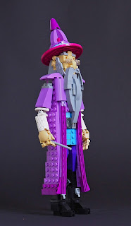
Albus Dumbledore


Harry Potter or the Magical World seems to be everywhere now, with LEGO's revenant theme and the new collectible minifigure series. This is alright, Harry Potter is cool. I've read the books plenty of times, they're well-written, lively, imaginative and full of good characters. The movies, in other hand, have never been important to me; I've seen them once per film and don't remember most of them, and try to remember the rest for sake of my book visions. I saw the Fantastic Beasts film just couple of months ago, and didn't like it that much; but that's not a big deal, I can always read the books. They're suberbly well translated into Finnish, too.

This is not my first Harry Potter themed build; the first was Arthur Weasley Arrives At His Workplace In Ministry Of Magic Via Floo Network, built for Iron Builder against Jonas Kramm. Arthur is such a great character. And so is Albus Percival Wulfric Brian Dumbledore. He is well-rounded, flawed but spledid, and most dear to me when he's bit mad and whimsical and lovable; talking about having a scar of perfect London underground map in his left knee, offereing citrus mints and liking knitting patterns. This is Dumbledore as I see him, mostly based on description on the very beginning of Philosopher's Stone.

I began with the head, as usual. I had tried to built Dumbledore before, but it turned out to be The Lecturer of Recent Runes, a wizard from Unseen University, Ankh-Morpork, Discworld. On that build, I already tried to make Dumbledore's famous half-moon-spectacles. I used minifig handscuffs and cheese slopes, but they didn't look good; this time I settled with trans-clear 1x2 plates sticking from under the eye headlight bricks with 1x1 tile on top of them. They aren't crescent-shaped, but I like how they cover the lower side of the eyehole, as Dumbledore gives one of his stellar looks over them.

Dumbledore also has his nose, broken on at least two places, at least once by his brother Aberforth (Aberforth is cool). I tried to achieve it by using a tooth piece on the end of it, and I'm happy with the result. Dumbledore has, naturally, his beard, that is long enough for him to stick under the belt. In contrast to Hans Langseth's scruffy beard made of plates, Dumbledore's facial hair consists of curved slopes. The moustche uses two Wedge 3x4 Open with Cutouts and 4 studs pieces. Those are cool parts, as they have the bow shape with both concave and convex side. I've used them as a bodice, knee armour and window frame, to mention a few. As they're rather big pieces, large part of them is hidden behind the beard, in the structure of the neck. The 1x4 bow pieces that form the upper front part of the robe are connected directly to them.

The robe uses different shades of purple. The main part is medium lavender, that fits Dumbledore's character and is quite common colour these days with Friends and Elves (except that Elves got chancelled. What a same, it had so cool parts). The hem, as well as the slightly but pleasantly curved lapels (not sure about this word), are old 90s purple, which is cool and energetic. The little what is visible of the waistcoat is medium blue, nice, mundane colour too, and the trousers are dark purple. I don't like dark purple very much, but I had some 2x2x3 convex slopes in it, and the darked shade works well where it is. The boots are tall and heeled as they should be. The arms are quite boring and almost identical to ones of another Discworld wizard, Chair of Indefinite Studies. White sleeves are something like a bitter compromise, but I had no ideas with my purple-shaded pieces.

Dumbledore has a traditional wizard's pointed hat. I don't know if Rowling descibes Albus's hat but I think hat like that fits any wizard. The brim is purple 8x8 tile/plate, and as it's flat as anything, it just saws the top of the head away. It looks surpsingly natural, to my opinion; as the stud above the eyebrow plate is visible, they look a bit bushier. The cone of the hat is made of what was available in fitting colours.

I also built Dumbledore's phoenix Fawkes, named after famous British terrorist. The most curious part of Fawkes is the head, which is a parrot. This is actually an ancient stoled technique from 2007 or so when I see someone using brown parrot piece as a eagle's head. I though it was Barney Main but I couldn't find the creation on his Brickshelf (prehistoric!) so I'm not sure. I think it's a wee bit funny, a complete bird as a bird head.


As a side update, cats have overtaken my build space. I moved to a new apartment with Pinja and the cats Takku and Elsku-Maumau week ago. My building layout it slightly better than before, and I have more space for the creations too. Things are, in all, good.


-Eero.


2018-10-20

Grata of Kontrabontembi

 Grata is a senior exchange student of Kontrabontembi monastery for wizard monks. She masters the green fire of Glum-Murdia and magma-chain-sorcery, but she's most keen of her official monastery school suit with its well-fitting wide-brimmed hat. This amazing backstory was written for the exhibit tag in Pii Poo's Helsinki event a month ago; the creation itself, an another human character build I like fiddling with, is based on some colour and interesting pieces.

The original idea was to make a layered costume of dark blue and dark red areas over a white clothes under them. I had got some of those dark red windscreen wedge pieces, which are nicely shapes for dresses, skirts or lower parts of greatcoats; so the main part of the coat was to be dark red. I also had plenty of those Jedi Starfighter flap pieces, and I think this is the first time I use them on anything at all. I interlaced them to create a frontal armour of interesting pattern; It would be made of leather in real life to shield the upper legs for magical impacts or forge works, bit like blacksmith's apron. This leaves the upper legs somewhat visible, which meant I couldn't cheat on them as I did with Kuohu, elemental incarnation of water a year ago. However, I was never quite happy with Kuohu's leg design, so this wasn't a bad thing really. The stationary sides of the dress naturally limit the sideways leg movement, which makes wider poses impossible, but at least the legs are real here; and they can be angled a little, and that looks a lot more natural than straight 180 degree angle of both legs.

The chest area was re-designed many times. The minifig wing pieces were on pretty much every version. Early on the chest was mostly white, but in the end a small chest plate of dark red looked better, as it created a good silhouette of darker sides over the white areas and somehow brought the colour together as a whole. It's slightly angled with a brick joint, which makes it more dynamic, at least to my eye.

The legs are quite ordinary, with upper leg design from Herald of Scales - though the sides are flattened to allow some movement within the borders of coat sides. The boots are brown to add some more mundane shades to the rich colour of the coat. I'm happy with the colour balance here, as well as the shaping of the boots. Small ball sockets are a source of sorrow here once again, as they're only available in greys; they're hidden quite well though, which again means that the movement is limited, but fine enough as it is. Due to limits of colours, there are some black offset enablers visible on the back.

The arms are mostly regular - "Y-joint" ball sockets, round bricks, nice printed CCBS shells and 3x3x3 cones as trumpet sleeves. The sort of cape-things made of Chima wing pieces were a late addition too, and I managed to get even more of those from Pii Poo's tables during the progress. They recall the layered armour on the front of upper legs and fit the overall style of suit; the wing pieces are simply connected with 1x2 thin TECHNIC liftarms. There's also SW constraction figure shoulder pads that bulk up the coat to make it more convincing.

The hair went through few version. Black is quite a usual hair colour for figures like this, but it's plausible, hides unwelcome patterns and is common among needed parts. The old version had a long braid made using those strange finned TECHNIC pieces from Atlantis monsters; it had a white rubber bands as a, well, rubber bands or whatever is used to band braids. It didn't work so well and I ditched it, going for a messy look with lot of spikes on other sides. The hat was there all the time, but changed a lot. First it had the same dark red and blue colour scheme as the coat, but six-wide brim looked puny, like a pie hat of a grandmother. I wanted something more extravagant. I wanted it to be reddish brown at first, to works with the boots, but I only had 8x8 dishes and they were too small; dark bley 10x10 looked much better, actually shadowing the face. I was unsure about it at first, but it grew on me. Ironically, I bought a 10x10 dish in reddish brown from Pii Poo during the recent event, but didn't feel to change the hat; it looked good as it was. 

-Eero