2021-04-16

Grand Hotel Kudelma

Here is, finally, the building, the (hopefully last) grand pandemic big MOC, an epitome of my love of architecture. This is my biggest singe building MOC so far, measuring 6 modules aka 96x64 units. It began as an usual two-module corner building with the tower inspired by Usko Nyström's Imatra State Hotel (1903), originally called Grand Hotel Cascade, at the legendary Imatra rapids. I had a closer look on that fantastic building last summer and it inspired me to start building this in last August. The tower is thinner than on the hotel, which is bit of a bummer, but thicker tower would have deemed very tall cone roof (the angle is quite close to Nyström's hotel), which would have messed up the proportions, probably. My inventory of 1x1 round bricks in white was also limited.

Along the tower, the numerous chimneys, bulbous roof shapes (originally red, now black) and the entrance "hut" refer to the hotel. During the process, this picked up plenty of other influences. The work of Usko Nyström, Albert Petrelius and Vilho Penttiläs's office had made a big impact on me. Their use of stone shards embedded into the plaster is re-created here with 1x1 plates stuck to TECHNIC bricks. Stars and circles are also common on especially Nyström's facades, for example on fascinating Kointähti (Morning star, aka Venus) house in Helsinki's Pietarinkatu (1906). 

The smaller tower above the terrace is inspired by Usko Nyström's architecture though the wider bay under it is clear Gustaf Estlander element. The corner on the first picture, with its mushroom-shaped top floor flanked by extrusions, is almost copied from Von Essen-Kallio-Ikäläinen office's Norma building (1904) in Helsinki's Katajanokka; that house is one of the most beautiful and robust buildings of its age. Capturing its flow required building the whole corner with SNOT and bow arch pieces, which, in contrast to macaroni bricks, leave no small gaps!

I built flowing, gapless curves already on last year's Kotirinne house, and this building further developed these techniques. The key piece is 6081 Slope, Curved 2 x 4 x 1 1/3 with Four Recessed Studs. I used plenty on those in most corners. This means that tha actual brick construction zig-zags quite a bit, with SNOT bricks and brackets to connect the slopes. They require more little bricks than usual - 2x2 corner brick was my friend here - but the solution make the building very sturdy, and the corners are beautiful and friendly! The radius of this curve is same (one unit) than on 2x2 round bricks, and small sturdy colonnades are used on the second floor. Their shaping refers to Lars Sonck's Eira Hospital (1905). The thick, stout tower with roof terrace displays motifs taken from Giotto's bell tower in Florence; such geometrical approach became common in Finnish architecture from 1907 to 1915. 


There is a idea of polychromy of materials in this build. The ground floor (in greys) is natural stone and raw, colorless plaster. The windows and doors (reddish brown and medium nougat) are varnished wood, probably pine and oak. The bulk plaster is white with sand green windows and grey stone ornamentation, as in Imatra hotel. The roof is red tile; Imatra hotel has always had iron roof (except some post-war temporary roofs), but the red in the drawings might suggest tile roof. Roof tiles were popular among architects, but expensive and deemed maintenance in cold climate. They didn't always materialize from the the drawings, and were often changed into iron sheets later on. On this model, the roof is a combination of polymorphic shaped build with slopes, capped with angled bricks. I originally wanted to make the whole thing with slopes, but it was just too hard to buy enough concave slopes in dark red! I'm very happy with the solution, though; it's quite realistic, has a nice corner detail and appropriare rows of attic windows. The previous city block already brough back the element of roof to my modulars, and this one further stresses its importance. I like proper roofs!

Along with the polychromy of the building, I wanted to add some life around it. As usual with my modulars, there are some people about. Not too much to draw the attention away from the building, but enough to create the sense of scale. There are also plant life, in beautiful autumn colours. The tree is built around old dark grey dinosaur tail; it's shape refers to trees in early 20th century's facade drawings. Flowerbeds and vases of these plants appear all around the building, but they're concentrated into the terrace area. Even though this building is called hotel, I didn't want to emphasize it. There might be some usual apartments too, and there definitely are usual unspecified business spaces on the ground floor. Then again, Imatra hotel never had any big HOTEL ROOMS AVAILABLE signs in the actual building. The terrace with cocktails should be enough.

-Eero


2021-04-14

YMPÄRI YMPÄRI YMPÄRI

Animated moving bricks of Vuhvelituotanto are back, even if they were never gone! Vuhveli will be!


This stop-motion spectacle was on production from August 2020 to April 2021. I had built Jean of Emergent Dance last summer for New Elementary's article. As I photographed the model, I noticed that it was very well balanced and sturdy. As I had plenty of free time - my last year at the Unversity had just started remote - I began making some animation tests myself. Stop-motion is easiest with two people, as pair of extra hands saves lot of running around. All the previous Vuhveli animations had been done that way. However, this had become harder since 2016 when I and the other Vuhveli fellow Esko moved to study in separate cities, Tampere and Helsinki. The pandemic didn't help, neither.

I found out that the easiest way was to adjust the camera shooting timelapse shot per 10 seconds, moving the figure and afterwards deleting all the shots where my arms are visible. I shot outside in the garden, as I always do, which meant quite stark contrasts with late-summer sun! I personally enjoyed this effect. It removed the style away from usual studio-level stop motion, creating something original! Of course there was all sort of embuggerances - figure falling down and them haphazardly recovered, camera somehow moving off-focus, over-exposure and under-exposure... But in the end, I think these "problems" enhance the atmosphere, where Esko's eerie sound art and computer effects add their own piquant charm.

-Eero


2021-04-10

Doreen Inverardi

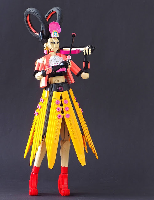
 About two years ago, after North Sea trip that included visits to official brand stores in London and Glasgow, I built a figure named Zinnia Superfuzz; she was a bass player with rad flower-motif dress and tall heeled boots. She was on display inside our kitchen window for more than a year. Recently we got new windows, the old ones being very leaky, and I haven't yet created new display there. But taking Zinnia out of her glass cage made me finally do some tweaks on her, removing two units of lower leg to make the proportions match better. There are some photos on the end of this post.

Making changes to Zinnia made me think about building the whole band. I've made a band before, of course: a real-life one, Circle from Pori, currently on display at the LEGO house in Billund, where it can be observed by the Danes (or at least the company employees). However, those Circle figs were much smaller. On Zinnia I had deliberately aimed for larger figure, just for a change, and it enabled different piece uses than my usual scale, even though it made the head look tad small. That was obviously balanced with the huge hair.

As this was a fictional band, I could choose the instruments freely. I had a bass, a good base for any band to build upon. Actually, when I began building this, I had no clear idea about the instrument, except it was not going to be drums - she can't sit with that skirt! After finishing I ended up givin her a violin, which looks like a side-build from Friends set. I also managed to use Clickits wrist band as the horse-tail hair of the bow! It was based on a tablescap I made several years ago. I also toyed around a idea of synth with elegant stand made of dinosaur tail parts, but that didn't fly.

The dress tablescrap was the de facto starting point. I had it around on my table for many months, serving as a throne for knitted Krtek Pinja made. Its size was perfect for larger scale figure, as the waist hole was 4x4. Everything on it is angled around 19 degrees from the central axis, which made actual connections pretty much impossible; I ended up just bracing it between parts on 3L bar. The Clickits ring tops this bar. It was frustrating to fiddle with, but ended up being sturdy enough! The flowers refer back to Zinnia's dress. I wanted to make the entirety different from her cool black attire though, being bold with warm colours and vibes. I had wanted to make red heeled shoes for a while, and small coral jacket with sporty stripes felt like a nice challenge. It turned out pretty good with my limited coral collection! Pinja suggested pink so I gave her dark pin shirt underneath it. The black rim circles the bare stomach nicely, reflecting the back parts of the dress, as well as the black fingerless gloves. The sparkling ascot - an Elves cape - was a spontaneous addition, but I think it works very well. I'm always happy to use odd minifig cloths on completely different scale MOCs. 

Then there was the hair. As I mentioned before, scale this big with the usual face design needs large hair to balance things out; otherwise it ends up looking like a tomato on a gravestone. On Zinnia I used mass of Hero Factory ammo belts stuffed with flowers. I went with similar route, using rubber wheels. I ended up being around 4 kg of wheels recently (Mostly interesting ones - Power Puller wheels are heavier than you think!) and had been experimenting with them. With the big balloon ones I made hair that was vaguely 80s feel, with large back lock and front bangs. But it was very heavy. The center of weight ended way too far up, and the figure toppled too easily. So I changed into smaller, more elegant tires. I had never had smooth, thin bike tires before, and they are very convinient! At first I positioned them A-shaped, flowing downwards - but with the jacket and the skirt there was too many A:s on top of each other, and the composition looked downcast. To brighed it up, I braced them upwards. It's a very futuristing hairstyle, something like a pumped-up Princess Leia look. Clam ornament with some heart earrings completed it.

-Eero.


2021-04-05

J. Blom's Wholesale and Retail building

Due to the pandemic and lack of events and exhibits my LUG Palikkatakomo ry has been organizing more contests than usual. In winter 2021 it was time for modular building contest. The previous one had been in 2015 (I got the third prize, Ideas Birds, which was Not Bad At All), so plenty of time had been passed! On that contest, my entry was Ambrose Street 23, which was also my first modular ever... Since I've build around 20 modulars, so I had bit more experience.

Against all my habits I chose to build an actual, real-world building. At least partially. I've been talking about this before, but buildings, real-world central-area stone buildings are BIG. In minifig scale, that means large, very large MOCs. In 1900 in Helsinki average apartment house depth was 15 meters; If used formula 2,5 units (studs) per meter that would mean depth of 37,5 units, and with 3 studs per meter 45 units! By width, some Amsterdam-style townhouses probably fit a baseplate, but your average Finnish turn-of-century fastighetsaktiebolaget won't fit on two baseplates (or moduverse modules). My solution has been creative freedom - capturing the spirit of the age and architecture rather than forcing real-world solutions.

I didn't here. I went full-on on real building, proportions and all. The building I chose fitted 32 studs wide plot well enough. The interior wouldn't have. I had no idea about, it really: the house was demolished 71 years ago. There was no photos of the interior. Town archive probably has the floor plans, but with pandemic and everything, I didn't want to bother them. They were probably closed, too. But what, exactly, is this weird house?

Tampere was a city with major textile industries. John Blom was one of the first sellers of ready-made men's clothing. Novgorod-born architect August Krook designed Blom's commercial building in Kauppakatu 12, next to Pohjoismaiden Yhdyspankki building. The building was completed in 1904. It is a striking and strongly decorated building, inspired by contemporary Vienna architecture, the secession movement. Especially M. Kühn's one family house in Vienna, presented in Austian magazine Der Architekt (well known in Finland at the time) is clearly similar. The retail building sold fabrics and clothing. It was demolished in 1950 to make room for a more effective housing block.

I began the process by scanning the facade drawing, dividing it into 32-wide grid and then planning the widths of each elements. The 1x6x5 panels, working as big windows, had to be prolonged with trans-clear 1x2x5 bricks. The techniques are quite usual, but the actual brick construction was difficult due to lack of white pieces in general: I was also working on another white building (published soon!) and it has drawn dry my whites. It still felt best colour to use: the paragonous Vienna architects preferred it, and while I did not know the exact colour of Krook's plans, he might have been using white, or a very-very light yellow, tan or grey (I didn't have much yellow or light yellows neither, which helped to choose white). 

The main challenges were the top-floorw windows, curved framework on second-floor windows and the overflowing plant-motif ornamentation. The top-floor windows are made with lot of SNOT; I wish they made more concave slopes, but no luck - "emptiness" of arch brick undersides make them look unappealing! I also wanted to leave enough connections for the leafs around the weird windows. I used yellow new-ish leaf pieces at first, but the colour combination looked too omelette-like, so I switched into pearl gold. Based on photos those leaves looked very shining; on straight sunlight they almost disappeared. Gold leaf ornaments were also used by Joseph Maria Olbrich in Secession pavillion, and Krook was definitely familiar with that building. However, creating the pattern in pearl gold was hard, and the result is bit of a compromise. The middle section ornaments, utilising sausage-to-plume-hole -connection, turned out better, and was easier to construct. I'm very happy with the lamps; the round ends of old whip pieces have been crammed inside trans-clear minifig heads, places inside the round fish-bowl things. 

The back and the sides are appropriately plain, featuring bare brick walls; the firewalls are without any aperture, as required on the building order. I still wanted to include some detail on backside. There is a horse tied to beam, using Friends bridle piece, a little shack as usual, and the boss of the place arguing the tailor about new batch from the factory. It's simple little scene, but creates the contrast between the artistic, international and shining facade and the everyday life inside the block, with its earthy tones.

As usual, I didn't build the interiors. The real building had a splendid white staircase and an elevator to the storing space on the attic, but those would not have fitted the 32x32 module, as described above. I compensated the lack of interior by adding some textile samples to the big windows; I'm especially happy with the Japan-inspired one with cherry blossoms and black branches. But it's not a proper interior, and couldn't compete with the detail-filled and refined furnishings of my LUG mates, who scored better. Well-earnedly so.

-Eero.


2021-04-01

Shōgunocturn

 Nocturn was pretty cool set, back in 2007. I remember everyone liking Nocturn. He had cool glow-in-the-dark parts, snazzy combo on transparent blue and lime, bizzare head with jutting lower jaw and four arms. In Finland, it was exclusive on some toy stores only existing in southern Finland, so I bought my copy on trip to some Pokemon TCG match in Helsinki. My interest on TCG was already fading, so getting Nocturn was, honestly, probably the most impactful thing on the trip. 

Everybody loved Nocturn in 2007 and he's still liked, so when group of Bionicle builders plan collaboration on 2007 sets, more than one might end up picking Nocturn. So... Oops, all Nocturn! I didn't want to distract too far from the original set, so this is somewhat usual reboot. However, and unsurprisingly, the samurai aesthetics ticked again back in! Maybe it was the two-toe feet of the set, or wide pauldron-like shoulder spikes, or twin katanas, but there was something very, very vaguely samurai-like in Nocturn. I emphasized it by making the shoulders more pauldron-like, utilizing common lime green dinosaur tails from Mars Mission line. I also gave him longer horns to make the silhouette even more radical; the crest has Sinestro print fron Green Lantern sets, which fitted the aesthetics nicely; I know nothing about Green Lantern, but the print is cool and got several cheap. 

As with Botar, the eyes are mirrors of soul, so I wanted them sharper than those light-bulb like ones on original set. They're simiral to Borat, featuring 1x1 round plates with hole, connected to T-bars with their lovable plume holes forming a penetrating stare. Usually the extra knobs on T-bars would be a problem, but here they just gave Noc two extra teeth! His lower jaw, originally using piraka foot, was re-designed to fit more visible white teeth. I also added a tongue, as that felt fitting to Oni theme and monster feel in general. Red also bounced up well among the blue and green.

On legs, I wanted to create flowing shapes very different from the clunky legs of the set. The lower leg piece is the same, however; and two-toe feet, albeit much smaller, refer back to both samurai socks and the set. Using those weird Starts Gresh armour pieces was one of the original goals, and I'm very happy for the feet turned out. The arms, on ther hand, are mostly trans-medium blue, mixed with glowing parts of the original. Building them meant facing age-old problem of Bionicle builders: Most of the ball sockets are more or less broken and don't have enough friction to hold the weapons up! Bionicle building is hard, and not least due to this issue. Partly for this reason the back arms are very system-heavy.

And the weapons! Original set has two katanas, stupid squid launcher and silver tentacle. I kept the swords, of course, as they were fitting for the theme. I thought about making a realistic crossbow, but had no idea how to pose it on lower arms, so I went with a exaggerated Japanese kanabo mace instead. The tentacle turned into a silly chain weapon with small blades. I had designed that one for pre-Pit Kalmah model 8 years back, but that one was never finished, and the chain idea was forgotten. Until now. With those weapons, he's actually not very shogun-like, but more like big mid-boss goon that gets killed by the hero's mentor. Strong but dumb.

And hey - March wasn't that much of an architecture month after all. My LUGs contest jugding is late, so I haven't been able to post the model that was the middle part of my "white buildings" trilogy. But everything is ready, photographed and edited. Just waiting to be posted.

-Eero.