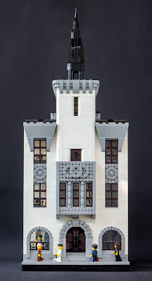
This was my entry for Palikkatakomo ry's commercional building summer contest. The subject was simply a commercional building with footprint from 16x16 to 64x64. I had a clear intention from the beginning - to build my own version of architect office Gesellius, Lindgren, Saarinen's Pohjoismaiden Osake-Pankki bank from 1903-1904. I wanted to make a cross section of the banking hall and the vertical main facade. So the building is practically a three-dimensional axonometric cross-section. I haven't usually built interiors to my modulars, but I've grown interest in them, too, and this is the first finished one. I've got a much bigger, similar project in progress, too - as it has been for a year now.
 The main inspiration was Eliel Saarinen's watercolour sketch from 1903, showing a symmetrical facade with sharp-pointed tower and plastered surfaces with natural stone ornamentation. To building was not executed this way; the facade was built with smoothly hewn soapstone and the tower was omitted. The interior was glorius with pear tree furniture, skylights and rich ornamentation. The project was widely celebrated and was presented on international architecture magazines. It was demolished just 30 years later in 1930s to make room for Frosterus & Gripenberg's huge new bank building.
So this was my starting point. I did not want to copy the exact building or drawing, but to make my own version of it. Firstly, I had chosen to make the model 64x32 studs in size - 64x64 would have been too big job for the time I had got. This meant I had to abandon two of the five window axises, and the facade worked pretty nicely with these three vertical elements. I made a relatively finalised facade drawing (in Tikkurila train station and in train from there to Tampere) with measures - 3-4-3-4-4-4-3-4-3, 32 in total. The first-floor arches are made with tooth plates, soemthing I've wanted to try for a while. The tower has same smooth shapes than in Kudelma hotel, and stone armament... cheats a bit, mathematically, but works pleasantly nevertheless. I'm particularly happy with the stone ornaments between the 2nd and 3rd floor windows.

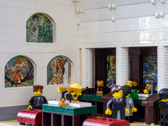
The frescoes of the bankin hall are not Lego so this is not purist work (gasp!). Our LUG's contest rules allow up to 1 % non-Lego-stuff in entries, and this one uses seven Magic the Gathering cards, illustrated by Rebecca Guay, much-adored artist of vintage Magic. Her work is very fitting for this jugendstil/Art Nouveau period, reminding of Alphonso Mucha or even Tampere-based Joseph Alanen. There cards - Samite Blessing, Sky Spirit, Dwell on the Past, Pulse of Llanowar, Quirion Trailblazer, Devout Harpist and Calming Verse - vary from unplayable to relative weak; but every one of them have beautiful art and I believe they work better here than in any of my decks. The art is almost exactly 6 studs wide, which made the integration very easy. The cards were not harmed during the build, they're simply contained inside the walls.
 I kept the banking hall simpler and cleaner than the real counterpart. The vault is made with normal bricks, angled with swivel joints, and the skylights are done with using windows instead of bricks in the final segment. The actual roof in on top of the vault stucture as in the original; this is done simply with black bricks and transparent panels for the skylight. I think the vault is a bit too high; I added one 4-wide segment late in the process, but looking it now, it would have worked without. There is more than enought air and light in this semi-sacred space of capital.
In addition to the hall, some of the spaces of the street building are cut and visible. The sturcture is unrealistically thin, but there are limits on what can be done in two weeks in 32x64 plot! On the first floor there is the bank manager's office, with tile stove based on a model designed by Valter Thomé around 1903; it was originally built for another project, but didn't quite fit. The third floor has the break room for bank staff, featuring a smaller stove. The first floor has simply a vestibyle leading to the banking hall, kept warm with a soapstone stove.
-Eero


