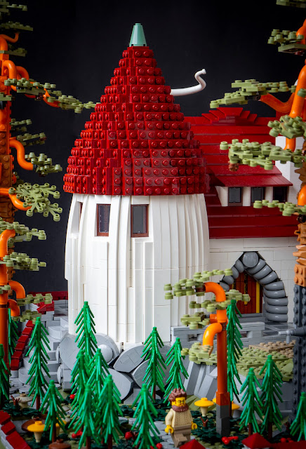
Number two in my 2023 series of large architectural models is a villa built for Palikkatakomo's housing exhibit contest on Pii Poo's Helsinki event at the turn of October. I got the second place on both LUG member and audience voting; I was beated by one vote by the splendid tree house in member voting and was third in the audience score.
My original proposal for the modular Finnish town was "Some housing blocks and a suburban villa". When it turned out that we're going to have a the housing exhibit contest (I think I proposed it - we've had some in the past) I chose to build the villa as the contest entry. This meant shrinking the area from original 2x6 modules to 2x2 modules, which made the plot around the house somewhat smaller. Otherwise the idea stayed the same.
The building is heavily based on Suur-Merijoki manor by the esteemed Finnish architect trio Gesellius, Lindgren & Saarinen from 1901-1903. It was constructed to a Swiss industrialist Maxim Othmar-Neuscheller to Viipuri area. The area was lost to the Soviet Union in the Second World War (twice) and the building was destroyed afterwards. But in the first decade of the 20th century it was the most well-known Finnish housing project and published widely in international architectural magazines. The original main drawings are fortunately available in Finnish Museum of Architecture's Finna website.
 |
| Gesellius, Lindgren & Saarinen 1902. Museum of Finnish Architecture, CC B.Y. 4.0 |
It's naturally a fantastic project. I wanted to capture the careful interplay of smooth white facades and the various types of aperture; and the combination of grey natural stone, white plaster and dark red roof tiles. I wanted to have the billiard room separated by a narrow gatehouse-like edifice arching over the main entry. I had to fit it into four modules, so I ditched much of the bulk of the original project, housing the servant's quarters. I ended up with a simple rectangular mass, with the main door in the middle, flanked by the round tower and a protruding avant-corps with a triagular gable. I jutted the arch bridge and the billiard room below the gable to form a semi-open courtyard; and I lifted the mass five bricks over the zero level of the module's surface to make room for the entry arch and to create an interesting composition with the natural and built environment. (Of course, in this case, everything is built by me, in plastic.)
The idea of the place is that the natural cliff has been extended with a brusque cyclopic bond masonry below the tower, and the pathway was been dug into the entry terrace through the rock; this gulley begins from below the arch. The high stone foundation enabled the horizontal polychromy of grey, white and dark red while making a neat contrast with the smooth walls.
Mostly, the walls are traditonal brick-on-brick construction and the roof is made of slopes. Most of the corners are sligthly curved with inner SNOT structures. There are both very vertical and horizontal windows; the former remiscenting of medieval forms, the latter akin to more modern paragons. Without the castle-like tower and the high tiled roof the white walls with wide windows are quite similar to modernist buildings of 1930s; many of the principles of both early 1900s and 1930s were quite similar.
The tower breaks the simple shaping. It was pivotal to achieve the slightly inwards curving shape of the silhouette of the walls; this meant I couldn't use curves to make the round shape itself. Thus the round shape is stepped and made of (theoretically) 8 panels, though naturally one of the them "is" inside the main rectangle. The steps are a plate and a half a plate in height, which, to my eye, looks flush enough. The slight inwards curve gives it organic, mushroom-like quality - like something that has grown out of the soil.
The roof of the tower was the first thing I built for this. I first tried to make it via trial-and-error, using the Lowell sphere as the starting point. It didn't work out - I don't have enough three-dimensional abstract perception qualities! So I installed an old freeware of LSculpt. I made STL and OBJ files of the Suur-Merijoki tower roof, taking its silhouette from the facade drawings and making a solid of revolution with an another 3D modeling software. I stuck the file into LSculpt and with some adjusting it designed the roof. It consists of four identical panels, but as you can see, their sides zig-zag in quite a peculiar manner. No wonder I couldn't make it out by just building.
The billiard room is obviously too small for minifigure-scale games, but I loved the fact that the original had such thing. It also works as something like a watch house to guard the gate. I'm very happy with the very steep gable, made with two 1x8x3 slopes that I got in 2019 for my first New Elementary Parts Fest. They're only connected by the top studs, but there are some tiles stuck inside the parts to keep them in the right place. The 8x8 plates of the roof match the geometry perfectly, and their studded surface calls back the tower roof. The first version of the whole roof was made of plates and wedge plates, but it didn't work out; those two remain. The tall chimneys, especially the kitchen one in the street side, break to horizontal composition, as common in the English Modern Style paragons. The house is heated with wood so there is a log stack in the back; a familiar sight to most Finns, this one. There definitely wasn't a log stack at the foot of Suur-Merijoki - that would have been something for the servants to do discreetly. My version has shaken off the weight of class society.
The basic idea included the natural cliff that has been left mostly intact. As the nature of the plot has taken into account, it also has some old trees: Two large pines, two smaller ones, and many little spruces. It was not intentional, but I was suggested by a fellow builder that the small spruces, with the rather low stone fence, make the house look larger and more castle-like. If so, the effect is rather pleasant and I'm happy with this remark. In fact the trees are small, as the tech of using stacked grass stems only works in small scale; and I didn't want to have many large trees to cover the building. The stone fence was the last addition, the finishing touch, and it is small for the same reasons - a cropping element was needed, but I wanted to keep it low so that it doesn't cover anything visually, nor give an impression of very closed, private and no-go area; the house should open warmly to the surroundings.
The pines are larged. The original idea had them, too. There weren't big pines near Suur-Merijoki, which was situated in a small spruce forest within the large fields (it was a manor, after all, not a cottage). But hardy pines are a well-known and strong element in Finnish art of the time - one only has to recall Eero Järnefelt's Koli landscapes. Even Eliel Saarinen's famous villa fantasy, published on Ateneum magazine's architecture issue in 1901, had a gnarly short pine.
Our modular Finnish cityscape was a Project Support project and I had designed a simple pine holotype for our LUG, made of a moderate number of different parts from the Support. It has the same olive green sprigs and macaroni-tube branches, and a dark bley, dark orange and orange gradient on the trunk. I was going to use them, but I ended up making a version that was essentially the LUG holotype in steroids, enhanced with a larger part palette. Dark orange was switched to medium nougat, as it looked better and I had got those rock face plates from the support. These trees consist of segments connected tightly with 4L bars. Their connection to the ground is not very assuring, and the branches and the sprigs can fall of, but the trunks itself are quite flexible and thus do not break easily. This is due to the 4L bar "skeleton". The branches are made of orange macaroni tubes and all the orange little technic connectors I could find. I like the orange-olive green combination - it has cool, albeit vibrant, harmony in it.
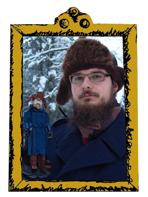
The minifigures here are me and my partner Pinja, making this a sort of villa fantasy of myself; a further developed Villa Korpkuusi from 2021. There are no interior, but I actually made a floor plan for it. It's needless to say that it was utterly unrealistic, but that's probably acceptable for an architect on his free time.
-Eero.


.jpg)


0 comments :
Post a Comment
Note: Only a member of this blog may post a comment.