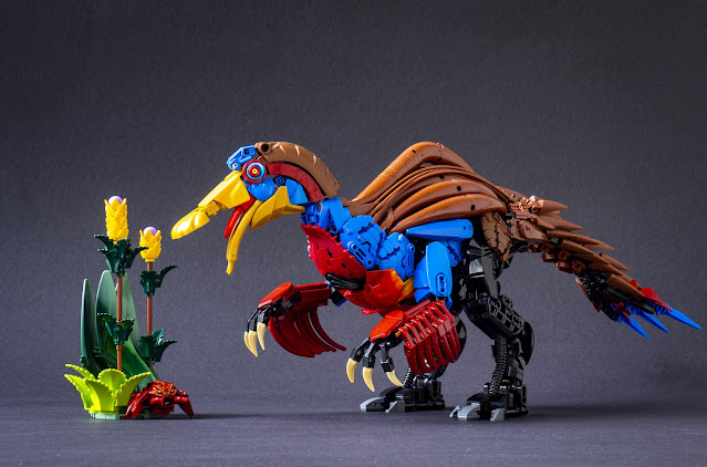
And Meet Your Fate. The finals are here. My Deinocheirus did make it to the finals, beating Jack's heart-stopping Ai-Ai and Mitch's breathtaking Dragon. The final theme was NOT Unity, Duty & Destiny - fortunately. It is something more fun - FINAL BOSS. Free-form, but steering for the impressive.
There were three roads to take here: First, a well-known final boss from somewhere, aka Bowser; or a something that has the feel of final boss while still being an original character; or a joke on the theme, aka the last foreman in a post-apocalyptic world. I didn't want to build Bowser and I don't play enough games to know well enough anyone else as iconic. And Bionicle-related parts are not very good in building persons in suits. I took the middle road, and decided to build something that the medium is good at: armour. I made a samurai, but enhanced one with extra... arms, magical-mechanical ones. These is a magic arm for... magical attacks to dodge, and grab actions. And swordfighting with four katanas instead of one makes it different from all the mid-bosses and mooks met during the gameplay.
The final model is relatively close to the first small skeches I made for this while being away from my bricks. On the original idea the samurai was floating; I planned to make a stand, or make more arms and have some of them - or the weapons held in them - touching the ground for support. I made some build sketches on these, too, but I wasn't able to make a pole-arm that would have been sturdy enough to support the weigh and still look elegant and plausible. I instead focused on more lighter weapons and just made many of them. The magic arm felt dynamic enough without anything to hold, as it allowed open-handed posing.This development put the figure's feet back to ground. I designed some plate armour using modern small Technic panels I had bought from "mixed box" on the PaB wall on Lego store in Vienna last september. Using those angled ones as samurai armour (under the round dish here) was my first impression with those parts. But having a normal standing charater supporting two large and heavy extra arms was a structural challenge. However, balancing things is something I like in Lego - I have taken countless one-leg-standing poses on quite heavy figures along the years. The key is balance; when the both sides are equal in momentum, even light structures can support them. And this is very true here: once one of the extra arms is removed, the model becomes saggy like a spaghetti. But with both of them on, it is possible to adjust to stand up beautifully, even without a wide stance. The very tall geta shoes, made of rubber liftarms, help in the posing by providing friction and flexibility.
From the beginning I knew the arms (or the figure, in the floating version) would be connected and supported with big macaroni parts; I have used them only in a couple of builds so far. They allow interesting forms while still having relatively sturdy axle connections. As you can notice, they bend quite a bit ad have small gaps in between, but the hold. It was not entirely easy to find the right positions: I took decent photographs first, but learned from them that neither of the battle arms were distinguishly presented in them. I re-designed a bit and positioned them more widely; you can see the original shots in the end of this post.
The magic arm was relatively straighforward. It was going to be a big arms with some eldritch energy. It felt like a perfect use for the 10 trans-purple CCBS limbs I had gathered along the years. I made it pearl gold to be able to use some interesting parts like Chima ultrabuild armour and eagle wings; and to make it feel special, videogame-like and different enough from the darker colour of the figure. The shoulder joint has rotating double-ball-joint to support the weight but allow adjustments to posing and balance.
The second arm is weirder, but follows the colour scheme of the magic arms. However, I replaced the trans-purple wiht bit of trans-blue in form of those cool, printed Ninjago spin-tops. The battle arm didn't need to be as eldritch! The arch with smaller arms was here from the beginning, but the golden flame pieces formed a beautiful fan under it; the beam in the middle is the most fragile part of this MOC. The three arms mirror the arms of the figure itself and were designed simultaneously; the upper arms are different, having armour plate on the inside, too, as they're not against any torso; these use the newly recoloured hexagonal plates in pearl gold. The lower arms are very close to the figure but clad in gold. The hands are new designs as they had to bend on the wrist; fragile but agile. They were re-designed for the second version for even more movement.
The head was the last thing I completely designed for this - it has been the case on many of my recent characters. I went with long zipline braids as they felt somehow fitting for the Cup; I hadn't done zipline hair in silver before. I've had the tablescrap of making a ring of ziplines on a DOTS key ring for a couple of years and this was the place for it. I'm especially happy how the braids divide above the face, leaving room for the horns. The kabuto (helmet) has been exploded, with some panels on the back of the head. There's also the third braid of 8 ziplines in the back.
And now - the final results of the Bio-Cup are up to Woomy, Nu_montag and, of course, the panel of judges. I'm off - this was a nice one. I've got plenty of more projects for August but with looser schelude, as I'll go back to working on my ph.D for a while. Cheers.
-Eero.
And finally, something very very much the same but still so different: some pictures of the version 1.0 that didn't look impressive enough in the photos:


