2020-03-15

Hippo Gibbon

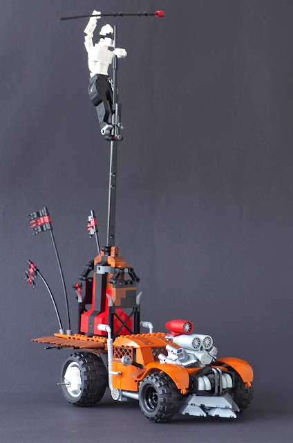
 So, it's the last day of MOC Wars and it's time of MOC War boys to start their final raid with "Hippo Gibbon", polecat pickup rod enforcer. This category is called Young Max Rockatansky: "Little Max got a little mad because all he got for his birthday were Technic pieces and some silly motors. Build a vehicle fit for Fury Road at least 16 studs wide with working features able to enact some proper vengeance." So, basically, a 16-studs-wide Mad Max inspired vehicle with working function.

I do really like Mad Max Fury Road. I think it just might be the best film of the last century, and I've made MOCs inspired by it before, too. Actually I also had a WIP of Immortan Joe around for couple of years, but I never finished it. But those were characters, and undoubtly the most popular thing in Mad Max movies is their vehicles. Rust, dirt, mixes of different cars, weapons, spikes, flags, supercharged V8s - those are in the core of films about chase scene practical effect galore.

I was bit stressed about this category at first. I'm not really a car builder. I now practically nothing about cars. Okay, I know how the drive them, I got the licence, and I even was a vehicle caretaker person of local police station six years ago (in my civilian service). But I'm very unsure about the pistons and pipes and gears and things. There might be some several car design errors here, but hey, look is the most important thing.

As often in my builds, some interesting piece uses were the starting points. I've used dark orange balloon panels before, in HAVOC-DISSECT IV's hair. But I got some more recently and went with them as the mudguards. It's not very interesting part use, as it's seen on official sets, too, but it captures the retro aspect of Mad Max cars (modern cars with electronic micro systems don't work on deserts) with beautiful rusty shade. I had also nice collection of dark orange wedge slopes, curved slopes, tiles and 2x2x2 slopes around, so it worked as the main colour. The minifig coffin piece was another root part, forming the fender. And supercharger - from Tuneable racer again - is used as supercharger, yeah dull again, but hey, who's ever seen that part? I only bought it from event a week ago... And some silver Nexo Knight wedge slopes are used on the cowcatcher. The doors open, and there's little miniland-scale war boy driver behind the wheel.

Along the aggressive shaping I also had to design the function. It was clear from the beginning. In Fury Road there are those Polecat cars, with war boys hanging from long poles balanced by counterweights. I wanted to make one. It uses three boat weights and a boat mast and miniland war boy with explosive spear. It was challenging to get right and took lot of adjusting; the counterweight should be little heavier than the pole. Or actually it is lot heavier, but closer to the axle, so the momentum is almost the same. The guy on the pole had to be balanced, too, and this is achieved by adjusting the spear arm on good position. Fine tuning! The effect is shown on the video below; sorry for it being idiotically shot vertically, but I hardly ever mess with videos and just think them as moving images, which they are not. It was also very windy.
So, that's it for MOC Wars. There's lot of time to build now with everything cancelled, but I'll keep few day's break from photographing and posting models. Thanks for Absurde for asking me in, and all the judges, house team co-members and participants for joining the battle. Hooray!

-Eero.


2020-03-14

Gateway to Bricks Unlimited

 MOC Wars draws near to end. It ends tomorrow. I've got this and then one another build and then it's all done. But worry not, I've got plenty of unpublished work still around.

So, this one is 20. Self-Repro Bricktime: "What would the laboratory for researching the self-reproducing LEGO brick look like? At least 1 LEGO propeller must be used, no matter what size!" On this particular category we had seen some modern research laboratories, and I though about twisting it to fantasy historical setting. I was inspired by Magic the Gathering's Kaladesh plane, which is sort of colourful Indian magic-steampunk world with lot of trans-blue aether pipes, gleaming domes and brass spaghetti. One of my commander deck commanders is Rashmi, Eternities Crafter, an elf druid researching teleport warp technology. I also though about making a very tall room space, with not that big footprint but airy atmosphere and tall windows. I also pondered about steampunk industrial enviroments and Tesla-esque scifi aesthetics. I also just happened to have a completely unused dome tablescrap around; it is based on the dome of Obecni Dum, the municipal house of Prague (I was in guided tour three years ago). I made some adjustments and it fit this use well, defining the measurements.

 I started making walls under the dome. I wanted to use "Persian" arched to keep the Kaladesh feel. I first made five (out of eight) wall sections but added one more to make the space more closed. The wall sections enclosing the gap were on 45 degree angle (think) with each other, and I forced them in same direction (unsure about the correct English terms here, sorry), bending the window frames made of 1x1 bricks. The curve was pretty, and while the technique was far from legal it fitted the magical environment and Kaladesh style, while being still quite stable. It also made it possible to connect both of those sides to the stud grid of the base, making to tower sturdies than it would have been without the bend.

Inside there is the machinery, again using some tablescraps. The UFO thing is a brainchild of New Elementary Parts festival. There's a far boy wheel inside, and second smallest rubber track/thread thing around it; 1x2 tiles connect to the track, which fits perfectly around it. On both sides of the wheel there are 6x6 round plates, with sort of gingerbread of 2x2 round plates under them, and teal 6x6 quarter round pieces connecting to them 2x2 rounds. It's pretty wild. I though of making a motorcycle out of those wheels, but one ended up in here. There might still be a cycle. The teal bubbly thing under it might be stolen from the blowfist on Ninjago City set, or at least there is something similar - just an image of memory, I don't own the set. I like the pattern of 3x3 dishes nevertheless. Under it, surrounded by the aether pipes, is the mandatory propeller piece on a lamp. I didn't have those wind-shaped Atlantis propellers available, so old traditional one had to do.

Then there is, of course, the reproducing machine. It is a mix of Rashmi's aether planar bridge and Sampo, mythical object from Kalevala, Finnish national epic. Sampo grinds money, salt and flour; this reproduces dark tan, medium nougat and dark orange bricks, perfect for building fantasy renaissance city. They burst out from three planar gates every few seconds. I quite like those golden prints on trans-blue spinner crowns, they have magical feel on them. Luckily I had three, even though one of them is barely visible. The machine also uses nexo knights mecha shield, three-pointed ones; interesting pieces, seen lot of interesting shapes achieved with them, but this is first time I use them on anything. There's two persons on magical persuasion with some local partician checking the results of their research.

The outside is bit extra, but I furbished it anyway. I though about cobblestones and a street scene, but didn't have much ideas about the passengers-by, so it turned to be a courtyard with some dry plants and pigs and creeper plant with red flowers climbing the tower, making the atmosphere nices.

Next up; Aqua Cola, Mother's Milk, Guzzoline, V8, and so on. And sorry about the typos, it's late and I'm tired.

-Eero


2020-03-13

Fresh fruit not good enough for you eh?

 There is still couple of days of MOC Wars left. Here's my sixth entry, for the category Not the bees: "Most actors have their overacting moments. But there are those few special snowflakes who turned it into pure brilliance. Nic Cage, Shatner, Nic Cage, Chris Tucker, Nic Cage, Samurai Cop, Nic Cage and so on. Build any of these overacting moments. Except for Tommy Wiseau - he gets enough credit for it as it is already. Consider focusing on silly facial expressions, go crazy." Simply, it was a catgeory for a movie/TV scene with overacting actors. The thing is, I'm bit left behind on the (American) actor scene. Only Nic Cage film I recall seeing is Kick-Ass. I of course liked Ace Venturas as a kid, but didn't really feel returning to them. They might not have aged that well - who knows, so I left Jim Carrey too (He was good in Kick-Ass II, by the way). I am a character builder, sure, so the category was a good fit for me, but finding the topic was the matter.

Then it came to me, like a thunderbolt from clear sky. Monty Python! It's loved and well-known, and seen numerous times in Brick form, most memorably by Iain Heath. It has a mental connection with me - meaning that it's a thing I care about, which is very critical for inspiration and the creative process. Making a scene for some Jim Carrey film I haven't seen or don't remember wouldn't have been the same thing.

In other hand, I have no idea how I ended up with the Fruit Self-Defense scene. It first appeared in Flying Circus and was re-shot as a shorter version for And For Now, Something Completely Different. This is the latter version, as John Cleese has a moustache (I naturally went with the moustache version). But honestly, I completely forgot the thought process before choosing the scene. Sure, Cleese is perfect in it, with odd body language and extreme facial expression. But I haven't seen the film for couple of years and it's even longer since I've seen the Flying Circus version. But I chose it, and found it on Youtube for reference, where I studies Cleese's facial features (very square jaw, wide shoulders and think neck). My first try was to make a bigger figure with more cartoonist features. I tried mixel eyes but the didn't work out. It's not my style and I don't get it to work. But again, like in Highlands Shepherd and Captain Nemo, eyebrows partly over eyes made the expression. The rest - thight shirt, big shoulders and neck muscles - were quite cool to build. SNOT work on the neck with its slight angle was probably the hardest part.

The comical scene didn't work with just John - he needed someone to yell at. The scene features all the British Pythons (that is, minus Terry Gilliam) in white sport attire, and building all of them would have been too time-consuming, repetitive and would have taken more curved slopes in white than I had around. In the scene, Eric Idle's character asks about pointed sticks, resulting the most over-acting scene in it: John's sergeant yelling to Idle's face about maniacs with loganberries and such. So I made Eric Idle too, poor man to be yelled at from couple of inches. He was lot easier, as the expression is more neutral and his body form isn't so bulky as Cleese's. Getting the arms flow naturally was the main challenge, and as a special trick, a short white string part with studs in ends is used to hold them, hanging naturally. The figures are not very poseable, but there was no intention as is a scene. I'm also very happy how the composition works, as the characters are very close to each other (physically that is). They are not that small, but fit a 16x16 plate, with John Cleese aggressively invading Eric Idle's personal space. Don't come crying to me!

Next up, minifig scale, architecture, fantasy scifi setting. Tomorrow on this same bat-blog.

-Eero.


2020-03-11

Sushi

 We're living interesting times, with MOC Wars on the way. There's four days left... So you can except pretty active posting for now. This is category Couldn't Eat Another Bite: "Build a meal that’s half (or more finished). Show us what was on the menu, but make sure it’s been partially eaten." I was surprised that there haven't been any half-eaten sushi dishes yet. Sushi is delicious and popular, and also very visual type of food. And I've seen plenty of sushi build out of bricks, but not very often recently. Being inspired by the taste, I made this entry in few hours around week ago.

One of the main challenges of the category is that it's half eaten. With sushi, a "per piece" food, this is not much an issue because half-eaten dish looks just like a smaller dish. However, it would have felt dull, so I made a half of a roll that had been destroyd, as it sometimes happens, and a piece of cucumber left idle from  it. There's also spills of soy sauce around, referring that eating action had already taken place. Some ginger strips (light yellow) and seaweed (trans-green flames) are also present.

In addition to them, there are four sushis, two rolls and two nigiris. Colours are imporant aspect in this food type and colour contrasts make them fun little builds. Seaweed uses on sushi is very dark, and black could have worked, but I went with dark green as it's more unusual colour and looks beautiful, less stark with white, trans-orange and yellowish green. Trans-orange is used as a sour-and-sweet sauce and raw salmon; I think it is salmon, even though it's Norwegian invention in sushi. Using "tongue" canopy piece as a strip of fish was definitely an experimental, even provocative action; It'll be intesting to see what the judges think about it. On this case, I went with interesting rather than realistic. I'm also particularly happy with the avocado nigiri.

In addition to the food, there are some accessories. The chopsticks are as simple as it gets. The plate is reddish brown to create a warm atmosphere for the food. A wing panel from Last Flight of Destiny's Bounty is stack under the plate as a napkin; I got an extra from Pii Poo's event couple of weeks ago (I had a LUG show on two last Saturdays; this was on display on the latter in Lahti). Then there is the soy bowl, essential part of sushi dish, though I believe that most sushi eaters in west at least use that stuff wrong (me included). The bowl has some structural tricks in it, as the corners are made of double convex inverted slopes. It's not a new trick really, but might boggle some minds a bit; I learned it from Reverse-Engineering contest six years ago. I actually forgot the bowl from the display last Saturday, so here's the meal on the whole.

Next up, something completely different.

-Eero


2020-03-09

Dancer from Atlantis

This is my fourth MOC Wars entry and maybe the one that took most time. The category is Frazetta, referring to artist Frank Frazetta, who is known for fantasy and scifi art; his subjects tend to be people in very few (or none at all) clothes, ranging from barbarian heroes to mysterious princesses. This category is Letranger Absurde's, who's the pirate captain behind the whole thing. He's also in the house team, which is my team (not competing for winning), and he spesifically asked me to build it. Who could have refused?

I went through Frazetta's web page's galleries. There are plenty of things, as he was very productive artist; there are album covers, comic covers and work from Tarzan and John Carter, with dangerous animals and Mars aliens; ridiculous heroes and damsels in distress or causing distress. Many of them were intriquing, but I wanted to work in larger character scale, and very big scenes would have been too heavy.

A less-known piece called "Dancer from Atlantis" caught my eye. It features a naked female skipping with a black bull: Dangerous! The human figure portrayed was remarkably more realistic than Frazetta characters in general, and the strong, hard light exposured the forms well. There was the bull, too - but it was lot more vague and flowing than the human figure. I though about this contrast, and how to create it with bricks. I ended up taking a "painting" approach to the bull, making it two-dimensional silhouette, while making the figure more traditionally. However, it is also supposed to be seen from the back angle only, as there is no front side (boo). This was mostly to save time, as this MOC Wars is rather hectic happening (there's about one week left, but I've got two finished builds after this one too).

Making a nude sculpure with bricks as such would have been interesting; it's a traditional, dignified form of art, from croques to painting and sculpting, but would usually require a model, which naturally didn't exist (or maybe it did, in Frazetta's studio in 1987 when the original was painted, who knows), and the concept of the category was to recreate the painting... A whole sculture would have looked better, and would have made a nice if conspicuous display piece in exhibit. It doesn't work in exhibits now, only in the photos. But making the front would have been hard without a reference, same person and same posture, and working without worrying about how the connections look on the other side was quite refreshing.

I began working with the shoulders. The hand design was there from the beginning, and I really like how the hand muscles turned out. The spine area looks almost grotesque, but I believe it's better than 1x2 tiles, not to mention jumper plates, would have looked. The butt took couple of takes - it's very prominent in the original, with the hard lighting. There's a mixel joint hidden on the right haunch to get the risen leg to the right angle. I especially like the foot on this limb. The left leg works as a pillar and is surprisingly sturdy, even though the whole things is connected to old type of 1x1 plate modified with ring. It's white but visible only on half-a-plate thick part, which is hard to spot. On the head - which was the last part I built - 1x1 quarter round "pie slice" tiles are used to capture the skull shape. It's very different from my usual heads, as the eyes didn't matter on this one. It's interesting how changing the angle affects what is important to show.

As mentioned before, the bull is two-dimensional. The whole thing would probably have been better with whole, big, beefy bull leaping, but hell, building a leaping bull without any experience on such things. Not piece of cake, a bull. But making a two-dimensional silhouette of the bull was interesting too, and created a similar relation than there is in the painting, between the dancer and the beast and the style they are painted in. There were still challenges, too - I had to adjust the height of the head and make the withers thicker to give it some strenght of animal selectively bred to have as much muscle as possible. The tail is a dinosaur tail with elephant trunk - somehow it adds a bit of humour to the build, but is still pretty faithful to the original, and I think those pieces create a beautiful shape together.

I took also alternative pictures with plywood backdrop. They show the bull shape better, but turn it into a barcode, and the dark bley stand looks bit silly with a lighter background, but at least the wood pattern is beautiful.

The next model will be published rather soon and it will be delicious!

-Eero.


2020-03-03

Jällivaara-class Digging Armour

 This is my third entry for MOC Wars. The category is called Clunkers, and it's one of the more complicated ones: "The demands of corporate and the dangers of mining asteroids for rare elements have reduced margins, safety, and dignity. Build a "Clunker", a one man, short range, under-the-radar, mining vessel of questionable spacefaring integrity fit for maximizing profits by reducing costs. Take into consideration the trade offs of mining tools, cargo hold capacity, defense ('cause space pirates), maneuverability, and speed. MUST be built in Miniland or larger scale and shown in action mining an asteroid."

It's not a small assigment, giving it has to be at least miniland scale and feature an asteroid scene. Scale, of course, wasn't a problem. I usually build in larger than miniland scale. However, I rarely make scenes for my figures, as they take lot of pieces - not to mention how much a scene with a space vessel would take! Nonetheless, the assigment was very interesting so I jumped to it. I liked the feel of this customised, slightly outdated space technology with a hint of cyberpunk. I wanted to make a very cramped vessel, a canned food type of thing. My concepts were numerous - but it was always going to have that egg-shaped dome and chromed Rock Riders drill. They're both cool pieces, and the dome especially nods back to old b-film robots.

Without clear concepts I made the upper part with the dome and the shoulders; The driver's real arms would be inside the shell, but there would be a pair of strong yet clumsy mining equipment, like tools from heavy-duty Swiss army knife. They're given extra friction with some gears connected with friction pins. Use of big wheel hubs, along with the colour scheme of dark red, silver and black, makes it actually look like something that would transform out of Vereftoi Radiante's Salamander Sword speeder.

When the top part was completed, I had to decide what to do with the rest. I though about a jellyfish sort of thing that would have several mechanical tentactles hanging under it, made with CCBS parts. I tried them but they didn't work; the pattern was too different and they were just tad feeble. I settled with Dalek space dress instead - Skaro mining technology - with heavy lower part with (supposedly) rocket engines underneath. It felt bit rigid, and I wanted it have a joint in the middle. I tried an inside-out tire, and old trick from Black Fantasy, but it didn't really work. I made faux-flexible part with some swivel hinge plates and curved slopes instead and it looked great, making to posing more dynamic.

The lower part has some interesting bits. Wide castle helmets are embedded into the structure, nodding back to the spheres on Dalek shells. Metallic silver track links - two came in one Power Miners set - protects the front. On the back there is a round hatch, but it's up to viewer's imagination if it's the part where the driver crawls in... One preliminary ideas was to add a trans-clear visor on the front to give glimpse of the driver's bare feet, but that would have demanded too much from the inner stuctures, which are ugly and rainbow-coloured as usual.

The suit has also a backpack. In addition to interesting profile, I wanted to make a contrast between it and the factory-made suit. I have plenty (six maybe) of those 1x6x5 panels with Space Police III graffiti stickers, but I managed to find only one, which was located in the back of Frog Monument, which again was on display inside my window... But I digged it up, and it gave the model clunker-like atmosphere. It has oxygen tanks and exhaust piping stuck on the side, too; the piping part is an odd element, from weird Tuneable Racer from 2003. I don't think I've ever seen in used in a MOC before.

The head is recycled from and old WIP that never got finished. It has dark blue eyes and eyelashed made of a batarang; I though those would work on the cyberpunk context. The teal hair is reference to Rock Raiders, of course, and uses pieces bought from LEGO House's AFOL Day Pick-a-Brick. Then there's the scene, of course. I'd rather had a brown or dark tan asteroid, as the Clunker has light bley on it, but I didn't have any good asteroid landscape parts in those colours, whereas light bley allowed me to make all sorts of craters and stones. The clunker is mining some vibrant coral minerals - let's call it magnesium -  though it's not clearly visible on the eye level shots which I prefer.

By the way, Jällivaara is Finnish name of mining town Gällivare in northern Sweden. Lots of Finns went there to work. An additional fact: this creation reminds a lot of one called Moon Mayhem from 2015. I was never quite fond of that one, even though it was popular. Looking back it now, five years have passed swiftly, but mostly for good.

-Eero