2021-12-24

Father Christmas


 Do you know what time of the year it is? Yeah probably as it's christmas eve (when I'm publishing this. Most will read this later on, when it is not. But a blog post is an entity that lives in particular point of history). And whose great day is it? Father Christmas's, of course - I somehow dislike the name Santa Claus even though it's just Saint Nicholas with a twist; all I can think is Cola Santa, which is sad. Father Christmas is better, or in Finnish, Joulupukki, the Christmas goat. Or maybe a Yule goat. 

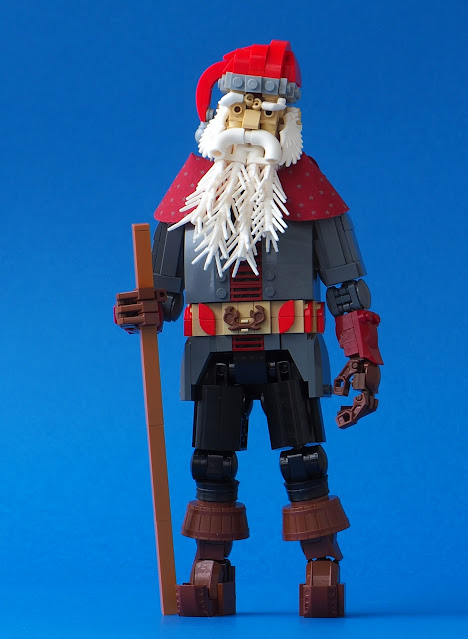
I've always liked the concept of him - very old guy, practically an ancient, with a beard and good intentions. I'm a fan. So it's weird that I haven't build any model of him until now. All I can think of is this 16x16 vignette made for a LUG contest in 2012 (for some reason, the url says Merry Chrisman; the text has some opinions that remain unchanged). What a coincidence, as this new build is also a contest entry, for Palikkatakomon Wanhan setin uusi elämä aka Old set's new life contest. I was 5th (shared with another entry). The old set this is """based""" on is 1555 Santa Claus, a set our family got from an American friend who always sends us a bit packet of gifts each year. It's the only LEGO item we've ever got from him, and oddly it arrived about 20 years after its release in early 2000s. There's probably a story behind it. Well, it's a cute little set. But I'm not fan of Santa Claus wearing all too bright red uniform with white fur. What I wanted to achieve is realistic, rough, human and maybe slightly scary Christmas Geezer who has seen some life. He's got a red cap, fair enough, but the mantle is grey and the fur is, well, lighter grey. HP bed curtain worked perfectly as the collar, its grey stars matching the mantle.

Overall the character looks familiar - even though I haven't build Father Christmas before, I've built many white-bearded gaffers with red suits, and I reckon the all reflect my childhood admiration towards the Eve Night Visitor (who gave me such treasures as Scorpion Palace, Jakten på Makuta, Troll Warship, Uruk-Hai Army, Kanohi bag, Boxor, Motor Set and Bordakh). These are various Discworld wizards, many Ridcullys in particular, and some Balins, and who knows what else... So I did not have any problems to start this. The main idea and the seed part was to use white grass stalks (with bar) to form the beard, and even though it took many alternative versions, it ended up looking good. I've used wings as sideburns many times before, but they matched the beard texture so well that I went with them anyway. The eyebrows are identical to the latest Ridcully, only white. They vastly enhance the character!

Most of the solutions are basic character building stuff and probably not worth of mentioning; I'm happy with the "armpit" slot of the loose mantle, which means the torso can be 8 studs wide without the shoulders growing too wide. The belt uses tan, which is also the skin colour here, but I hope it does not look like a bare tattooed stomach! Instead of regular sack I gave him a birchbark knapsack, familiar from older Joulupukki aesthetics (term punkinkontti, referring to this, is still widely used in Finland). The stick comes with same sources; here it is a very simple one made of five parts in pleasant medium nougat colour.

That's it - and this is also my last model this year (I'm away from my bricks, well, most of them; here, in Joensuu, are about 15 big dwarf system characters and dozens of Bionicles and thousands of silly Bionicle parts... so not that away. But the good stuff is in Joensuu, waiting for my return next year. Merry Christmas and jolly new year everyone).

-Eero.


2021-12-20

Dustsettles

 
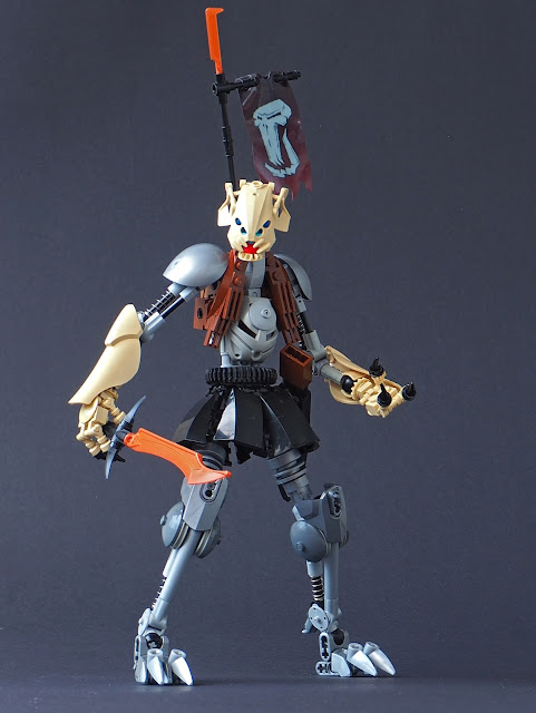
I've made some real Bionicle models this year and this is one of them! His name is Dustsettles, probably, and he was built as a part of Secret Santa collaboration for lache (lache.mocs). What I received was this amazing duo of Discworld characters from Ivan Martynov. Thanks Ivan and jolly Christmas to lache!

In other words my idea was to build a new version of lache's sleek speed build MOC Smokeclears, a Zesk-faced swordman character with silver legs and blacks skirt and sort of brown vest; as a speed build MOC it had both very simple elements like the legs and some really cool bits like the vest and the simple torso build; I felt that was a fertile ground for some re-imagining. I began with the legs, going futher with the mechanical feel of the original, while keeping the two-toed feet design. I like big dished joints on Bionicles and added those to the knees, which have rather interesting joints where the shock absorbers are actually functional! The CCBS shells imitate the shapes of the original's Inika kneecaps.

The skirt is somehow less special than on lache's original, but my heavier version needed more robust sturctures; there is a vahki hip piece down there. I also added a scabbard to the sword, as I usually like my sword-wielders having one, and it creates a cool silhouette while also helping with the posing. This scabbard uses a new 1x1/1x2 inverted bracket for some SNOT, allowing the (obviously too shallow) slot made with a 1x2x2 brick. The torso was the most challenging part here, and I didn't quite achieve the simple elegance of the original, but I quite like the vest feel those brown mudguards create; the grille tiles reflect the matoran torso gears on the original (that piece was the speed build seed part, but I didn't have any here so I couldn't use them really). I would have loved to have similar ruru-2x2 round brick combo than on the original, but I needed more poseable neck and it didn't work out. So the slightly turtle-ish neck is a compromise.
 
The arms were built after the legs and have also those shock absorbed, thou they are not functional as in the legs. There was a large contrast between the upper and lower arms on the original, and I enhanced it by making the lower arms bulky and organic. The fingers were bit of challenge - standard human skeleton arm fingers would have looked too normal! Fortunately I had some skeleton legs, and with some black claws they made decent if somehat grotesque fingers. The silver pauldrons were used to balance out the silver legs. I knew from the beginning that I wanted to keep the head simple, but I filled the Zesk mask with some pieces to give him blue eyes and a lower jaw of a small tan gear; most of these fillings are not "connected" properly, but simple fixed between the mask a a ball socket inside. 

The silhouette of the character felt a bit too simple, so I gave him a sort of sashimono with a troll flag from Fantasy Era castle sets - I'm always happy to use such pieces. I also rethought the sword. Lache's original had a basic Bionicle blade from 2007, but I wanted the sword to be more convincing (most Bionicle weapons are silly). I had one cool HF standard sword in copper, probably from Ninjago, and the colour had a nice contrast with the silver legs, so I went with it. A little uruk-hai sword on the sashimono compliments it. Ths scabbard was shaped to theoretically "fit" the sword.

-Eero.


2021-12-17

Mesilinna

Even though most of my builds are characters, I am still an architect by professional, and the built heritage is my speciality. My architectural passion and delight lies in the Finnish architecture of early 20th century, and builds such as New Century City Block III, Grand Hotel Kudelma and Blom's wholesale building are examples of this. I tend to build my modulars "by block" so that they can be shot at any angles: and thus I don't usually bother building the firewalls nor courtyard walls, as they'd take lot of parts while not being visible to anyone. But I made a difference here, for a couple of reasons. First, thing building, named Mesilinna (sort of proto-honey castle), is a reworked version of an older model, the Louhi building, which was part of the Block II

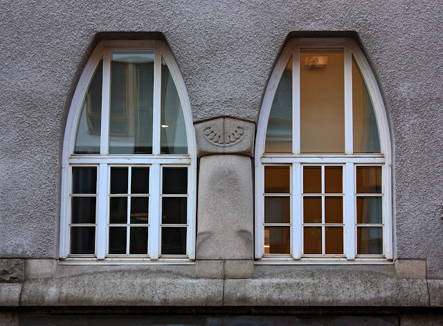
Looking back it now, this seems to be a major improvement... That Block II is mostly demolished now, I felt I could do better (and I can, and I do. I have one 64x96 stud modular building WIP active right now). Nevertheless, I think there were something strong in the shapes of that Louhi building and I didn't want to abandon it completely. It was some sort of combination of two major granite-clad "national romantic" (use the term with caution and critical viewpoint!) building, Tampere Cathedral (St. John's, by Lars Sonck 1900-1907) and Polytechnics Union building (Karl Lindahl and Valter Thomé, 1900-1903). Let's take a look at them, with my very own photos.


In the original Louhi building I had combined the soft free-form shapes of Poli with the steep, tall spire from Tampere cathedral; I had tried to make a round dome, but didn't manage, and ended up with round form that merges into an almost pyramid-like cone. The squared rubble granite wall was imitated with a bare studded surface. It was not too bad, but looks quite bland up close. Also, the tower was too tall (it didn't fit the top shelf and was most of its lifecycle without the sand green copper spire) and the ground floor was very random. The roof had an appropriately steep slope but was otherwise stupidly flat. These were the starting points, its ups and downs. In truth I rebuilt everything except the tower roof, which was nice and strong enough. The tower windows are close to the original, but they were rebuild; technique-wise the hardest bits were probably the stones above the corner windows, which had to realistically extend from the side to side.

I gave the surface a brand new texture of tiles, cheese slopes, ingots and curved slopes. I though of mixing different greys, but the old greys looked somehow messy and the contrast between light and dark greys was too big; I'd love if the produced something like a middle grey, though it seems unlikely. Out of these refence buildings, Sonck's church has very polychromatic surface of different stone types, while Poli's facade is made of uniformly light grey Uusikaupunki granite (or tonalite; the building was actually originally designed to have a plastered facade). I went with the feel of the latter, capturing a monochrome stone surface with various block sizes and shapes. It took plenty of pieces, but I'm very happy how it turned out.  

However, I did not want the building to be completely stone-clad. The old one was smaller than one module, approximately 32x24 studs in size; and that was too small for my liking. Even two-module (64x32) modular building is very small, at least compared to usual plot sizes on Finnish towns; but this is just model and it doesn't have to be completely realistic... anyway, I wanted to make a composition of smooth plastered and rugged stone surfaces. I went with dark tan that felt down-to-earth enough and made some horizontal hexagonal windows with upside-down 1x2x3 slopes. The plastered areas are flanked by little brown-roofed turrets taken from the Poli building. The plastered part is inspired by Birger Federley's Tampereen Osake-Pankki building:


I kept the rope bridge -utilising gateway, as I liked it - but I topped it with a stone-sculpted bear's head to work with the aesthetics. The roofs are still steep, and use the same simple cheese slopes technique, but now they are actual, full roofs with a gentle slope to the courtyard; and chimneys, I actually did remember the chimneys, which are something I tended to forgot in the past!

-Eero.