2024-12-31

Tontun Lyhty


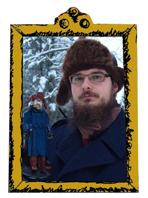
The name of this work is in Finnish as some things do not translate well. In dominant English-American culture, Santa's little helpers are know as elves, are generally small, cheerful, beardless and wear green. They are ridiculous. Their Finnish (and probably Swedish etc.) counterparts are known as tonttu (tomte), deriving from the folkore creature that keeps watch on saunas, barns, stables and so on. At least in modern descriptions, they are short, bearded, oldish, wear pointed caps and grey, red, brown and green. Some more, erm, traditional descriptions include grey skin and one, huge eye, but somehow those hardly ever make it to Christmas decorations. The word tonttu is closely relates to tontti, aka plot, and this is also obvious in Swedish (tomte and tomt). This is naturally because tonttu was the warden of the estate.

Anyway, I built this for my LUG Palikkatakomo's Christmas Ornament contest. I won the pro category. This was the third time, in a row, which is pleasant but also a liiittle bit embarrasing (I'm the chairman, again.) This took a little more than a day. The idea was clear: melancholy, a tonttu squatting in front of a campfire, small 1990s 9V battery box in the base, a light with those super cute 9V light bulbs. During the process, the campfire turned into a snowball lantern, but otherwise it remained the same. Most technical prowess was put into the beard (where else?) and some (maybe less successfully) into the connection of the shoulder pad hat. The rest was easy.

Christmas is over, but I didn't want to hide this until the next one, so I'm capping 2024 of 26 builds with it. Happy New Year!

-Eero.


2024-12-26

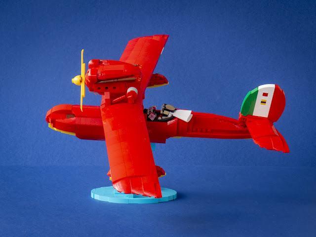
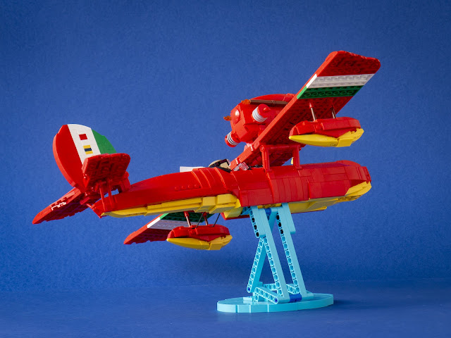
Savoia S-21

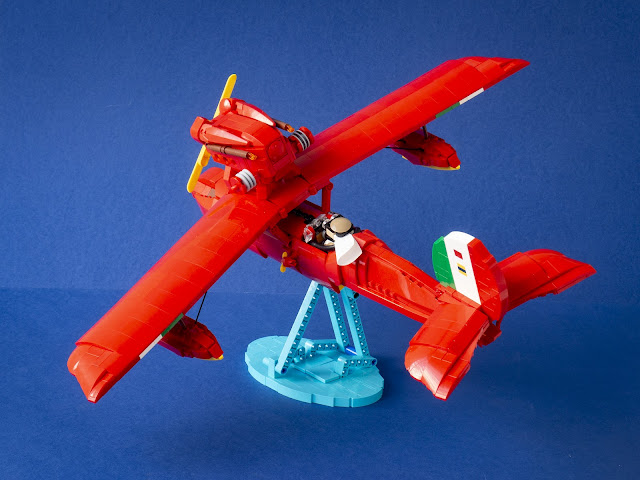
 I've got no doubt that Hayao Miyazaki's Porco Rosso (1992) is my favourite film. I've built the signature seaplane four times; the first one (cirka 2008) was not documented, but my Brickshelf has a version from December 2009 that can't be much younger. I had the third version from 2015 intact until this summer and even had it in some retrospective exhibits last year. However, I had long realised that its proportions were severely off; I liked its wings, engine and tail, but the fuselage had the bulk of a bomber and I quite never achieved the desired shape of pontoons.

The idea of reshaping this is not new. I'm not sure what it took to finally actualise it after all this year. Nevertheless, I finished this already in July and displayed it in Pii Poo Helsinki event; then it just took some months to photograph it.

This time I took a very close look to the proportions of the actual plane. Savoia is a real manufacturer, and despite it weird looks, the plane is not that far-fetched. As well-know, the closest real-world paragon is Macchi M.33 (two of which were ever built). Monoplane flying boat fighters were very rare, as were ones where the cockpit was situated behind the wing and the engine. Porco's plane (which is a prototype barn-find, too dangerous to fly due to the take-off issues) takes this typology even further with having the wing elevanted above the fuselage; M.33 had the wing connected to the fuselage.

However, no physical Savoia S-21 has ever existed. Ghibli animators drew different proportions for different shots as there was no physical model to reference to; even "official" drawings partly visible in Art of Porco Rosso book feature clearly different measures of the fuselage ratios on the front and back of the wing. The position of the cockpit in relation to the stepped underside varies considerably. This is not an issue when watching the film, but when making a replica, I had to choose the best-looking (and the most common) alternative.

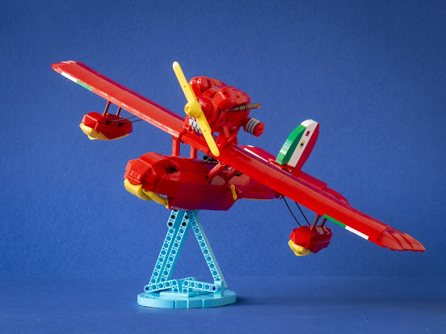
The first part of the design revolved around the so-called Porsche Bow (Wedge 10x2x2) that had been introduced recently in red. Ultimately Markus Rollbünder whom I asked for opinion was right - it was too big and long a piece, I had no hope of embedding the shooting slots with them on the nose. The finished design uses smaller pieces but benefits from other new wedges, which are most prominent in the wing tips. The back of the fuselage was the most challenging part of the whole model and took several re-designs. In addition to being elegant, I wanted to whole model to be sturdy enough for swooshing. This omitted to most free-form techniques, as there had to be continuous skeleton running though the tail. Despite this, the lowest red layer is angled with old finger joints. I'm particularly happy with the obscure Technic steering connector that connects the tail wing; it's very sturdy, and the crowbars are only a cosmetic elements.

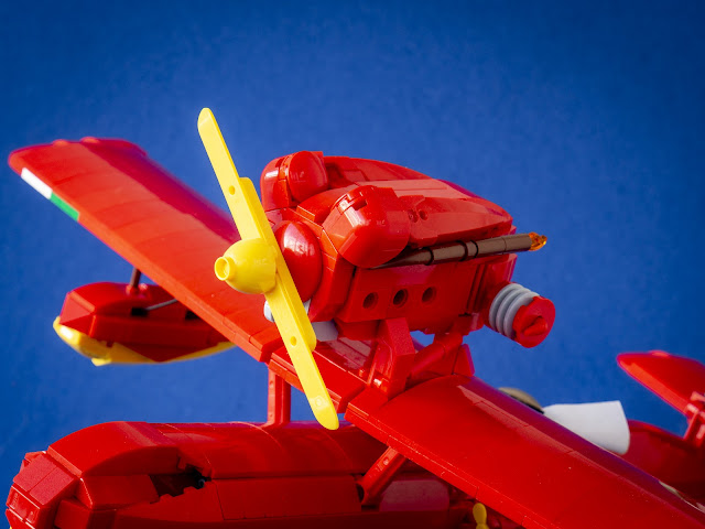
I was happy with the old engine, but this enabled some new developing of skill. Porco's engine has these two blob things, likely hiding the V12 pistons, that are rounded on the front and gently sloping and narrowing in the back. I liked their profile in the old engine, but they didn't narrow. Both of the essential parts here, 2x2 corner curved slope did not exist at all in 2015 and the Constraction claw with axle appeared in red only in 2020. Integrating them into the structure took some effort and the result is not entirely gapless, but it flows and has some new aerodynamics. The propellor spins freely.

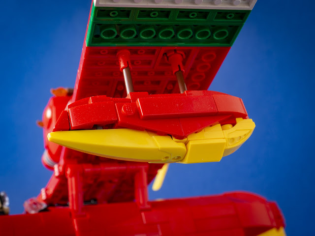
Again, the pontoons were a challenge, something that I left for the last moment. They still have some "polygons" - the shape is very difficult, especially with the curving border between the red and the yellow. The underside uses the same Constrastion claw, and oh boy it flows beautifully. I think it's more essential, as the top is mostly hidden under the wing. The wings itself are recycled from the 2015 version, though I redesigned the inner structure to house the new connections, and the wing tip is rebuilt with newer pieces.

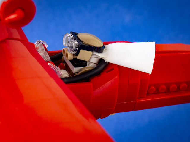
The previous version has a small Porco in the cockpit and I was not going to skip it here; I wanted to position the plane in mid-air (with a new, more marine base) and having it flying unoccupied would have had catastrophic consequences. While the cape scarf has been recycled from the previous one, the recoloured tan binoculars make sure that Porco Rosso looks better than ever.

-Eero.


2024-12-22

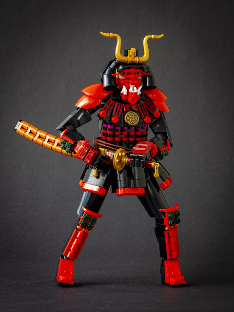
The Shadow General

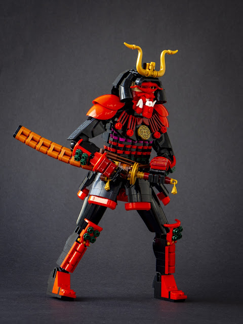
The year rolls towards its end but the models just keep rolling. They have to. This was built for a Secret Santa collab and dedicated to DanielBrickSon, inspired by models Kumamoto Castle Samurai, Wake up Samurai and the general abundance of Japanese culture elements in his creations. Merry Christmas Daniel!

I had a tight schelude for this build, as I wanted to finish it before leaving for Christmas at my parents' home. Thus, I built this in one day, December 20th. I have built many samurais in the past, which was a great asset. Furthermore, I (finally) watched two Kurosawa samurai films this year, and this was partly inspired by Kagemusha. While not portraying anything from the movie per se, the title is a direct reference.

I began the process by tablescrapping the mask, which is inspired by Daniel's life-size one. Embedding robot hand into the headlight brick made it possible to have quite small teeth in addition to the larger fangs. The nose handlebar is not officially connected, but stays finely between the other parts. A small area of skin - two tan headlight bricks - reveal that this is indeed a human in suit. Usage of the large horn pieces as the helmet sides was the very first thing assembled here, and the pearl gold crest is borrowed directly from Daniel's Kumamoto Castle Samurai.

I wanted to keep the armour realistic while still playing with some new parts of this year. Thin mudguards pieces from rose bouquet set are used in the limbs, and the shoulder pads are from the same source. The golden ornament on the neck guard is from the not-yet-released bamboo set. The torso armour is a simple cylinder of 1x2 round plates, with 1x1 round plates and flowers in-between for colour. The skirt flaps are connected directly to the cylinder, which enables their variying angles. Unusually, all the joints save the wrists use ball joints. This enabled sturdy limbs, fitting for an armoured warrior, and references to the constraction community this Secret Santa circle is based on. I must confess I really like those large Star Wars upper legs shells; they save time and look natural, perfect for spots were the legs are mostly hidden and thus don't require extra effort to look interesting.

-Eero.


2024-12-18

Diver

 This MOC goes back to this spring, when the first images of Dreamzzz summer wave sets where published. These included 71478 The Never Witch's Midnight Raven which has a bubbling cauldron on the back of bird, featuring a pair of new pieces. My first reaction was: That's definitely a vintage diving helmet part, I'm sure it'll appear in some other set in such use. Maybe on a diver mech. I'm sure they wouldn't have just accidentally designed a part that looks that much like a vintage diving helmet. I mean, it has a round hole for window and everything. Weird that the set than has it in fun secondary use got revealed first, though... I wonder in which theme the actual diver will appear in?

 My theories were doubted by the New Elementary team. And I took an oath that if I'll end up reviewing a set with that part I'll build the damn diver to go with the article, to prove my point. Guess what? No, no sets with big diving helmets were revealed, so far; and I ended up reviewing some of the sets of the wave, including both sets with the piece in it. I dodged my oath first time, as my MOC accompanying the review of 71483 The Never Witch's Nightmare Creatures featured Cordelia in it, inspired by the many magenta and dark purple pieces. But when writing my review on the Midnight Raven, I had no other choices. 

Not that I'd be complaining. Vintage diving suit are cool as hell. I built one a decade ago. It is a mix of different part types with too strong, clashing textures. And clashing background wrinkles as well. The new version is also much smaller, as the scale of the helmet couldn't be negotiated with. Dark tan felt like the best choice for the suit. It is also hue light enough to prevent the model from ending up too dark with the dark pearl grey helmet. In general, this scale is something I don't work on often - but accidentally, the recent Théoden is pretty close. 

I used CCBS shells to give the impression, of relatively loose, heavy fabric. These isn't much range of motion (and thus only two photos), but at least the posture is natural enough. Lack of motion is probably acceptable in a heavy suit like this. There weren't many essential details, but I included the weighted-down shoes for seabottom walks. Funnily enough, the neck armour thing was the last addition - I hadn't done much background work, but fortunately realised that they were essential before photographing. Last but not least, I'm particularly happy with the mittens.

-Eero.

2024-11-27

Théoden and Snowmane

 This was my entry to my LUG Palikkatakomo's Movement Contest. I got the first prize in the pro category - second time in row this year (and the final tally wasn't as tight as last time). This was a last-minute builds, and I had to shot it with artificial light as the sun of the last day had long since set. These images are new, taken today - you can see my original ones in the end of this article. The video is original, though (it was shot by Pinja who also made the photographing set). As the name suggests, the aim of the contest was building a movement, in a literal sense - no political movements - fr example. The rules allowed both "real" movement via mechanisms and sense of movement frozen in time. The first type was more popular.


In my approach, I merged a long-time potential shortlist project into the contest requirements. The updated Finnish translation of Lord of the Rings was published late last year, an impressive edition with illustrations by the author and chapter names in red ink. I read it in the beginning of the year (I think I read the book for the first time in 2007 or 2008), followed by the watching of the Peter Jackson films (still holding their thunder and more), and, last but not least, reading History of the Lord of the Rings, published in The Return of the Shadow, Treason of Isengard, War of the Ring and the first part of Sauron Defeated. I've had the hardcover compilation edition for about ten years, but I had never read them from cover to cover, only dipping my toes in the most intriguing matters. I had missed a lot of content. On these reads and watches, I was particularly touched by the mysterious Hold of Dunharrow, where the Muster of Rohan takes place, and the riding of the army through the darkness sent from Mordor. This story element is mostly gone in the films, for a good reason: You need proper light to show things in the screen, something that written word doesn't have to worry about. But it also makes the arrival of the riders in the long-awaited dawn more powerful.

My desire to build King Théodon goes further back, though. I was impressed by the character in the first time I saw the trilogy in around 2005; the character is successfully deepened from the books, and the performance by the great late Bernard Hill reminded me of my grandfather. I remember making a watercolour painting of Théoden around 2011; but I had not really touched the subject since. Rohirrim are very strongly about movement, and the charge in the Pelennor fields was the moment of glory for Théoden. This was the moment I had been looking for.

 Nonetheless, the task was not easy. I've never built motion sculptures. I used to make some walking machines in around 2010, but this was quite different. The horse didn't need to gallop, it needed to look like it would be going relentlessly forward, hundreds or kilograms of horse and man about to smash into the troops of Mordor. I stared at the gif version of Muybridge horse sequence, proving that a galloping horse has each hoof in air at the same time. I had really no idea how to achieve that - but I knew someone who did. I had the pleasure to meet Jason and Kristal Allemann when we displayed models simultaneously in the LEGO House 2019-2021. Jason designed his famous Galloping Horse model in 2020, with free PDF instructions. I took Jason's design as a base to expand and revise on.

I soon realised some design aspects that I needed to change. Jason's horse has perfectly flush motion without pauses and crackles. This was enabled by simplified anatomy, featuring only two joints on each legs. I wanted to be closer to the real animal in Muybridge sequence, so I added the third joint to each leg. This caused some problems, but I overcame them with white rubber band sinews that steer the movement to the right direction, preventing the legs from locking. I managed to do this while still keeping the same Technic mechanism, connected to each leg with bars. I also think it was beneficial in the contest to have a heavy modified mechanism instead of a directly copied one.

Jason's horse design is streamlined and beatiful, like a classical sculpture. I wanted to take Snowmane to a bit different direction: This was the war-horse of proud warrior folk, a large beast with heavy hooves and blaring nostrils and visible horse-teeth. I looked for the movie design for inspiration, but the horse armour needed to be lighter to allow the movement. I also leaned heavier to greens, the colour of Rohirrim. Nonetheless, the clasp in the front is a direct reference to the movie design. I'm particularly happy with the chicken suit wing ears and the Technic cam (snow)mane.

I built the complete motorised horse before taking any stabs at Théoden himself. I let the horse design determine the scale, which ended up being quite a bit smaller than I had though. As a result, Théoden is somewhere between Miniland and my usual scale. I knew from the beginning that there would be a spear and a shield, and that the spear would be positioned to skewer some orcs, and that the shile d would feature a reprise of a sun design I made in 2012 for Ragnfast, who I believe was my first model to be featured in The Brothers Brick. I wasn't able to make a green background for the shield so I had to settle for dark orange.

Théoden had to be very sturdy to not fall apart in the galloping motion, so I couldn't have the usual level of sophistication on the limbs. I included the essential details, like the stirrups and some chain mail. Théoden is described drawing his sword after his spear shatters, and here it rests in the scabbard waiting for the moment. I liked Théoden's helmet design in the films, but I felt that this scale was too small for anything like that, so I made a new design. I'm very happy with the combination of the arch pieces, click hinge nose and the bushy beard (Théoden is fortunately descibed having a long white beard). It's pretty close to some Miyazaki geezers, a very personal and proud point of reference. The armour shell helmet is far from any historical designs, but it was compact enough, preventing the head from growing too large.

2025 will show how well the mechanism will endure in the exhibitions. It's driven by 1990s 9V motor connected direcly to the output of a train speed regulator. Getting power from the grid is helpful in the events, and regulating the speed made the mid-process testing easier. As the weight of the model gradually rose, I needed more and more speed to have it running properly. Ultimately, the maximum speed was not too much.