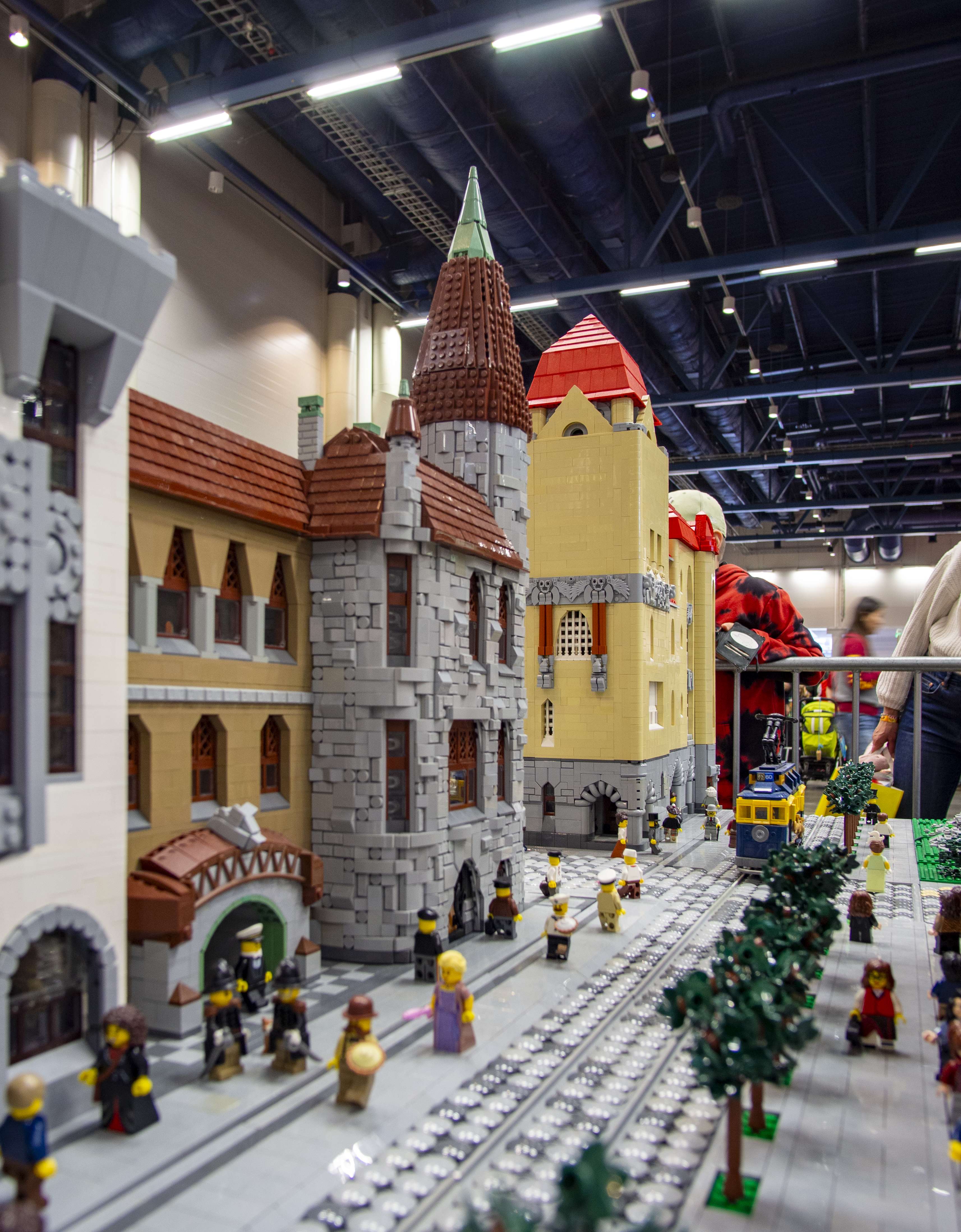
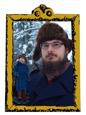
This is my last creation of 2023, althought it was finished already in early September for Pii Poo Helsinki event. The building is the last large architecture project posted this year. I began with the tower in spring, but the other parts were built very fast in late August and early September.
This is obviously based on Gesellius, Lindgren & Saarinen's Pohjola Fire Insurance Company building (1901) in Helsinki (plans for it were mostly designed by the architect couple Ines and E.A. Törnvall, but G-S-L designed the facades, stairwell and main interiors). Especially the tower part, but also most of the other details, are very closely copied from the original facade drawings by Gesellius, Lingren and Saarinen; these drawings, the other one which is available in Finnish Museum of Architecture's Finna, were drawn after the building was finished, in 1902. The building was inspired by American Richardsonian Romanesque, especially Cheney Building, but diverged from the Romanesque historicism even more heavily. Its rich ornamentation was inspired by Finnish nature and folklore; Pohjola is the antagonist realm in Kalevala. The ornament was carved in soft soapstone from Eastern Finland (quite near from where I'm from, and where I'm writing this now on Christmas holidays); actually all of the facade save the granite pillars on lower half of the ground floor is clad in soapstone, varying from very rought to finely cut.
 |
| Constantin Grünberg, Helsinki City Museum, CC BY 4.0. |
I was inspired by the shapes of the tower, as well as the rich surface and the colour of the soapstone with wooden window frames and tall copper tower roof. I wanted to capture the tower very closely. The other parts have some heavy compromises. Firstly, I ditched most of the Mikonkatu street facade, as it was very long; I also left out the avant-corps (section the side with a pyramid roof) on the other side. Furthermore, I switched the facades, mirroring the whole building. This was mostly due to the fact that my designated display spot had room for two modules on the left side of the corner and three on the right side; and I wanted to emphasize the Aleksanterinkatu street facade with the main portal. This was the main facade of the building (left on the picture above).
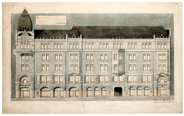 |
Mikonkatu facade, 1902, Gesellius, Lindgren & Saarinen. Museum of Finnish Architecture.
|
Neither the old black-and-white photograph nor the original facade drawing mediate the polychromy of the soapstone surfaces. Its colour varied from lead grey to golden brown and it often has darker brown seams. Here's a detail photograph of the facade:

The top floor is made of smooth soapstone and looks a lot lighter shade, especially in old photographs. This is probably due to the lack of deep shadows and the fact that the smooth surface attracts less soot and other such grime. The other smooth parts such as the pilasters between the windows appear light shade as well. For this effect I chose to make these arean primary on light greys, new and old, while making a mix of light and dark greys and dark tan to the squared rubble surfaces on floors 3-4 and dark greys with dark tan on the most heavily rusticated stonework on the arches of the ground floor and the regular ashlar of the second. The old tires used on the top of the tower are actually quite close to the real soapstone colour. The granite pillars of the botom half of the ground floor would have been ideal in sand red, but I was forced to make them in grey for obvious reasons. We need more sand red!
To get the details right I took a very scientific approach to this model. I took the facade from Museum of Architecture's Finna and rescaled it in revit to make the height of a minifigure (4 bricks) to match the average height in Finland in 1900 (170 cm). Then I printed the the tower facade in 5 parts in the final scale. This made it possible the build the tower facades on the paper and make the proportions match. This was especially important on the main gable with its Boberg-inspired rising sun motif! It also made it possible to get the tower roof angles right. Studded SNOT was a slam drunk choice for it, as the real metalwork is accordingly studded. The minifigure heads have orc prints looking inside the tower!

The rest didn't require dedicated model sheets, as the mass of the facade is more straightforward. I altered the window frames to make them match the parts I had around (I only bought very few pieces for this), but otherwise it's quite close. New 1x4 "loaf" curved slopes worked very nicely on the top floor, and I'm very happy with the eagle-and-squirrel frieze there. The most challenging parts was the arches on the ground floor; I didn't have enough 1x2 wedge plates (the one with 2 studs) and I had to survive without, while still trying to capture the round shape that opens up gradually, while keeping a good balance between the dark tan and dark greys. The large windows on the second floor of the tower were also challenging and required plenty of wedge plates. A couple of brown ziplines with some pneumatic hose made it possible to make the window frames.

The final hotspot of detail was the main portal, featuring grotesque human characters and two torch-carrying bears which are the symbol of Pohjola company. This is probably the most iconic set of ornamentation in Finnish Art Nouveau. I made the humans using minifigure parts as they were roughly the right shape. The column over them are shaped like pines with bushy tops. I imitated the branches with minifig arms and the sprigs with messed chains; the male click hinger above them represent the groups of small bears, but the scale is indeed very small! The larger bears took many versions and had to be simplified considerably. Pinja interpreted them showing the middle finger and I can't unsee that now; the minifig hands are the flames of the torches.

This model is focused on facades, but I had to deal with the back wall and the firewalls too - I didn't have buildings this large to make a closed block, and it wouldn't have fitted the collaborative project anyway. I also wanted to make a firewall with an inscription. They were common in Helsinki at the time, but Pohjola building was flanked by older buildings so they weren't visible. I took some liberties and flanked the right side with a small Empire style building from early 19th century; the facade detail is very typical to Helsinki. The colour is old Light Yellow, which is a mellow tone and very fitting. This house is cross sectioned, as I had time to make a couple of rooms. They fetature historistical fireplaces, which are quite different from the Art Nouveau ones I built for Tampere Bank earlier. The rest of interior follows this somewhat conservative motif. I didn't add figures there, but a dog on the upstairs and a cat in the downstairs; I'm particularly happy with the high-breed dog that uses Master Splinter head.


That's all for now! I'm planning an another post to show my layout from the Pii Poo event, as it brings my urban architecture projects from few past years together. But this is the last new model of 2023. I posted 22 models this year, which is considerably less than in 2022 (30) but still tops the lowest score of 2018 (18). However, these included 3 very large architecture projects, so I wouldn't be surprised if I built more than ever. And if one adds all the New Elementary posts and my work as a LUG chairman, it was quite a heavy Lego year.
-Eero.