2022-10-26

The Milky Way / Speed of Light

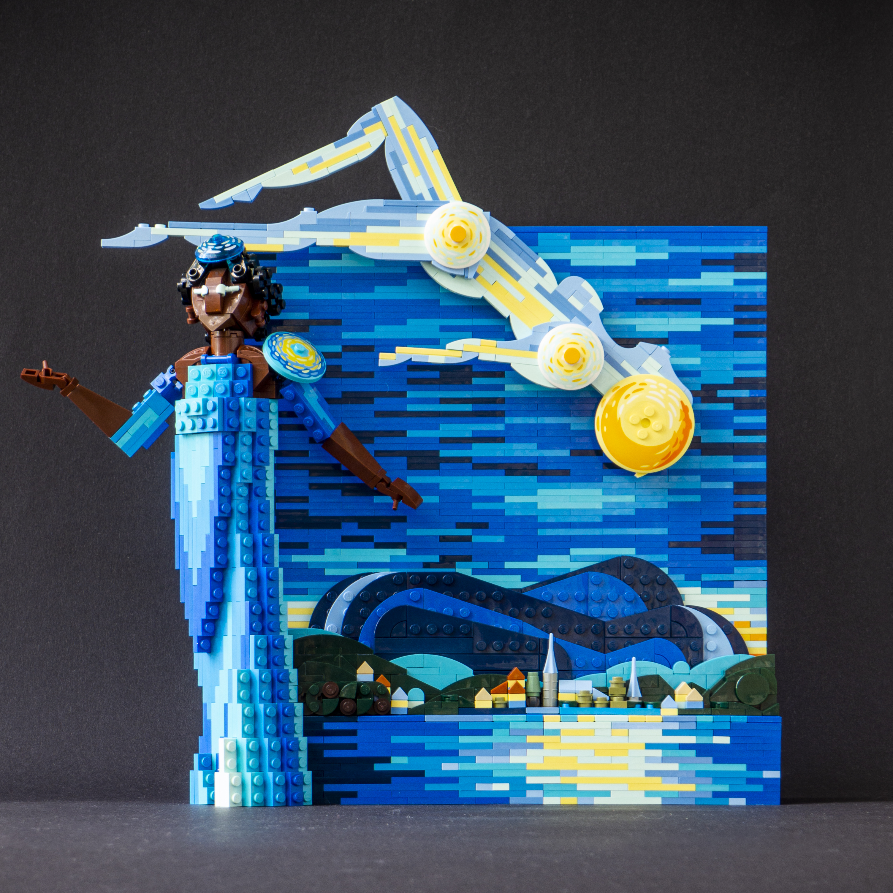
This MOC was inspired by 21333 Vincent van Gogh - The Starry Night set and built for an article about it on New Elementary. As you can read in it, is lovely set, likely my favourite ever - yes, even passing the nostalgia factor of childhood memories. I kept it build for a couple of months and then took it apart to build a MOC; I like to include a MOC on my New Elementary articles. For the first time ever I was solemn to do so. Maybe some day when I have a bigger home I'll rebuild it and hang it into a wall. It has a connector for that.

This MOC combines the 3D painting aspect with my usual character building. The colours are vital here, as the original set is an beautiful example of premium colour use on a model. This build uses mostly the same array of colours. I balanced the blues and yellows differently by adding the reflection of the moon to the water; the original Starry Night doesn't have any water in the landscape, but I think it fitted well, turning the village into a lakeside town. There's also the last (or first) shine of the daylight behind the fells on the background. In general, I think the scenery was inspired by some town in Northern Finland, with fells and a lake near by (there is always a lake). It was not deliberate to move the scene from The Netherlands to Finland, but then again, why not.

Most of the Starry Night set is plates, and I wanted to utilise there blue-hued plates to build an usually constructed figure in a dress. It is inspired by geysirs, the huge blasts of water rising from the ground due to geothermal activity. This made the figure relative simple, though there is plenty of SNOT inside! The figure is connected to the "painting" with two mixel ball joints, as those allow easy but very stable 90 degree grid changes, and are easy to include in a plate construction. I'm rather happy with the figure's hair.

There is also another human figure, also build mostly of plates, but mostly in two dimensions - a sort of link between the dress figure and the painting. She is the Milky Way, though I think the Finnish term Linnunrata  - The Route of Bird - captures the essence better. This figure also breaks the rectangular shape of the backdrop (which is mostly recycled from the set), creating a tension between the human-sized, town-sized and the galaxy-sized.

-Eero.


2022-10-16

AI Admiral

This is another collab model. The idea was to give an AI Looking Glass V1.4. some pictures and MOCs to generate an " average MOC designed by X" and then actually build it according to the image. I used similar photos of similar character builds to make coherent images, then picked the most interesting one. Here are some examples on the Looking Glass images:

Trust me, I didn't add here the most disturbing ones. I picked the one that was dubbed as The Admiral by Djok. It seemed to have a coherent consept, simple colour scheme and a pose with attitude:

As I perceived it, the character had a sort of half-trench coat, with tight trouser and sort of armour on another leg. There was definitely a high hat to compleate the uniform, some epaulettes and a red sleeve muff to warm the hands on windy decks. The color scheme was nice, lot of dark blue with some red and pearl gold. I began with the shoes, using a Hero Factory foot as a frame. The armour uses CCBS; the Chima pawn club attachs nicely to the CCBS shell! 

The next part was the coat, shaping the coattail and the bust with the insignia. The arms were the hardest part, as the angle had to be tigher than 90 degrees to be natural. The first version used the smallest CCBS shells with ball joints, but had too muech gaps. I solved it with SYSTEM. I finished the coat with a high collar to make the uniform look warm yet regal.

I added a sheathed sword, as it fitted the navy theme. The long straight object by the coattail leg on the AI image could be perceived as such. The hat was hard. I wanted to use those Chima Ultrabuild axe blades, but thei connection - merely an axle - is hard to connect on a free angle. I used a pull-out pin, which made the hat quite long; I wish they made axle hole/pin parts two-module long. I think it looks fine in the end. The earmuffs use stickered gear mechanism 2x2 round plates from Ninjago, which I fortunately had two of. They fit the dieselpunk aesthetics decently. 


2022-09-11

Baltasar Herbamare Plötz

 This is Baltasar Herbamare Plötz. He was built for a crab collab just tomorrow, but the character goes way back, maybe 6 or so years. He was my character on tabletop role playing game Shatterzone, vigorously reshaped from original shell designed partly by one Greg Farshtey. Well, anyway, Shatterzone is set in space and specifically in starship Minna Canth, piloted by drifter Jake McKorhonen with proud Ostrobothnian heredity. Baltasar (named after German baroqu architect Johann Balthasar Neuman) was the ships janitor, though he was a painter by profession (Shatterzone is realistic in a way; artists usually need another job). He solved the final conflict by painting a heroic rapper portrait of Martian biker mouse Verneri Vaderi, the story's antagonist, persuading him to be good again. More information can be found on Shatterzone Wiki.

I must confess this wasn't going to be Baltasar to start with. I was just making a crab (a pocket crab), with round shell and the eyes under it. Actually, the first shell wasn't this round, it used some angled tipper ends. They were bugger to connect, as they don't have any connection points inside! I finally replaced them with a X-pod dish, which worked much better. And the crab needed for some sort of theme... and the crab collab had many crabs, garder crabs, fortress crabs, robo crabs, but no painted crabs (I suppose) so Baltasar it was. I had to give him one big and one small pincer, as Baltasar is that sort of crab. The beret was easy, and the painting of Verneri Vaderi was fun to do. It must be noted that I made the original painting on watercolours during the game session; it's on the GM's apartment's hall wall. I know it because I saw it last Wednesday.

-Eero.


2022-09-03

Pohjoismaiden Osake-Pankki - Nordiska Aktie-Banken

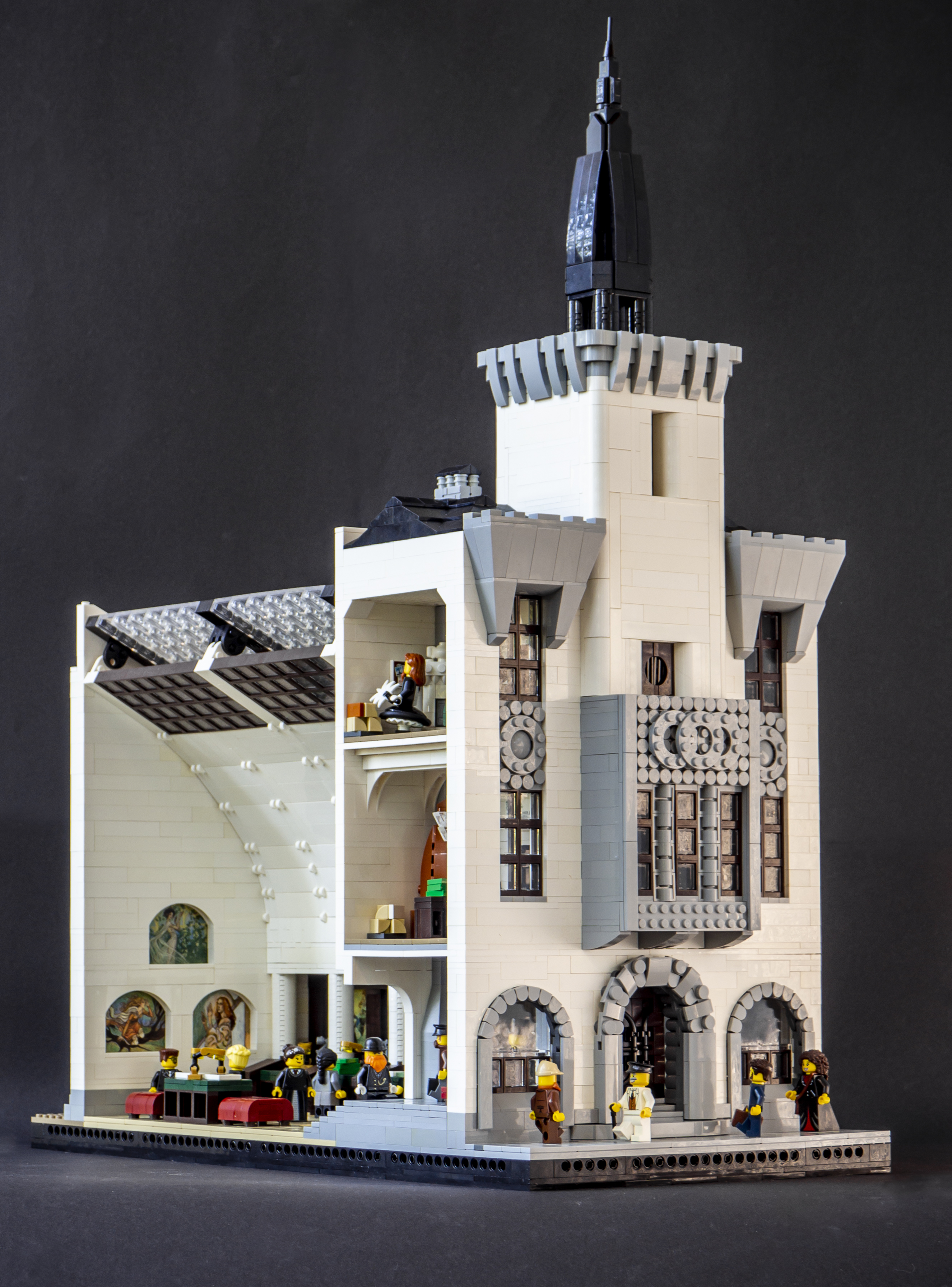
 This was my entry for Palikkatakomo ry's commercional building summer contest. The subject was simply a commercional building with footprint from 16x16 to 64x64. I had a clear intention from the beginning - to build my own version of architect office Gesellius, Lindgren, Saarinen's Pohjoismaiden Osake-Pankki bank from 1903-1904. I wanted to make a cross section of the banking hall and the vertical main facade. So the building is practically a three-dimensional axonometric cross-section. I haven't usually built interiors to my modulars, but I've grown interest in them, too, and this is the first finished one. I've got a much bigger, similar project in progress, too - as it has been for a year now.
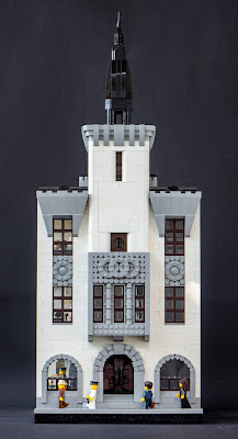
The main inspiration was Eliel Saarinen's watercolour sketch from 1903, showing a symmetrical facade with sharp-pointed tower and plastered surfaces with natural stone ornamentation. To building was not executed this way; the facade was built with smoothly hewn soapstone and the tower was omitted. The interior was glorius with pear tree furniture, skylights and rich ornamentation. The project was widely celebrated and was presented on international architecture magazines. It was demolished just 30 years later in 1930s to make room for Frosterus & Gripenberg's huge new bank building.

So this was my starting point. I did not want to copy the exact building or drawing, but to make my own version of it. Firstly, I had chosen to make the model 64x32 studs in size - 64x64 would have been too big job for the time I had got. This meant I had to abandon two of the five window axises, and the facade worked pretty nicely with these three vertical elements. I made a relatively finalised facade drawing (in Tikkurila train station and in train from there to Tampere) with measures - 3-4-3-4-4-4-3-4-3, 32 in total. The first-floor arches are made with tooth plates, soemthing I've wanted to try for a while. The tower has same smooth shapes than in Kudelma hotel, and stone armament... cheats a bit, mathematically, but works pleasantly nevertheless. I'm particularly happy with the stone ornaments between the 2nd and 3rd floor windows.

The frescoes of the bankin hall are not Lego so this is not purist work (gasp!). Our LUG's contest rules allow up to 1 % non-Lego-stuff in entries, and this one uses seven Magic the Gathering cards, illustrated by Rebecca Guay, much-adored artist of vintage Magic. Her work is very fitting for this jugendstil/Art Nouveau period, reminding of Alphonso Mucha or even Tampere-based Joseph Alanen. There cards - Samite Blessing, Sky Spirit, Dwell on the Past, Pulse of Llanowar, Quirion Trailblazer, Devout Harpist and Calming Verse - vary from unplayable to relative weak; but every one of them have beautiful art and I believe they work better here than in any of my decks. The art is almost exactly 6 studs wide, which made the integration very easy. The cards were not harmed during the build, they're simply contained inside the walls.

I kept the banking hall simpler and cleaner than the real counterpart. The vault is made with normal bricks, angled with swivel joints, and the skylights are done with using windows instead of bricks in the final segment. The actual roof in on top of the vault stucture as in the original; this is done simply with black bricks and transparent panels for the skylight. I think the vault is a bit too high; I added one 4-wide segment late in the process, but looking it now, it would have worked without. There is more than enought air and light in this semi-sacred space of capital.

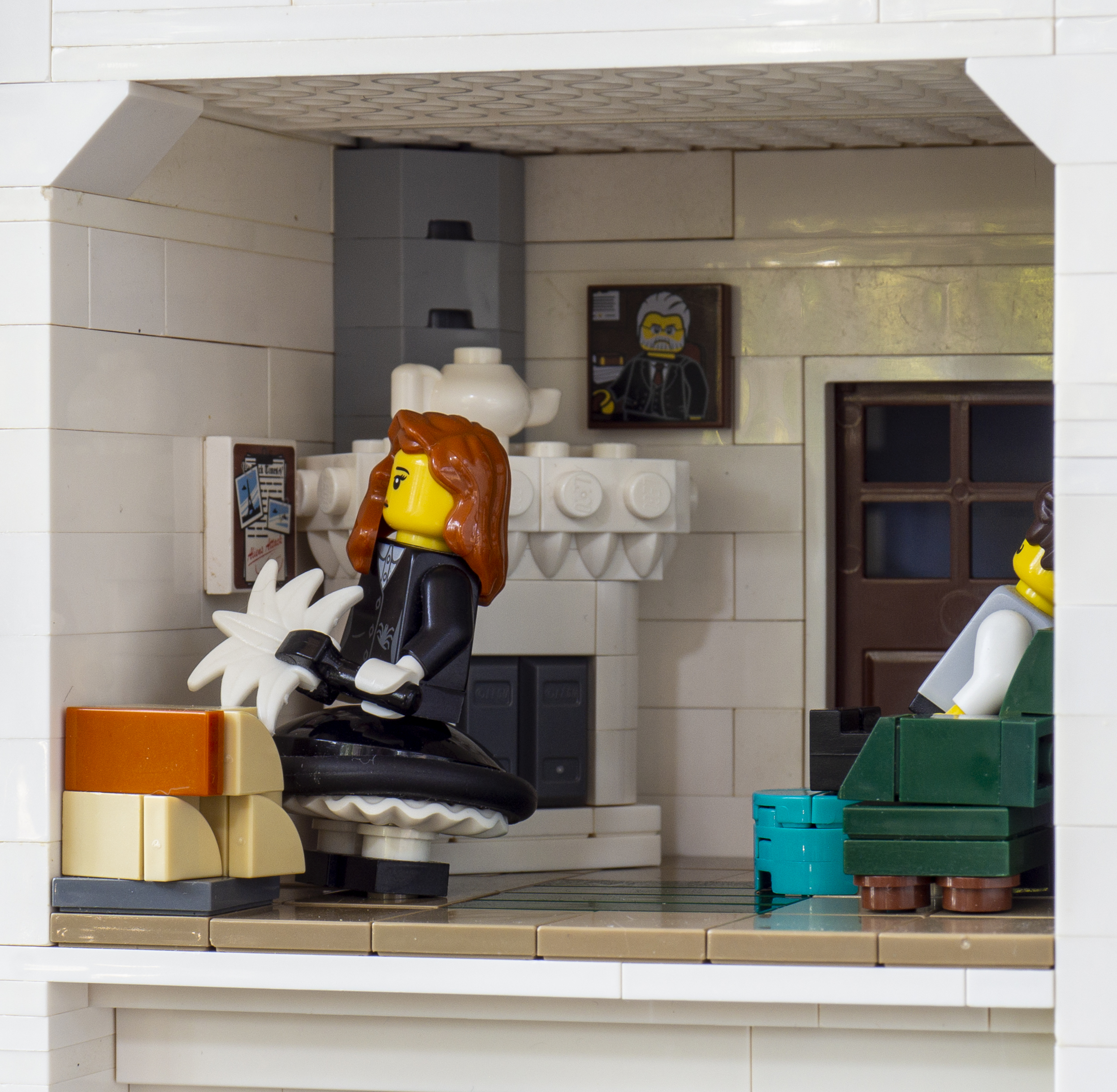
In addition to the hall, some of the spaces of the street building are cut and visible. The sturcture is unrealistically thin, but there are limits on what can be done in two weeks in 32x64 plot! On the first floor there is the bank manager's office, with tile stove based on a model designed by Valter Thomé around 1903; it was originally built for another project, but didn't quite fit. The third floor has the break room for bank staff, featuring a smaller stove. The first floor has simply a vestibyle leading to the banking hall, kept warm with a soapstone stove. 

 -Eero


2022-08-26

Doreen Inverardi Revisited

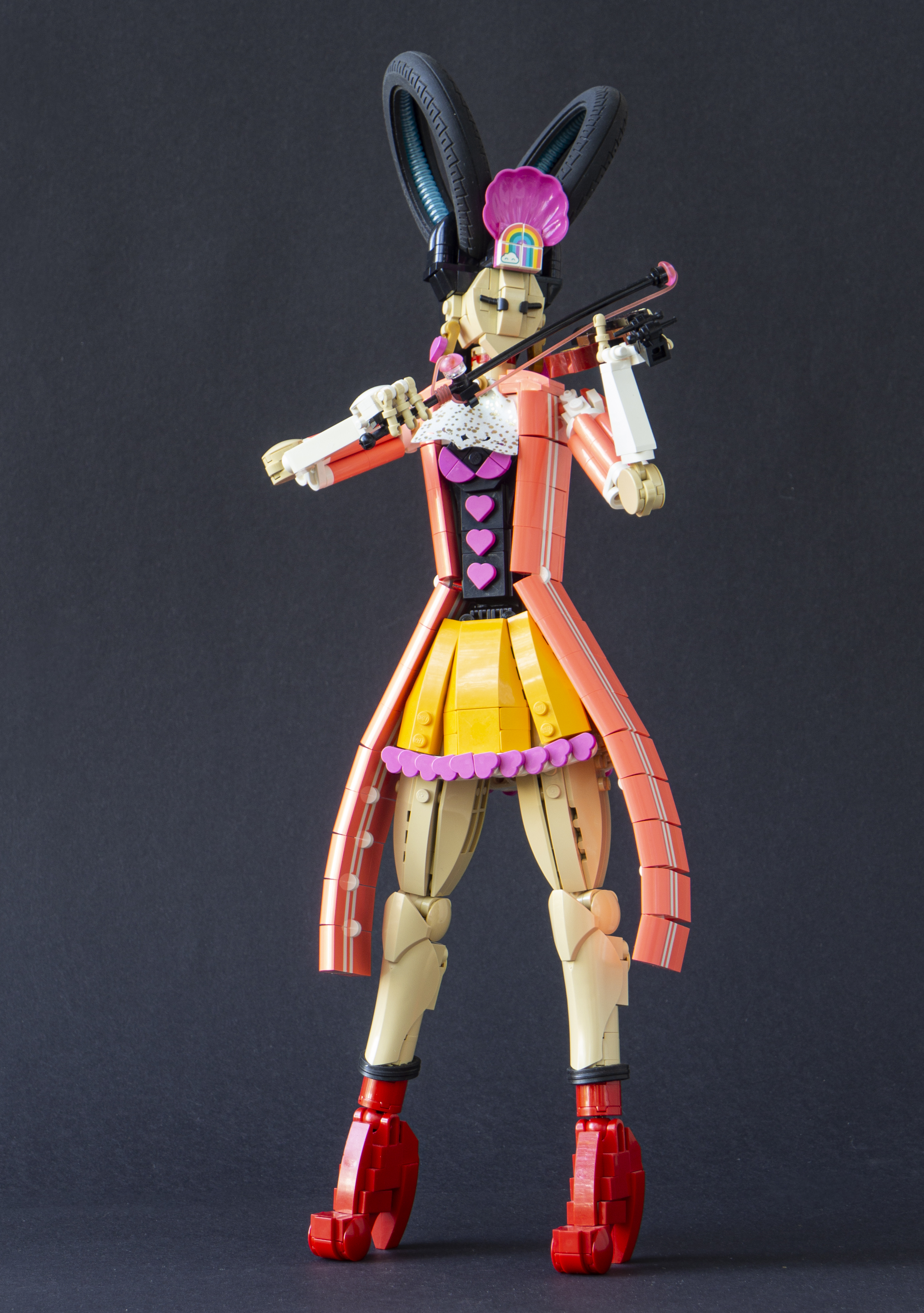
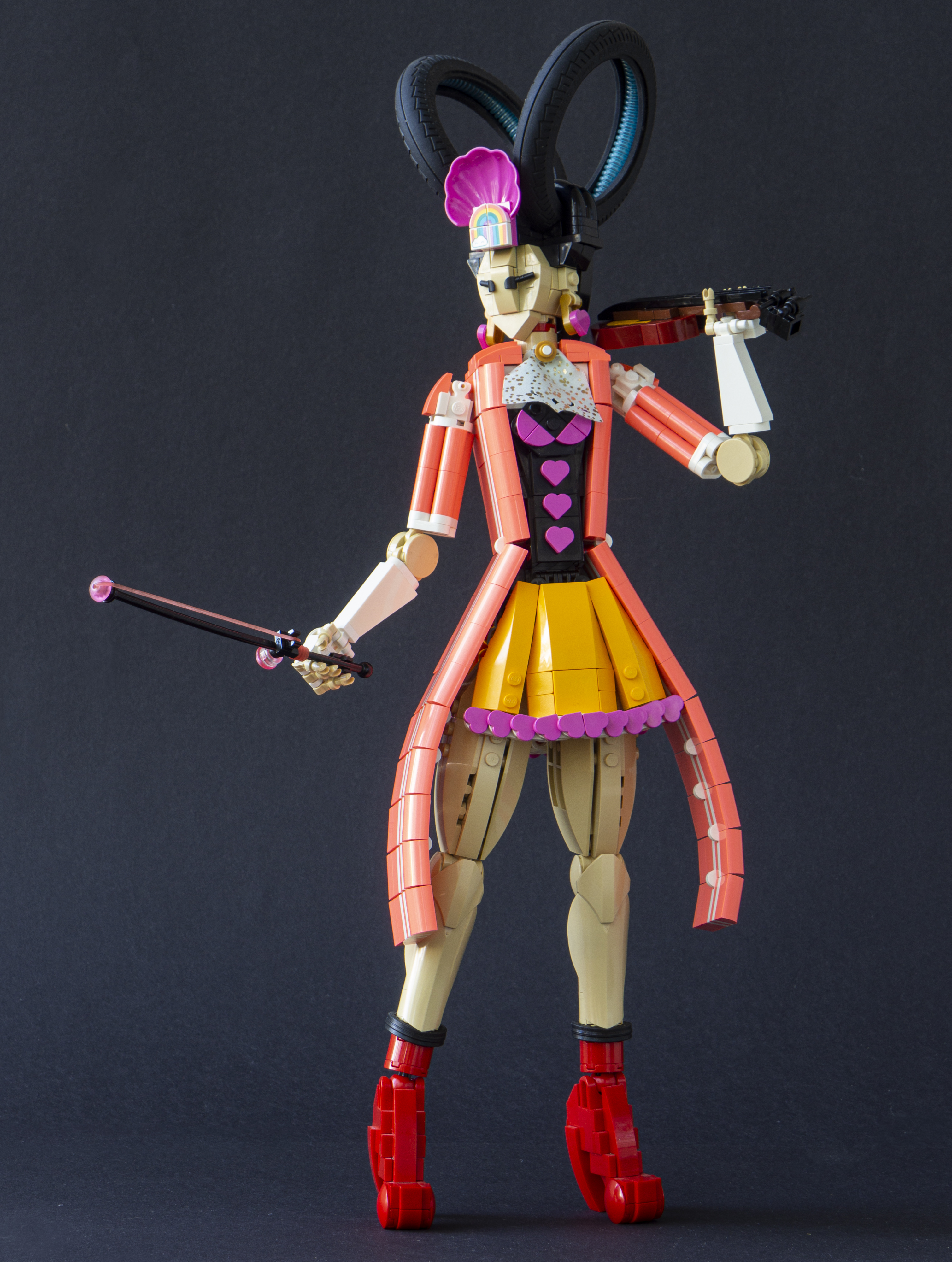
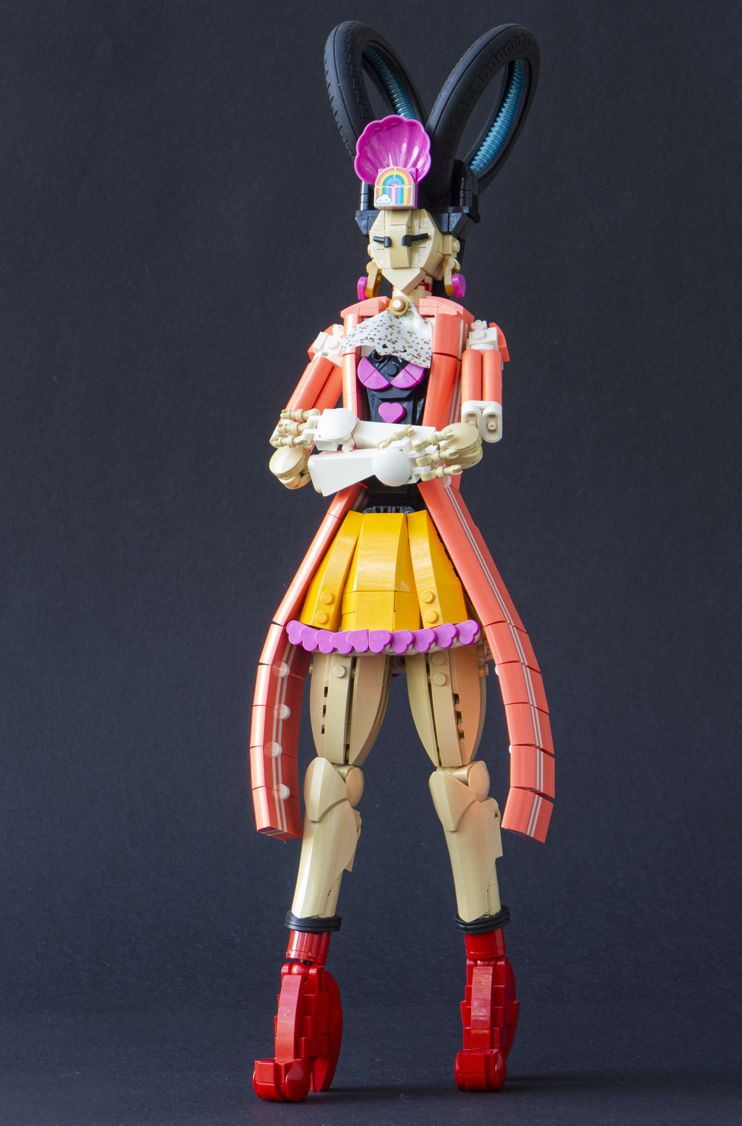
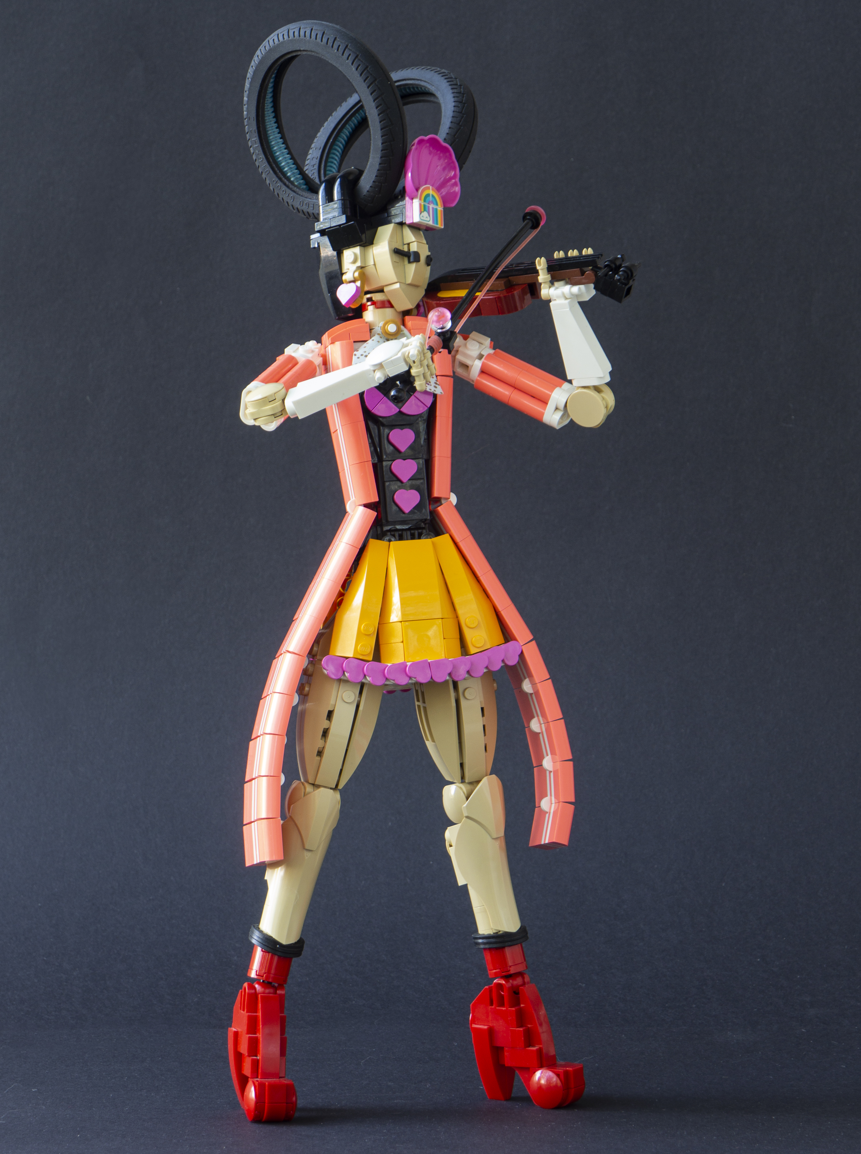
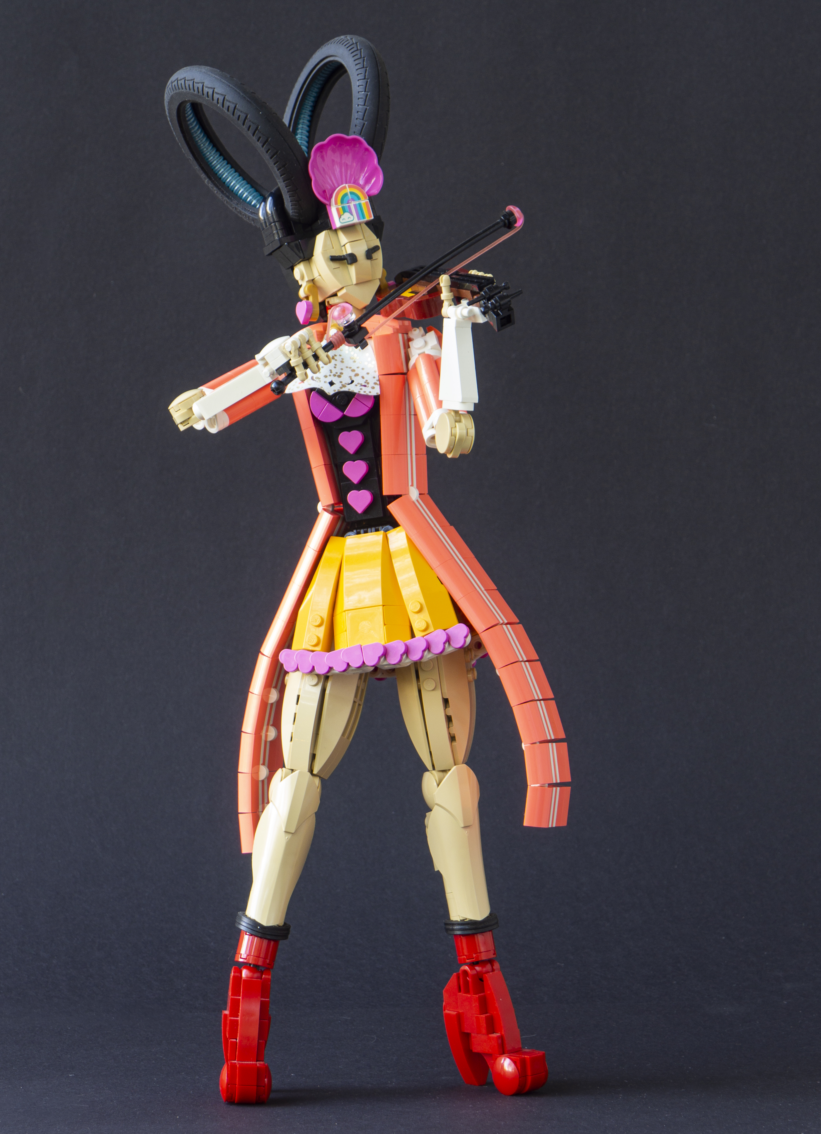
 Some creations are easier than others. I've made some great ones on a few-hour storm of inspiration, clearing challenges from victory to victory. And some are painful, with all too much breaking to pieces and absence of motivation. The original Doreen Inverardi was one of those. I had got that dress tablescrap on my table for months, and awfully wanted finally to use it somewhere. It was a mistake, though not a dramatic one. It was heavy and negated any leg posing; and with that short coral jacket the character was just a combo of sloppy ///\\\ shapes, looking a bit like sad spruce. It had certain nice ecentricity on it, but never met the quality of other builds on this "rock'n'roll" scale of musician figures.

I still had it on display for a year, and even on one exhibit, despite never pleasing me. And in the end it felt silly, pulling this model like a sled full of rocks. The solution was easy. I just picked up the good thing in it and redesigned the rest. It was a pleasant process of two evenings and now I like it a lot!

I had actually redesigned the legs slightly earlier, so I mostly left them as they were. The hige skirt was abandoned altogether. I liked the coral jacket of the original, with its fake Adidas stripes, but its sloppy position was not good; and it had potential for more. I enhanced it, making it bigger - like a tailcoat or a morning coat, but with sport apparel aesthetics! It fitted the feel of the character with its plastron. The shirt underneath was re-designed completely, in black and with heart buttons to fit the weird-classy aesthetics. I wanted to keep the bright light orange of the skirt and used this colour on a new one; the heart trim was the last one built for this character.

I replaced the gloves with simplier white ones that fitted the aesthetics better. I kept the wild hair as it was, only replacing the Technic connectors inside the tyres with some trans-light-blue tubes. This was done mostly because the connectors tended to fall off. I also changed the colours of the violin. It made the whole composition less busy and little more classy; I think this was acceptable, as the coat and the hair are so wild! And so Doreen Inverardi turned into a model I could be proud of, a full member of the imaginary band of character builds!

- Eero.


2022-08-15

Bea on the Beach

 This was my third and last MOC for New Elementary's Cloth Festival. It actually bends the theme a bit, as the pieces in limelight are not textiles but "Plastic" according to their Bricklink taxonomy. However, the Plastic category pieces behave similarly to cloth parts, so including them felt appropriate. There is a cloth piece here too, the blanket - but it's not connected to anything.

As Suon Suncaller was clearly a winter-themed character, I wanted to make a very summery person for balance. It called for a beach setting, and the sail parts (the set has only one) from 41317 Sunshine Catamaran were perfect for that. They're used as a beach skirt, and combining two sails in different position results a nice swirly star-like pattern in the middle. The sail parts again defined the colour of the MOC, though I dropped the white in favour of more bright colour: Medium azure, magenta and trans-yellow for the hair.

As the sail parts are large, 23 x 26, the MOC is larger than the two previous Cloth Fest characters; I call this scale rock'n'roll scale. This is the first time I've built bare legs in this scale, and there is an interesting bit of mould variation utilised here. The ankles use 1x2x3 slopes in tan with hollow, open studs, so a bar with small ball joint can go through, making a clean ankle joint with Mixel ball socket. This can be only done with the oldest (and least common) version of this part, but it's relatively stable.

The hair is made of stacked 1x2 plates, a technique I've used many times. I think the transparent plastic with the stud pattern has some tincture and variation akin to real hair. One must be careful with this technique, though - Bea had originally trans-blue earrings, and the gave the hair unpleasant green tint! The hair is topped with a big magenta hat, as hats are cool and they create nice posing options!

 In addition to the clothes, I packed in the MOC some extra beach gear; a box of picnic, a refreshing drick, beach-almost-ball, an ice cream cone (must-have!) and a crab. The crab is a reference to those crab collabs cool people do. The crab befriends Bea in the end.

-Eero.