2023-11-05

Villa Mauski

Number two in my 2023 series of large architectural models is a villa built for Palikkatakomo's housing exhibit contest on Pii Poo's Helsinki event at the turn of October. I got the second place on both LUG member and audience voting; I was beated by one vote by the splendid tree house in member voting and was third in the audience score. 

My original proposal for the modular Finnish town was "Some housing blocks and a suburban villa". When it turned out that we're going to have a the housing exhibit contest (I think I proposed it - we've had some in the past) I chose to build the villa as the contest entry. This meant shrinking the area from original 2x6 modules to 2x2 modules, which made the plot around the house somewhat smaller. Otherwise the idea stayed the same.

The building is heavily based on Suur-Merijoki manor by the esteemed Finnish architect trio Gesellius, Lindgren & Saarinen from 1901-1903. It was constructed to a Swiss industrialist Maxim Othmar-Neuscheller to Viipuri area. The area was lost to the Soviet Union in the Second World War (twice) and the building was destroyed afterwards. But in the first decade of the 20th century it was the most well-known Finnish housing project and published widely in international architectural magazines. The original main drawings are fortunately available in Finnish Museum of Architecture's Finna website.

Gesellius, Lindgren & Saarinen 1902. Museum of Finnish Architecture, CC B.Y. 4.0

It's naturally a fantastic project. I wanted to capture the careful interplay of smooth white facades and the various types of aperture; and the combination of grey natural stone, white plaster and dark red roof tiles. I wanted to have the billiard room separated by a narrow gatehouse-like edifice arching over the main entry. I had to fit it into four modules, so I ditched much of the bulk of the original project, housing the servant's quarters. I ended up with a simple rectangular mass, with the main door in the middle, flanked by the round tower and a protruding avant-corps with a triagular gable. I jutted the arch bridge and the billiard room below the gable to form a semi-open courtyard; and I lifted the mass five bricks over the zero level of the module's surface to make room for the entry arch and to create an interesting composition with the natural and built environment. (Of course, in this case, everything is built by me, in plastic.)

The idea of the place is that the natural cliff has been extended with a brusque cyclopic bond masonry below the tower, and the pathway was been dug into the entry terrace through the rock; this gulley begins from below the arch. The high stone foundation enabled the horizontal polychromy of grey, white and dark red while making a neat contrast with the smooth walls.  

Mostly, the walls are traditonal brick-on-brick construction and the roof is made of slopes. Most of the corners are sligthly curved with inner SNOT structures. There are both very vertical and horizontal windows; the former remiscenting of medieval forms, the latter akin to more modern paragons. Without the castle-like tower and the high tiled roof the white walls with wide windows are quite similar to modernist buildings of 1930s; many of the principles of both early 1900s and 1930s were quite similar.

The tower breaks the simple shaping. It was pivotal to achieve the slightly inwards curving shape of the silhouette of the walls; this meant I couldn't use curves to make the round shape itself. Thus the round shape is stepped and made of (theoretically) 8 panels, though naturally one of the them "is" inside the main rectangle. The steps are a plate and a half a plate in height, which, to my eye, looks flush enough. The slight inwards curve gives it organic, mushroom-like quality - like something that has grown out of the soil. 

The roof of the tower was the first thing I built for this. I first tried to make it via trial-and-error, using the Lowell sphere as the starting point. It didn't work out - I don't have enough three-dimensional abstract perception qualities! So I installed an old freeware of LSculpt. I made STL and OBJ files of the Suur-Merijoki tower roof, taking its silhouette from the facade drawings and making a solid of revolution with an another 3D modeling software. I stuck the file into LSculpt and with some adjusting it designed the roof. It consists of four identical panels, but as you can see, their sides zig-zag in quite a peculiar manner. No wonder I couldn't make it out by just building. 

The billiard room is obviously too small for minifigure-scale games, but I loved the fact that the original had such thing. It also works as something like a watch house to guard the gate. I'm very happy with the very steep gable, made with two 1x8x3 slopes that I got in 2019 for my first New Elementary Parts Fest. They're only connected by the top studs, but there are some tiles stuck inside the parts to keep them in the right place. The 8x8 plates of the roof match the geometry perfectly, and their studded surface calls back the tower roof. The first version of the whole roof was made of plates and wedge plates, but it didn't work out; those two remain. The tall chimneys, especially the kitchen one in the street side, break to horizontal composition, as common in the English Modern Style paragons. The house is heated with wood so there is a log stack in the back; a familiar sight to most Finns, this one. There definitely wasn't a log stack at the foot of Suur-Merijoki - that would have been something for the servants to do discreetly. My version has shaken off the weight of class society.

The basic idea included the natural cliff that has been left mostly intact. As the nature of the plot has taken into account, it also has some old trees: Two large pines, two smaller ones, and many little spruces. It was not intentional, but I was suggested by a fellow builder that the small spruces, with the rather low stone fence, make the house look larger and more castle-like. If so, the effect is rather pleasant and I'm happy with this remark. In fact the trees are small, as the tech of using stacked grass stems only works in small scale; and I didn't want to have many large trees to cover the building. The stone fence was the last addition, the finishing touch, and it is small for the same reasons - a cropping element was needed, but I wanted to keep it low so that it doesn't cover anything visually, nor give an impression of very closed, private and no-go area; the house should open warmly to the surroundings.

The pines are larged. The original idea had them, too. There weren't big pines near Suur-Merijoki, which was situated in a small spruce forest within the large fields (it was a manor, after all, not a cottage). But hardy pines are a well-known and strong element in Finnish art of the time - one only has to recall Eero Järnefelt's Koli landscapes. Even Eliel Saarinen's famous villa fantasy, published on Ateneum magazine's architecture issue in 1901, had a gnarly short pine. 

Our modular Finnish cityscape was a Project Support project and I had designed a simple pine holotype for our LUG, made of a moderate number of different parts from the Support. It has the same olive green sprigs and macaroni-tube branches, and a dark bley, dark orange and orange gradient on the trunk. I was going to use them, but I ended up making a version that was essentially the LUG holotype in steroids, enhanced with a larger part palette. Dark orange was switched to medium nougat, as it looked better and I had got those rock face plates from the support. These trees consist of segments connected tightly with 4L bars. Their connection to the ground is not very assuring, and the branches and the sprigs can fall of, but the trunks itself are quite flexible and thus do not break easily. This is due to the 4L bar "skeleton". The branches are made of orange macaroni tubes and all the orange little technic connectors I could find. I like the orange-olive green combination - it has cool, albeit vibrant, harmony in it.

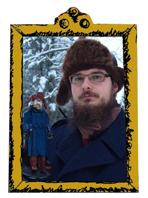
The minifigures here are me and my partner Pinja, making this a sort of villa fantasy of myself; a further developed Villa Korpkuusi from 2021. There are no interior, but I actually made a floor plan for it. It's needless to say that it was utterly unrealistic, but that's probably acceptable for an architect on his free time.

-Eero.


2023-10-24

King Dedede (2)

 Little King Dedede, from Nintendo's Kirby games, more familiar to me from Super Smash Bros. Like the Wanderer, the king was built for a New Elementary article about Mario sets; the coat halves are koopa shells and the eyes are from a Mario - indeed! - penquin. And like the Wanderer, I've built Dedede before too, in 2015. It's a much larger, of course, and somehow naivistic, and still intact - I like its expression, dislike its hammer...

This version began with those coat halves, though I must confess I turned them 90 degrees before applying them; I had though that the coat would open in the middle to show the belly, but it had to open on the top and bottom instead. The triangular pattern of the (sadly flat) belly is done using cheese grater slopes and they are connected with lever sticks, well, stick into them. Super illegal but stays in place, mission accomplished. I would have wanted to use some Mario character feet as the feet but they weren't big enough for Dedede's canoe shoes.

The beak was the hardest part, by far, and went through many iterations. Some had an open beak using lifesaver ring; an another used the hinge piece that ended up in the hat. The final version has a very weird tech were two Homemaker hands (round plate with ball) pinching two D-tiles next to each other. It works! An another pair of Homamaker hands are used as the mitten thumbs.

Next up, some more architecture. Only 15 posts so far this year (the lowest was 2018 with 18 posts) so I'm trying to get the backlog out as soon as possible. Only I've already finished two new models after the grand exhibit of my architectural builds three weeks ago.

-Eero. 

Ps. Instructions for this one were, and probably still are, available for New Elementary Patreons.


2023-10-16

Tampereen Pankki

 This is my most time-consuming model of all time. I began working on this in, I think, summer 2021, when there was still the pandemic going on, to some degree. I had recently graduated as a architect, and landed in a part-time job as a researched. And I was dreaming - or maybe planning - of beginning my Ph.D studies. Now, actually, and confusingly, term Ph.D is generally used even though one in the field of architecture graduates as a Doctor of Science (or technology), TkT aka Tekniikan tohtori, not as a Doctor of Philosophy. On the other hand, my thesis (I'll get to it...) is more philosophical that technical so, in the end, maybe it's all right. Back to the MOC!

So, I was a researcher on apartment design, and it was nice and interesting but my passion, nevertheless, lies in the history of architecture on Finland. Finland had a strong and multi-faceted period of architecture in the turn of the 20th century, now known as jugendstil/art nouveau period and back then usually referred as new style period. I have been building many models inspired by this theme - you can find them on the architecture tag of this blog - and made my (award-winning!) Master's Thesis on one interesting Helsinki-based architect of the time, Gustaf Estlander (there's a book on him on the way, funded by the Finnish Culture Foundation). And during the pandemic, I was embarking into the doctoral studies, with the subject setting on the same time with Estlander but on a closer location; my hometown, Tampere. This model evolved alongside the idea of the thesis, which is - and I am doing it full time now, again with funding from Finnish Culture Foundation - about the bank architecture of Kauppakatu of Tampere during the years 1899-1907 and beyond. Six banks, five private ones and one savings bank, were constructed at the time, very close proximity to each other and largely different in style and shape. It's a fascinating array of different solutions to similar architectural assignments.

This building is a synthesis or an amalgam of two of those projects. Tampere Savings Bank was designed by the most famous office of the time, Gesellius, Lindgren & Saarinen, based on a contest project in 1900. It was built only partly; the first and narrow section in 1902 and slightly larger section in 1903. There was an impressive tower planned into the corner of the street, but it was never built; the project was too ambitious for a savings bank of this industrial town. A local architect Birger Federley finished the building in 1920s with mostly classical design that, nonetheless, adapted into the romantic original design with similar subtle details. You sure can read more about this later on on the 1st and 2nd article of my thesis - I'm planning to write them in English.

Tampere Savings Bank's archive. Gesellius, Lindgren & Saarinen 1901.

A few years ago I had measured how large MOC would I have ended up with if I'd just built the original project of Tampere Savings Bank in minifigure scale. It would have been about 128 x 96 studs, aka 4x3 modules. That would have been impossible to store, so I buried the idea. However, I came back to the design from time to time. The tower exists only in these drawings; building it would somehow make it more real. So I began building it, not in exact scale but close. I also took the northmost part of the building, with a little tower (the ground floor hosts a funeral office) because I liked its design. I made a drawing while sitting on a train to Helsinki - I usually sketch MOCs only when I can't build them...


The final design stayed relatively true to the sketch (where I did not really remember how the tower roof should work). It became, if something, a bit simpler as I ditched one bay window tower. However, the sketch did not take the shorter sides into account - I was going to make a 2x3 module model as it fits on my part storage furniture. The other side would have the smaller tower, as above, but what to do with the other side - and the corner, as the savings bank has only one corner? I turned into another one of Kauppakatu's banks: Tampereen Osake-Pankki, the Tampere Share Bank, designed by Birger Federley 1904 onwards and finished in three phases in 1905, 1907 and 1916. On the Hämeenkatu side, it is quite ordinary but well-balanced Finnish jugendstil housing block, inspired by English and American villa architecture via paragon designs by Gesellius, Lindgren & Saarinen - including the Savings Bank but also houses Olofsborg, Eol and Doctors' house in Helsinki; I've built an house inspired by Eol before, here. Federley's bank had became a familiar and meaningful part of Tampere landscape to me and I wanted to pay it a little tribute. I also wanted to make a softly curving corned with similar design to the yellow Eol-inspired house, flanked by a triangular gable with a tall bay window tower. And add in some nice cavern-like loggia balconies, which appear on both Tampere Savings & Share banks. 

Tampereen rakennusvalvonnan arkisto. Federley 1905.


One of the most amibitious features of this project were the windows. Small square panels were the way to go to Finnish new style architects, as inspired by, for example, H. H. Richardson's villas and also by Wiennese secession. LEGO does not make many small-panelled windows - except with 45 degree angle "diamond" grid, as in fences and shutters. I've used those in the past, but they don't quite work. Another solution would be old windows, which are beautifully designed and shaped. They have a couple of issues, though: even though they include 1x1, 1x1x2 and 1x2 windows, the framed end up too big and the panes too small; secondly, they, and especially the smallest ones, are rare - and mostly bought out by my mate Oskari. I've used them and I will use them, but not as small-pane grids.

My solution was to build the grids with bars and axles. This made it possible to copy exact designs. It required quite a heavy structures of Technic bricks and such, but then again they made the overall model stronger. Secondly, I used a big bunch of 2432 Tile, Modified 1 x 2 with Bar Handle as the window frames. With those bar grids I was going to emit the glasses anyway, so those bar tiles worked just fine; they have smaller pane than the usual 2x2x2 window, and the rounded bar makes a neat detail. Foremost, they're cheap as soap. Right now, on Bricklink, you can get 355 0,0016 € a piece. Yes, that is three zeros, so 355 costs total 0,568 €. That's about 1/6 of a collectable minifigure. 

I made the window apertures using relatively recent inverted 1x3 arches to capture the gentle shapes of the style. They're turned sideways, stud-to-stud, and slammer together using 1xX L-panels for flush and gapless surface. Pretty nice, isn't it? It's like a curtain wall hanging from a pillar structure. It also makes the walls very strong (and hard to dissassemble for tweaking). Howerver, the first window axle is different; it uses recessed bay windows, a type of window panel with the side panes turned around 45 degrees inside. This was common in Finland at the time, following the debut on the Doctors' house, though it can be tracked back to some earlier American villas (at least). It is a bit robust and different it style, but allowed a clean design on the inside - which was much needed, as I needed to build some interiors too! You're about to find out why this took so long to finish...

But first - a few words about the bottom floor! It's clad in light (Kuru) granite, with shop windows arched by robust, well, arches. It's close to the real thing; I'm rather happy with my macaroni tube arches (you can do anything with those parts). And little non-working doors with their brass handles. It's a stable bedrock for a house to stand (I think the passage portal on the left was re-used by some Latvian architect in a house in Riga, but using something cement-like imitating stone; I saw it couple of weeks ago).  I also built two portals. The one leading to the stairwell has been inspired by the portal of the first part of Savings Bank - with heavy wooden door with black iron fittings:

 
The second is inspired byt the portal of Tampere Share Bank, as well as similar ones in Normal building from 1904 and Eira Hospital from 1905. I built this one during the special pre-hear streaming of Circle's newest album Henki; the door, which I am very happy with, is more recent:


That's it from the ground floor! The interior; an integral part of architecture (no shit). My modular buildings have always been hollow. No interior seen, no interior built. No working for vain. But interiors are interesting, and seeing countless cross-section drawings - and some real stairwells - I wanted to make one; with real grandiose curved stairwell with border ornament and arched top and colours and railing... This was inspired by the cross section drawings of Tampere Savings Bank and Doctors' house in Helsinki, both by Gesellius, Lindgren & Saarinen. All these stairwells (Savings Bank has three major ones!) have been retrofitted with a lift. Natural, needed, but also ruining the composition of space, the airiness of the well. Not here. Half of the stair has been cut off, of course, because this is a cross section. This may cause some confusion. But overall - the stairwell is realistic. The dimensions, the stair height of one plate - they're all quite close to real life. The structure that keeps the stairwell intact is the inner curve, made with 1x2 round bricks; the outer curve with the wall is connected to the middle ring. The wooden hand rail is unfortunately a bit studdy, but you can't get everything... The cutted surfaces (well, most of them, not the roof) show also the techniques and the materials: red brick, plastered on. Wooden floors and, on the right side, ceilings too. Wooden roof strusses - and bricks laid on the attic floor to block fire, as per regulations! This thing weight so much! And took almost 2 years to complete! The apartments have little brass (metallic gold) name plates!

The ground floor of the stairwell has a fresco based on my namesake Eero Järnefelt's famour Koli landscape painting (Koli is in Nothern Carelia where I'm from). This is, of course, very simplified. The cross section drawing of the savings bank has many frescoes, and a large pointillistic version of this Koli landscape is in Eliel Saarinen's Helsinki Railway Station restaurant (currently Burger King). This fresco was one of the first things I build for the interior, about 2 years ago.

The actual depth of the building is too thin and not realistic. As I told above, real building in minifigure scale make very big models, so I had to cut out something. The rooms itself are realistically sized, though; the right side should have a hall between the dining room and the stairwell. The rooms on the left side and middle-class apartments, with nice ceramic ovens (some based on real designs) and oak parquettes. The right side has upper-class apartments with fixed furniture, nature-themes frescoes, wood paneling and wood-panelled ceramic ovens.

This apartment features a poet's club, a very masculine atmosphere of whiskey, cigar smoke and bad jokes way past their expiration date;

This apartment is currently empty, but the inhabiting lady is just opening the door. I'm very happy with these chairs - such chairs with tall, triangular back rest were popular at the time.

In this apartment, a family is having a dinner and the (dusty!) maid is bringing in a pie. Servants were important in housing design at the time; most apartments with three or more rooms had a separate entry in the kitchen for the servants. They disappeared finally around the Second World War.

This apartment is empty as well, and features a home office of a clerk; Here the chairs have again triangular back rests, but they're simpler in design. The oven is based on a design by Gesellius, Lindgren & Saarinen.

In this apartment, the husband is setting a fire to the oven, while his wife is chatting while having a coffee; the doors with a round, coloured-glass window on them were common on Gesellius, Lindgren & Saarinen designs.

And in this apartment, the inhabitant has moved the furniture to make room for her hobbies; the cat is helping, and I'm happy with the lamp.

The ground floor has a pharmacy. They were common at the time and often featured an unique furniture designed by and architect; this is based on some real-world Finnish examples. Funnily enough, this building doesn't feature a bank - but probably the banking rooms weren't so important part of the Savings Bank in the end! More of this in the thesis... And I did build a bank a year ago, after all!

And now we're at the end of the tour. This one was displayed at Pii Poo's Helsinki event, with huge audiences and me in the live TV broadcast. And I also displayed this at the opening of my Hervanta Library exhibit mark three. Now it is in my home. And -  there's more - one modular building a bit larger than this (but with less interior) and a villa with no interior at all but with some fancy trees. So there is content. Hopefully also time to post it.

-Eero.


2023-10-09

The Wanderer (2)

 Here I am again, posting off the backlog. I had a 3-month vacation in Europe, travelling by boat, bus & train, and right afterwards the biggest Lego convention in Finland so far, with some pretty big architecture models. It's all finished now. I have two New E builds from my article on a couple of Super Mario sets, and after them I'll get into the buildings. Or, at first, one of them - the others might follow a bit later on. But they will follow.

This is The Wanderer, also known as the Emperor of Kamigawa, a character from Magic: The Gathering. I've built her before, too, in 2019 and with a much smaller inventory of bright pink parts. This model accompanied my Super Mario article as the sets included some parts in this colour; also some parts from the white billowing hair are from those sets. This time I upped the scale to my "rock'n'roll" figure scale, with allowed more; and I made a full poseable figure instead of a fixed pose from the card; I tried my best to have flowing shapes instead of jarring patterns; and I gave her actual face, because her face was, in the time between, revealed in the cards. I also changed sand green into turquoise, as it meant I could use those big curved parts I had acquired from The Lego House's AFOL day Pick a Brick in 2019. As I disassembles the original model only after finishing this new one, I can spoil you a bit with a comparison image. Wanderer has grown up.

 Even though there are more bright pink pieces around now, the biggest challenges nevertheless culminated on the challenge of limited colours. The hem of the dress, fitting the upper legs inside, went through several version; it consists of two L-shaped panels connected to the back with adjustable double ball joints. The another bit that took many tries was the sleeved pink arm, completed with a rotating and swiveling joint for realistic range of movement. In the end, I made a technic-pin-hole-and-boat-stud joint work, and even managed to fill the back of it with a another boat stud, connected with a pony ear tech. It is certainly more reliable than the old two-stud joint. 

I'm very happy with the boots; I feel like I couldn't really understand how the worked on the first time (and there probably weren't any uncropped images back in 2019). The golden angled... things below the knee were especially satisfying. The hat, on the other hand, was a battle I barely managed. I wanted to avoid too big hats, which made her look like a toadstool, and simple dish shapes just didn't do it - they sat too high. This is a bit of a compromise. I almost re-used the old hat, but hell, the pattern was too jagged and noisy; It didn't match. This lacks the golden rim, but sits on the head a bit better.

The cape/scarf was fun to build - as I mentioned earlier, those pieces had waited for a use for a good while. The billowing in the wind is captured on the original The Wanderer card art, and I wanted to recapture it. It used all of my plates larger than 1x4 in dark turquoise, though I've managed to restock afterwards. The cape's shape is reflected in the hair, which I think looks decent - though the use of those large white curved parts was mostly inspired by the fact that they were in the reviewed Mario set. I also liked the old version with its Technic figure flippers, but hell, you've got to move with the times.

 -Eero.