 Model Expo, the biggest scale model exhibit in Northern Europe was on the last weekend and the Finnish LUG Palikkatakomo had a show there (report may or may not follow). We had a big modular town/castle diorama, and there was, among other things, a house fair contest. The idea was to build a house on 32x32 or 32x64 area and then people (the visitors, not LUG members) voted the best house. There were 16 entries and my house, The Twisted Victorian, got 50 votes and was third alongside with Legorides's (Markku Jääskeläinen) house with awesome Scots pine tree. Awis's (Ismo Aavaharju) Finnish-style house was got the most votes and Janne Kortelainen's house with motorized things was the second. I got 70134 Lavertus Outland Base for prize, and while the set design isn't that impressive, it had brilliant pieces and you will definitely see them on my creations soon.
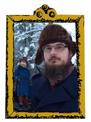
This house definitely isn't very modern. It is time traveller's house - You can see Aikapoika, my time-travelling alter-ego on the stairs. I think the whole house was transported to the fair from an another decade. I couldn't have built an ordinary house. No offense, there were some definitely cool ordinary houses in the fair, but it just isn't my thing; steampunk is. Finland doesn't have many houses like this, most of them are gray or white and use blocky shapes and minimum detail. This is of course different: Round yellow tower, black ornamented arches, funny somewhat tudor-style shacks on the side (probably inspired by Howl's Moving Castle, which despite being Miyazaki's worst movie has some awesome details) and big cone roof with a flag. And then the full thing is funnily angled, as there had to be 2 studs free space on every side.
 I chose yellow to be the main color as it is bright enough to look really good with black and I had enough yellow bricks left. I had ideas for more shacks on different, special colors like light yellow and medium blue but the ideas didn't fly as there weren't enough room and I didn't have enough bricks on those colors. But sand green and dark orange were good choices to my eye, and the rounded balcony with the stairs looked better than expected and give a nice spot for the figure.
The tower is rather similar to the one in the Prime Minister's apartment in Brassport. It looked nice and I wanted to try the idea with different color and greebling. As it would have been terribly hard to make all-round tower to burst through the roof, the backside on it is funnily shaped with an arched window and some hexagonal pipe pieces. They are interesting parts but rarely used nowadays, and I wanted to make a difference there!
-Pate-keetongu


0 comments :
Post a Comment
Note: Only a member of this blog may post a comment.