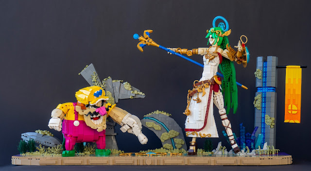
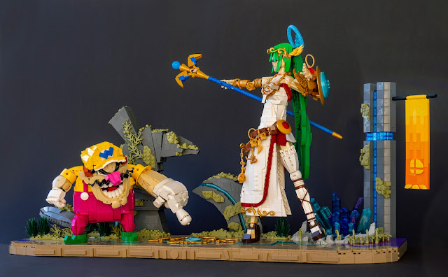
Hihoy. I mentioned some bigger projects on the last post, and here's the second biggest! This was built for my local LUG Palikkatakomo's "Digital scene" contest, scoring me the winning position with a decent margin (thanks to voters). The idea sprung (naturally) from buying Switch and SSBU in January (the plague seemed to be going on still, and we wanted some additional fun at home). Of course, I've played plenty of Smash Bros. before, with friends' consoles and games. Never owned it though - I've only ever had Game Boy Micro before!
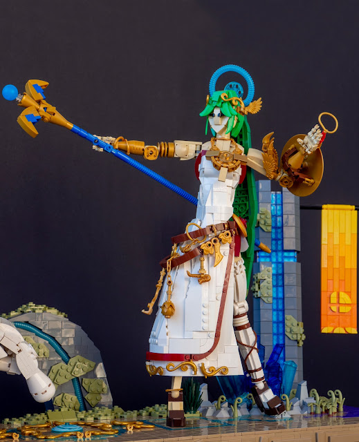
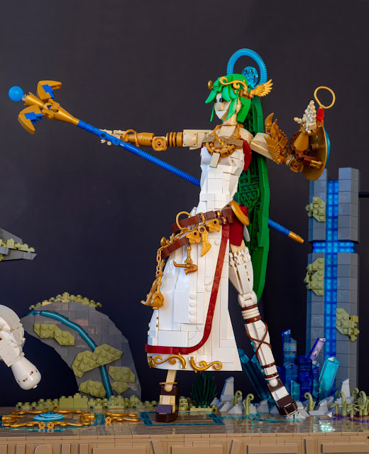
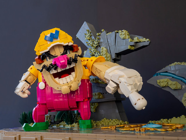
Controlling the wide variety of characters is a great inspiration for building, and my previous creations from SSB range include Samus, Samus, Samus, Samus, Dedede and Robin. Palutena gets her third iteration here - I've always liked the design; the first one (with rather special eyes) was built in 2015 and the second one, with more streamlined but still static nature, in 2017 for my Iron Builder against Jonas Kramm. New version of Palutena was on my short list for 2022 so it felt natural to include it in the contest entry. I chose Wario as the second character. Foremost because I like playing Wario, and Wario is cool - but also because the sheer stylistic difference between these characters was fun and illuminated the variety of the fighter roster! I had also wanted to build a proper Wario (wahahahaa) for years, and now I finally had enough magenta for his overalls. (Purple would probably have been closer, but magenta doesn't look bad, and there isn't much old purple around.) I'll publish separate articles for the character models soon.

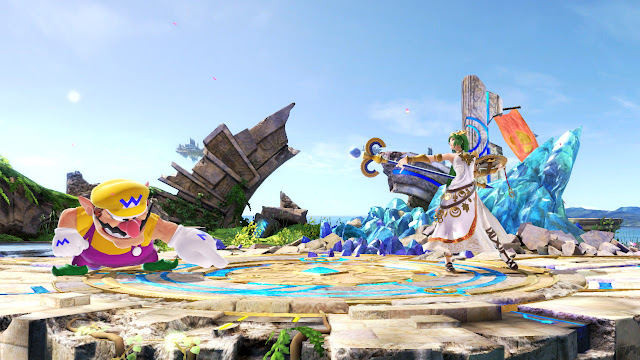
I wanted to build Palutena in the same "rock and roll scale" with Valerie Orion and such to achieve a good level of detail, and it also made the scale of the scene very big! I believe it's the biggest character build scene I've ever built, surpassing The New Shogunate from 2017. If I counted right this measures exactly 100 studs (units, modules) wide whereas Shogunate is 94 studs wide. I did not think it would end up so large... and I ever visioned having four fighters in the beginning! I'm happy I settled in two. Battlefield was chosed to be the stage on the very early stage. I did not want to associate the scene with any other game than Smash, and Final Destination would have been too much about wild background visuals, too big and striking the be build. Battlefield had some background visuals, Stock Fantasy Game stuff mostly, but enough the give the scene some depth and context. I ditched the additional platforms for clarity; the scene didn't need or fit them.
The ground of Battlefield is something between light bley, tan and dark tan. I didn't want to scene to be too grey, and tan would have looked a bit odd with the same skin colour on the characters. I had pretty good inventory of dark tan tiles (stressing the "had") so it was a natural choiche; I also added some worn-out dark purple areas on the sides. The bluish crystal thing on the bakcground could have been larger, but I that was all I had in these trans-blue hues; there should be plenty of car windscreens of my childhood collection in Joensuu though, out of my reach! The stone formations were duller to construct (I did not have much interest on building them) but I guess they're alright. I think them being taller than Wario adds some three-dimensionality to the scene. The orange-gradient banner was fun little build though, and I managed to include a little Smash logo to it. I think it balances the colours nicely. Other than it I wanted to keep the background colours down-to-earth and muted to make a contrast with the characters. Regular green appears only in Palutena's hair, while the scenery had dark green, sand green and masses of olive green. Most of the background elements are also behind the base. This made it possible to angle them freely, and also emphasized the idea of them being in the different "reality layer" - as in the game, the fighters can't reach them.


0 comments :
Post a Comment
Note: Only a member of this blog may post a comment.