Hiya! Summer holiday's end draws near and my last study year is about to start, but there's still time for some adventures. This one continues the Speeder Bike Contest series, moving to the infrastructure part of it. First sketches for this were made in December last year, but the concept itself developed quite a bit from back then.
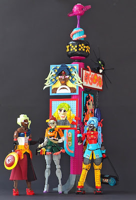
 The original idea was to make couple of spires - sort of thin towers, or thick lamp posts, to display advertises, screens, lights, trash cans and so on. In the end I ended up making three as I got some cheap magenta slopes, used here. This is actually the last one built, but felt the most natural to start with. The cat sign was the first attachment made for the spires. It is inspired by our cats, especially Takku, who is black and white cat that slightly reminds of a rodent. I mostly wanted to use the antennae parts for striking effect. The text is fantasy writing with elegant, curved letters made with vibrant coral curved tiles. The lamp hanging from the sign was originally going to be adjusted between two spires, but it didn't work out.
The carp sign was the second one. It is combination of two elements: the carp, drawn from Japanese folklore, against starry background (meaning unknown). The fish was built because it felt cool and I wanted to use 1x1 quarter tiles as scales. It also refers to another element on another spire. The starry background was originally long, six-wide element constructed for another, abandoned idea. They form quite interesting pattern with curved lines and ovals - their radius makes connecting them densely tricky. I ended up removing and replacing them several times. The medium azur thingy is more random, late attachment to balance things up and use out odd 6x6 quarter round slope piece.
The main bulk of attachments consists of portraits of the speeder bike riders. I wanted to preserve them as the focus of the display, and it made sense to have huge faces around as they're idols and paragons of the event. Three are displayed here and the last two on another spire. The portraits are definitely inspired by Chrish McVeigh's Brick Sketches. However, I had to mix his recipes, as his sketches wear plenty of helmets or masks and tend to be aliens, robots or male. My portraits are more boldly three-dimensional, and extra effort was put to the hairdos.
Aurora Sievert was the f irst. I used the same big flame piece for hair here and on the actual character model, and suffered from same challenges with its connection point - one axle is very ascetic! They would be more versatile if they had a pin hole next to the axle, as on usual Bionicle weapons. Maybe they're more elegant this way. I Bricklinked bunch of those pieces few years ago and finally managed to use all of them. Vereftoi Radiante was the second. I'm particularly happy with the hair with its vibrant coral streaks on black. The glasses are made with same technique than on the character, glass panels on lever base, but the glass in just bigger. Delfte Solflare's hair's gradient is not as elegant nor vibrant than on the original, as opaque pieces are used instead of transparent ones (which I didn't have enough). But it's not too bad - yellow, orange, red, lime and yellowish green should be vibrant enough!
The top of the spire is an epitome of the whole build - something colourful, vibrant and ambitious, with interesting and splashy part usages. It has a space theme with magenta Saturnus on purple stand above medium azure dome that rests on a space globe with belt of same star pieces than on the carp attachment (I bought them from London Pick-a-Brick last summer). It might be bit silly and that's the point.
The model also features character, who are fans of the speeder riders. One of them, Veron Zapper, was posted earlier. The two others, fans of Aurora Sievert and Vereftoi Radiante, will be posted on 14th and 15th of this month, so moew content tomorrow.
-Eero


0 comments :
Post a Comment
Note: Only a member of this blog may post a comment.